Manual word breaking in a game website
It is very likely that your game has some kind of catchphrase before drawing reader into the details of the game. In some unlucky circumstances the word breaks in a wrong place on a popular fixed-width device size.

A website for games you made maybe rather small, containing only brief introduction and a few pages or even a single home page, but in a way that invites reader to discover the game. The ultimate objective is to present your game to as many audiences as possible.
I have previously touched on the SEO and localization subject to ensure people from different places found your game on Google. For device compatibility you should design for mobile-first with CSS frameworks.
At least your headers should be pristine
There is one important point about word breaking that commonly arises in a website like game/product presentation page. It is very likely that your game has some kind of catchphrase (that you thought up for months) before drawing reader into the details of the game. They would be in a BIG obvious header tag.
And in some unlucky circumstances the word breaks in a wrong place on a popular fixed-width device size, like Apple product. Imagine everyone who uses an iPhone came to the website and see your weirdly broken key sentence. That maybe a substantial portion of your players.
You may not want to fix an entire website, but likely want to fix just the obvious one like this.
Problems without spaces
You may not think this is a problem if your primary language is English. English could word break very easily since the space between words, well, defines a word. But many asian languages (commonly called CJK) do not have spaces.
And even if you know all valid words in existence in that language, sometimes it is too early to break a word. For example from top of my head in this Thai sentence : กินอะไรกันดี
- กิน = "eat"
- อะไร = "what", this is 2 syllables but it is not possible to separate อะ and ไร.
- กัน = Usually means together. This is indicating that the speaker includes himself (e.g. "what should we eat together now?" เล่น = play, and therefore เล่นกัน means "Let's play together".) If I omit this, the sentence became more neutral but still could be referring to "together" still.
- ดี = A suffix that indicates the speaker is wondering. If I omit this, just กินอะไรกัน means more like the speaker is asking to a group of people (that are together right now in front of him) what they are eating/going to eat, but not including himself. If you attach this "wondering", then it now includes the speaker. This word alone means "good".
By knowing these 4 pieces of that sentence it is possible to write it out like English : กิน อะไร กัน ดี (presenting breaking opportunity on every words) but imagine the sentence landing at the edge of the page. If ดี wondering part falls off the edge to the next line it would now slightly looking weird as that alone means "good". (If you read fast enough, then it can still sounds natural but quite glaring as a header.)
If this is a part of a longer sentence, I even prefer having only one possible break point at กิน | อะไรกันดี since "eat" is the most important part and the other three sounded the most complete together. You see just knowing dictionary without context could leads to sub-optimal solution.
It is not a problem in articles since you are prepared to read continuously, and it is not practical to handbreak everything by eye and your language nativity. But as a header, you are itching to fix it since it is so small but very important to you!
Solutions
- You try to nudge your
<div>'s width until it breaks in the right place for popular devices like iPhone or iPad. Well I think this is too crude of a solution plus I don't want to touch my CSS framework's break points. I prefer the breaking information to depend on the text and not their surroudings. - You try changing your header's font size until it breaks in the right place. Not ideal for the same reason.
- Justify the text to a single line of fixed width
<div>. However multiple languages may have differing sentence length and so this solution may introduce other workaround needed like having to rethink your sentence in a similar length. - In game engines there are usually a function that dynamically scales text so that it fit perfectly in the rectangle you specified. (Or disable just vertical/horizontal overflow as desired) (For example this SO thread.) And then if this rect is only 1 line you don't have a word breaking problem! However for accessibility of your site when you consider small devices, the line would be so small that it doesn't look like a header anymore. You may put up with this, but I think I like the text to always be able to go to multiple lines as they wish as HTML was designed to be flowing from top to bottom endlessly.
- Use dynamic programming to insert word break opportunity according to a predefined dictionary. See DP Word Break Problem. You can then define some words plus the one specific to your game. The problem is if the dictionary contains short words, the end result may ended up too granular. (Still better than nothing for asian languages.)
- Preprocess at build time/process at client side the text automatically with more advanced external program/libraries. Example includes ICU's boundary analysis (1, 2, 3) or specific language project which may use a predefined dictionary and language rules or nowadays, may use neural network. In Thai language we have something like pythaiNLP. Google has Budou with its online service https://cloud.google.com/natural-language/ or could be connected with free backends.
- Manually specify where is a possible break. This is a preferred method in our case since there are so few but high value instances in the site that we would like to fix.
Default Unicode behaviour
http://www.unicode.org/reports/tr29
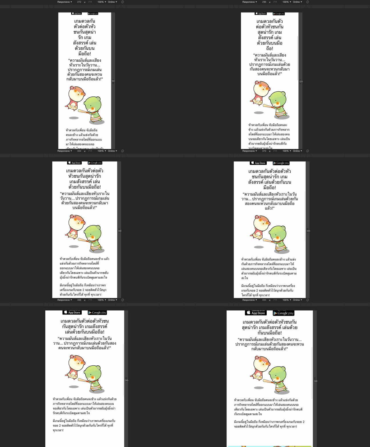
Vanilla HTML is not that naive, for example in Thai language it do break in a sensible place, at least it could always be read as a syllable. In Japanese, there is a rule like "never break in the middle of katakana" built in.
While in Japanese, this is less than ideal :
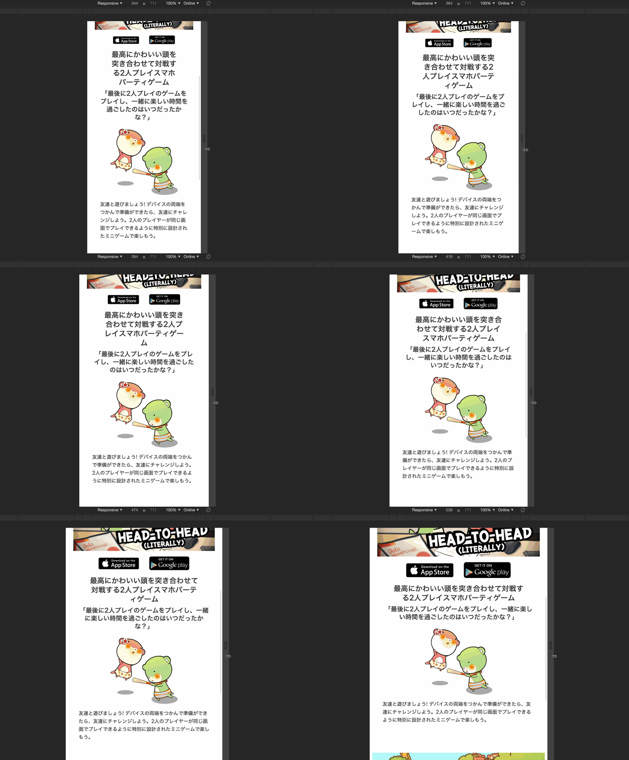
It seems to break at every character! Why is it not following the standard!?
Could manual segmentation beat machine?
Input
最高にかわいい頭を突き合わせて対戦する2人プレイスマホパーティゲームAccording to my (lowly failed N3 exam) knowledge, I would like this sentence to be broken to :
最高に|かわいい|頭を|突き合わせて|対戦する|2人プレイ|スマホ|パーティゲームUsing Google's Budou with MeCab Segmenter backend, we get this result :
budou 最高にかわいい頭を突き合わせて対戦する2人プレイスマホパーティゲーム --segmenter=mecab
<span><span class="ww">最高に</span><span class="ww">かわいい</span><span class="ww">頭を</span><span class="ww">突き合わせて</span><span class="ww">対戦</span><span class="ww">する</span>2<span class="ww">人</span><span class="ww">プレイスマホパーティゲーム</span></span>Which is 最高に|かわいい|頭を|突き合わせて|対戦|する|2|人|プレイスマホパーティゲーム. You see Google's approach to keep the text grouped is to use <span>. It did a good job at 最高に and 頭を where it put the particle before the break, so new line would not be a lone particle. However 対戦する is a verb that should not be broken but it follows "no breaks in kana" rule like Unicode's default rule. 2人プレイ for "two player game" is also preferred to be together. tinysegmenter backend gives similar result.
I don't have credit card set up to try Google ML ones. However we could see a glimpse of them from Google's own website. For example : https://pixeljp.withgoogle.com/. Even the class name for each <span> is budou!
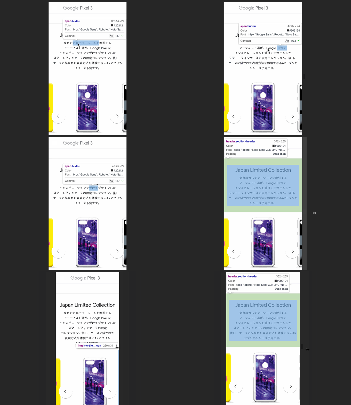
Some of the result are very good, such as スマートフォンケース for "smartphone case" it is able to segment "case" from "smartphone" even though there is no space in Japanese. Still you can see it falters in some place like verbs where it ends with する、した、できる where I think we prefer it to stay together with the main part (framed in yellow).
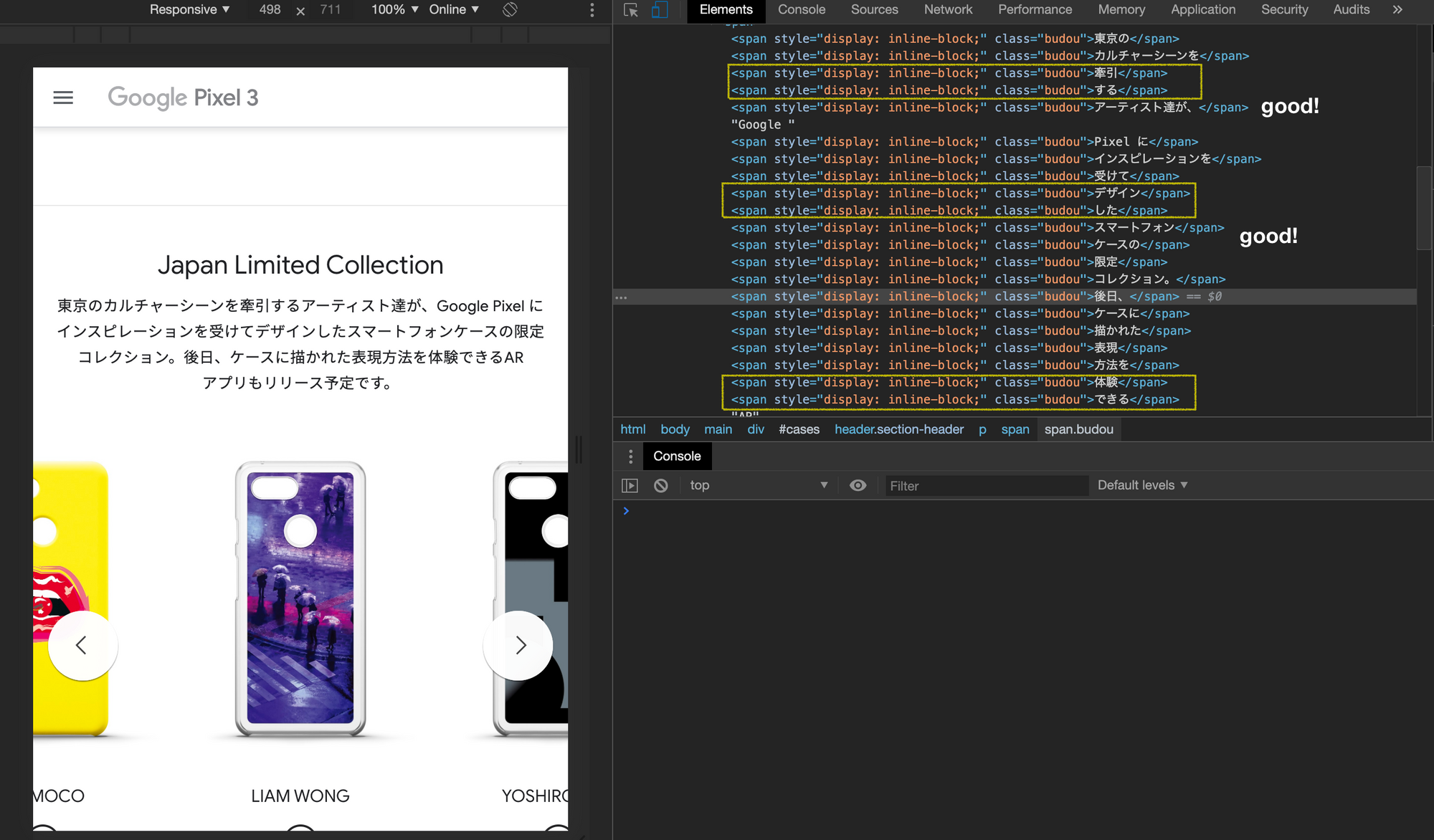
Now onto Thai language, I will try wordcut Node package.
เกมดวลกันตัวต่อตัวหัวชนกันสุดน่ารักOptimal (subjectively) result :
เกม|ดวลกัน|ตัวต่อตัว|หัวชนกัน|สุดน่ารักwordcut result :
เกม ดวล กัน ตัว ต่อ ตัว หัว ชน กัน สุด น่า รักWell this works more like syllable segmentation than a word or natural segmentation. At least each one is readable. I don't have Tensorflow environment to try out solution like thai-word-segmentation.
It is now clear that hand-made solution has the highest potential for small amount of texts. Our game website is definitely the case as we would rarely update it with new contents.
Handmade HTML solution
A solution maybe to follow Google, by wrapping <span> for each chunk of non-breakable text, then apply a style inline: block; (reference). One another solution is the CSS style white-space: nowrap; like this <div style="white-space:nowrap;"> make the text overflows on a single line without breaking no matter what. And then <wbr> tag could manually break the line if it needs to. This way we don't need to surround the text because <wbr> is inline. (So the processing is potentially can be just a string replace, which is easier/faster than wrapping.) I prefer the <wbr> approach.
The solution is therefore manually applying that CSS style then put <wbr> manually. Plus because English now not breaking according to white space, you will replace white space with " <wbr>" to restore the English behaviour back.
How to achieve this depends on what you built your website with. With pure JS, or jQuery you may search for all <h> tags and apply the style or formatting you want when your website is switched to a language that needs it.
In my case I was using Svelte, and it is easy to do "dynamic/conditional HTML". For example here's my custom ManualBreak component which accepts any htmlText. Svelte component contains logic on top where I define the input properties. Then below the rendered content, the text is modified (regex replaced) and sandwiched in a <div> with desired style. The input text has | baked in that will be turned into <wbr>.
<script>
    export let htmlText
</script>

<div style="white-space:nowrap;">
    {@html htmlText.replace(/\|/g, "<wbr>").replace(/ /g," <wbr>")}
</div>
Also white space stops breaking with that style, so I also replace " " with " <wbr>" to restore the white breaking behaviour somewhat.
If you use React, Angular, or Vue, which all are component based you should still be able to do the same conditional rendering.
Then I use it in important places where I prepared texts manually broken with | coming in. It's not a lot of work putting | on just important headers.
<script>
    import { _ } from "svelte-i18n"
    import ManualBreak from "../../ManualBreak.svelte"
</script>

<h1 class="px-5 text-center">
    <ManualBreak htmlText="{$_("gameMotto")}"/>
</h1>

<h3 class="px-3 text-center">
    <ManualBreak htmlText="{$_("gameInvite")}"/>
</h3>
If your website is a single language, asian language only, then you can just put <wbr> baked in the header and call it a day.
Result
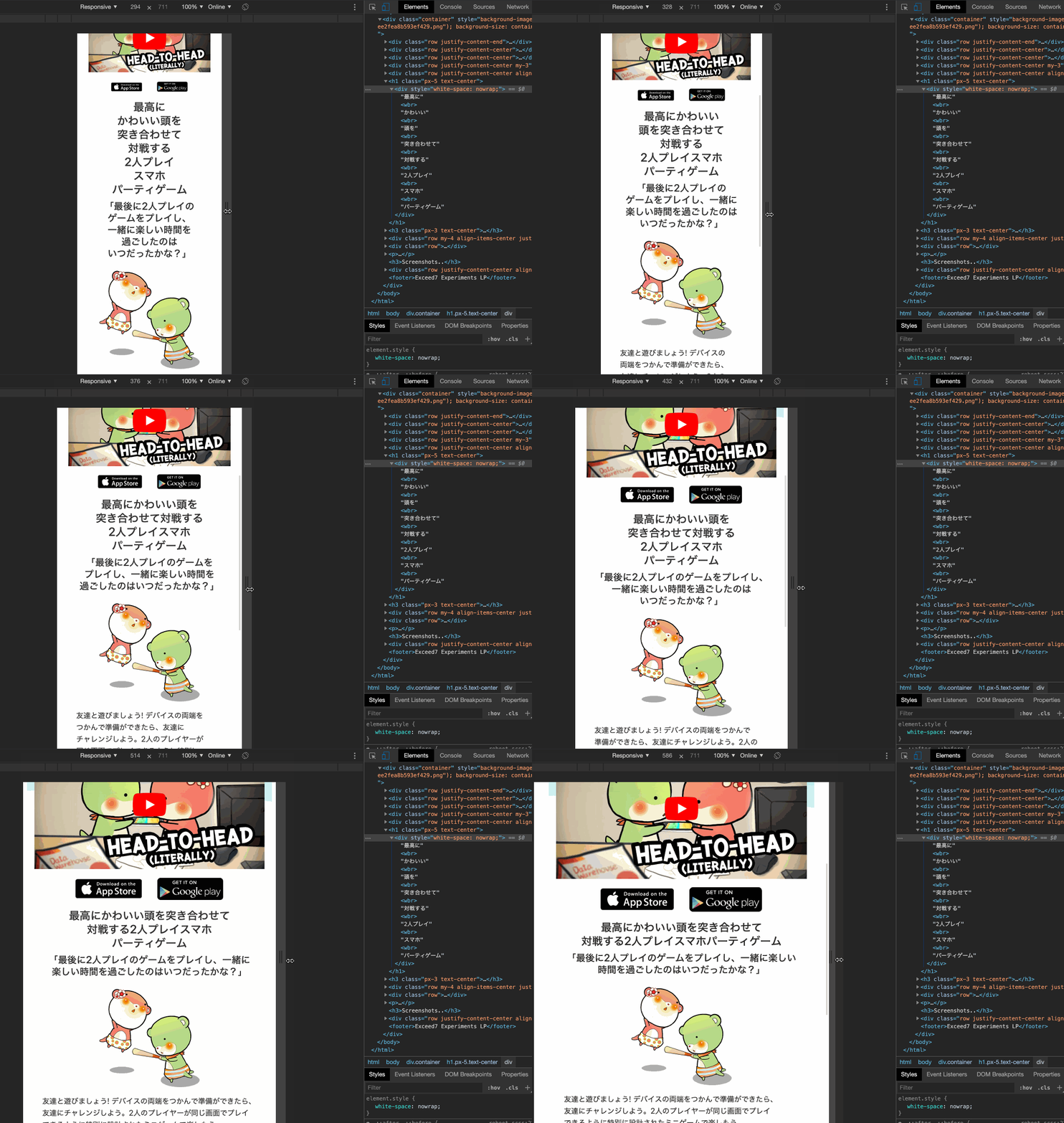
Here is my <wbr> broken sentence in action. It now breaks in a place I like. I think it worth my manual labor annotating it since I will use this static page for very long time onwards.
