Duel Otters clone analysis : Cats Carnival
This is a deep analysis of a clone of my game Duel Otters, called Cats Carnival. It's an honor to be copied THIS much.

Duel Otters 2.0 is nearing its release, and I think it's time to talk about this a bit! Because 2.0 is a major rework and many things changed, I want to write down all about what Cats Carnival copied (it's an honor!). At the same time, an analysis of my design that the person who copied probably don't know about, as a postmortem before I let go of pre-2.0 Duel Otters.
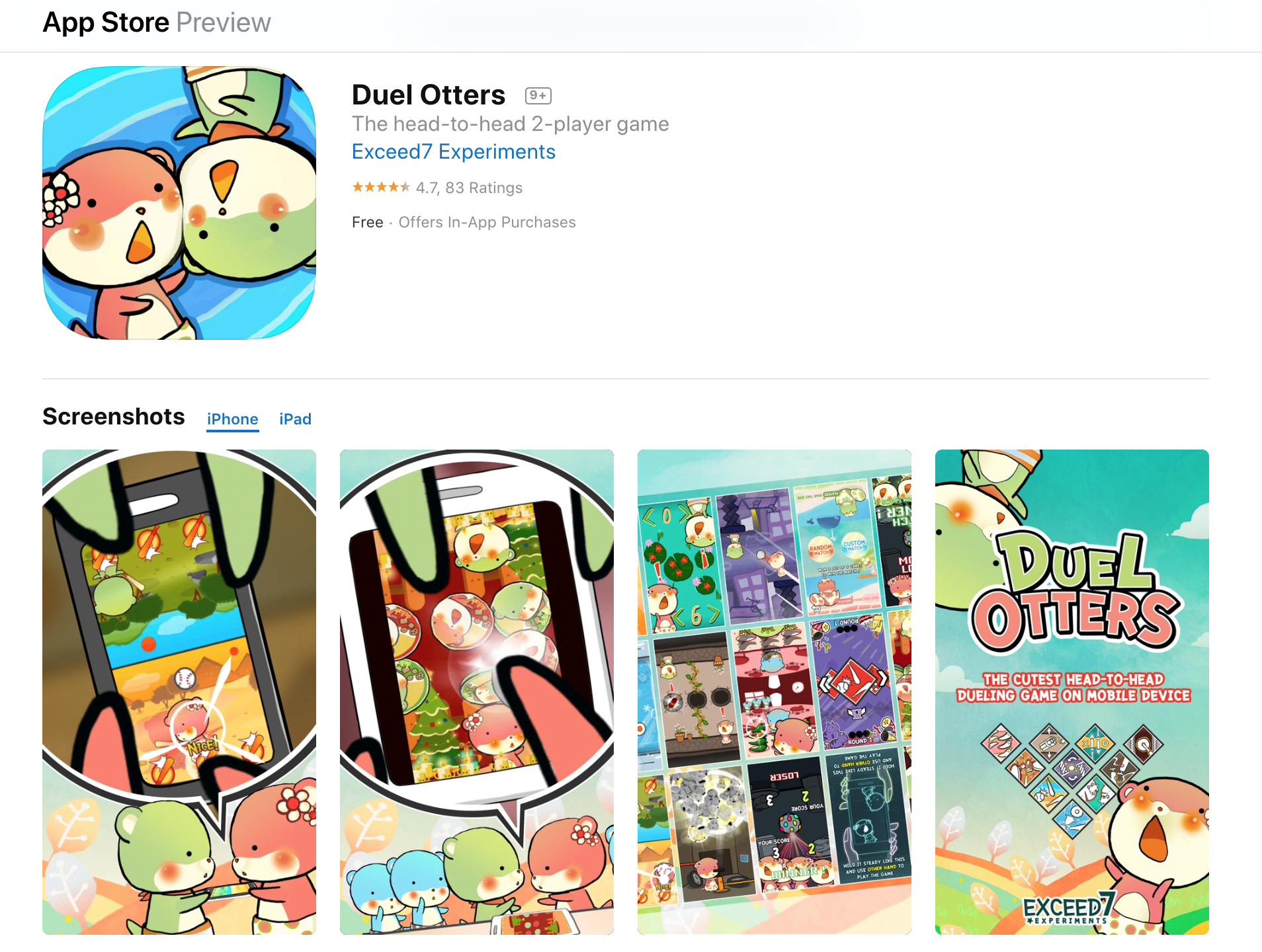
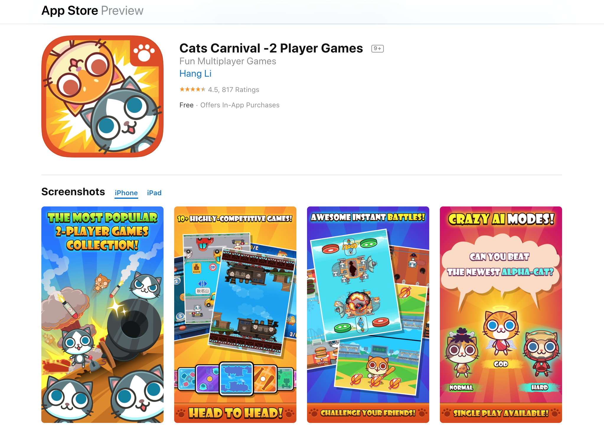
In this article, I hope you learn how a game came to be and why some devs keep saying "inspiration" rather than a "clone". That doesn't mean nothing in Duel Otters is a blatant copy, and so I will point those out too. Also I will explain thought process of something transforming from a mere clone at first into an inspiration. These are likely invisible to devs who just copy things.
日本人「かわうそ バトル」のファンへ、この記事はパクリゲー「Cats Carnival」を軽いに話しますw 自分が作ったゲームがパクリされのは人生初めてでした! 嬉しい!
Quick preface about Duel Otters
- http://exceed7.com/duel-otters
- https://apps.apple.com/th/app/duel-otters/id915930373
- https://play.google.com/store/apps/details?id=com.Exceed7.DuelOtters
- https://www.facebook.com/exceed7.DuelOtters/
- In university I started a project, a serious same-device fighting game which you play upside-down. (Named "Factora")
- Due to prototyping mistakes, it goes long way before I realize it was no fun. (I even made music and all the UI!)
- I prototyped a "stupid baseball game" in 1 day using Unity a while after graduated bachelor (the fighting game was made with Cocos2D) and it is more fun that that game I made for multiple months while in university.
- Factora was scrapped into a more stupid same-device party game, with simpler but more (mini) games on it.
- I managed to release it before I go to master degree at Japan, in 2014.
- The team disbands at that point into only me maintaining the project alone from Japan because others got a stable job now.
- I pushed some updates from Japan but not much due to working on papers. I birth a new solo music game project there, and decided to complete it before returning to Duel Otters.
- After graduated, that music game was going at slower pace than expected and I thought Duel Otters which is currently an active game is long overdue for update. (I call this "rotting") The end of 2018 I decided to open up the project, so I can prepare my mindset to update it in 2019.
- The project is a mess since I have improved so much from 2014, and I decided instead of updating I should rework the game and lay better groundwork.
- Because of life I only able to start the rework around 20 April 2019.
- The rework is finished around June 2019. Then I started working on a new content, it would be a shame if it is just a rework.
- Right now, September 2019, everything for v2.0 is ready except some social stuff.
- Then I decided to write about this topic.
If you want a longer (darker?) version of the history you could visit a more personal blog here http://blog.exceed7.com, particularly this post which contains links to many related posts at around the end. I remembered there are suicidal thoughts in there and maybe mildly NSFW, but rest assured it wasn't because of Cats Carnival. (lol)
Well I had came a long long way. I have my own story and my own cause I fought for. Maybe you have your own story that leads to having to clone my game. Did your life get better since then? Did I help you become who you are today?
I did talk about this on stage!
There are multiple occasions I can go back home to Thailand even while studying for master degree in Japan. In 2016, there is a "bar camp" event which participant could submit a talk and by voting you may or may not get to talk. (barcampbangkhen.org)
I thought it was funny I became a good enough game designer to get my very own first copy game, so I submited the topic, and I was voted enough! If you can understand Thai maybe you could watch it for fun, this article is kind of a remake of this talk with an added context of Duel Otters 2.0.
For Cats Carnival devs, I didn't talk negatively about you in Thai so rest assured! (There are few swear worlds but jokingly) You even get some free publicity from me I guess. And this article adds more to that.
Inventions
I always appreciate how each "mechanics" get invented and being copied. For example in Angry Birds era, every game somehow wants to use the "grid stage select with 3 stars" layout. Then in energy-game era, everyone must have that plus button glued to the bar to lure you into paying, or having a "gated material" like the upgrade screws in Hayday. Then in endless runner era, Cookie Run managed to get the most satisfying experience with many small polishes. Match-3 or a variant of color block games was always a thing, but King with its Candy Crush Saga popularized the "puzzle match 3" solution which instead of just score attacking, it is instead half RNG and half skill to get the block to the destination and "execute the move". It may take some man resource to mass-produce new stages (and not instantly infinite like score attacking games like Bejeweled for example) but damn it is so satisfying to complete the objective. Even a big company like Disney copied this invention almost entirely in a game like Frozen Free Fall.
Since I am a music gamer, I can talk for hours about invention in this area. Like how DDR invented beat-colored notes, or the fast/slow indicator, or the groove gauge. I must stop myself from talking more now.
These are the invention I am obsessed with observing, and appreciating whoever invented a new one. In this post, I will also share my own polishes and inventions openly.
Cloning (functional) polishes
You see a million of Flappy Birds and 2048 clones. Mechanically they are the same. However do you realized they have cloned "polishes" too? Maybe the dev that clone them are aware or not.
For example what if the original 2048 (the real original is a game called Threes however) didn't have a swipe-and-merge animation? That's actually a "functional polish" that make the game works. Notice that Candy Crush clones somehow have to display a word when you score big? ("Delicious" and so on) That's a very obvious non-mechanic, but a polish, that is easily cloned.
But do they realized that the length of animation and its curve characteristic in Candy Crush Saga is controlled in the same theme on the entire game? This is some polished they may failed to clone. In this article, I will also talk about such things Cats Carnival failed to notice.
The real inspiration of Duel Otters
Is a game called Bishi Bashi Special 2 (PS1) and King of Opera (iOS/Android). Here's what I took from these games. Yes, real dev do not pretend you invented something.
I will also talk what got indirectly transferred to Cats Carnival, probably without them knowing the origin and how that design came to be from the thought process.
Bishi Bashi Special 2 (PS1)
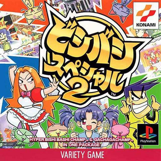
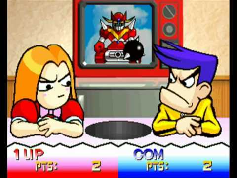
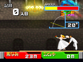
- There are multiple 2-player mini games. And there are SO MANY like more than 50! Each with surprising amount of details. (Graphic-wise, the gameplay is simple.)
- You collect wins from each game and depending on scoring modes you try to win the "campaign".
That's about it. In Japan, this game is an arcade cabinet too so this is kinda a port. Other than the 2 player minigames aspect, there is a not so obvious point I took from this game, but not blatantly.
- BBS2 has characters. I found this the most charming point of the game that this girl and boy is fighting each other on each game. There are games without this two too, and this is the point I think Bishi Bashi Special 3 (PS1) didn't look as good, because there is no character. (And so, limits the "story" behind it.)
I decided that Duel Otters would avoid to be like BBS3, and be a bit different from BBS2, by always constantly feature the character on every games.
The clone game Cats Carnival that copied Duel Otters without thinking probably missed this point, and the cats are instead generic. Then a common extension a game dev could think of to "get ahead" of the game you cloned is to add some kind of customization, (like if you cloned Flappy Bird, then you add a new bird which looks different. Common sense.) which Cats Carnival added an option to change the cats. However not knowing Duel Otters' constant green-pink character is "by-design", that extension actually violates the rule in my design. I chuckled a bit when I see they decided to extend on that route. However, character customization can lead to a new monetization opportunity too, like having to watch ads to farm currency to unlock those. - BBS2 requires a score indicator. Which changes depending on games what is required to win.
In Duel Otters prototype, I once copied this shamelessly but it conflicted with the upside-down design because you now require to duplicate the indicator to be readable by both sides, and it looks weird. I then try to force them into a bar-type so that both sides could read it. But what kick start everything is when I worked on the Baseball minigame's decoration, which is a sun that keeps expanding when you score. At that point I realized if I am creative enough, I can roughly tell a score without any numbers. At this moment one of Duel Otter's identity was born, the score indicators are mostly graphical and understandable from both sides.
This is an aspect that Cats Carnival dev probably realized, as other than minigames that they copied me they have added their own originals too. (Great!) But those games featured numerical score indicator because they don't have my creativity to copy. - BBS2 is explosive. This is one aspect that is hard to copy, and Cats Carnival missed on this. The animations are janky, explosions everywhere, and it is so satisfying. I "blatantly copied" this, by making the keyframes of my character a stepped constant rather than continuous. Cats Carnival features many easing animation (more often the default ease-in-out) and probably didn't realize this in my Duel Otters design. BBS3 is also falling short, because it is much more tame and not as "explosive". If you played BBS3, you know what I am talking about.
Though, actually BBS2 is not the only inspiration. The other one is Tom and Jerry. What I liked as a kid is that the cuts after each time Tom gets hurt was quick and satisfying, and I want to replicate that feeling. There are many mini games in Duel Otters that the character gets hurt somehow because of this.
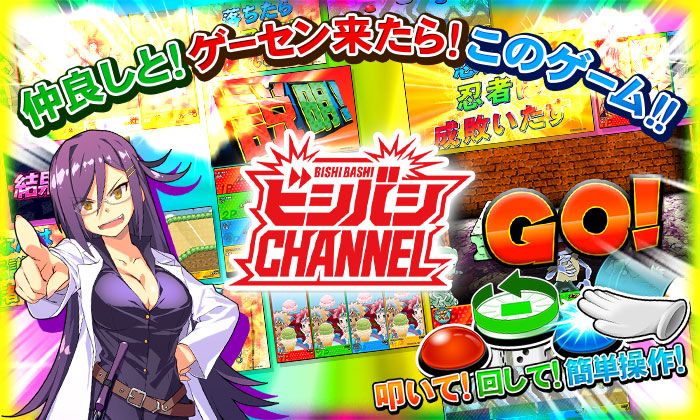
Their latest iteration is the arcade-only Bishi Bashi Channel, which is much modernized with moe characters. The games are still wacky, but I missed the 2 characters from BBS2 so I credited this particular "2" iteration the most for the creation of Duel Otters.
King of Opera (iOS/Android)
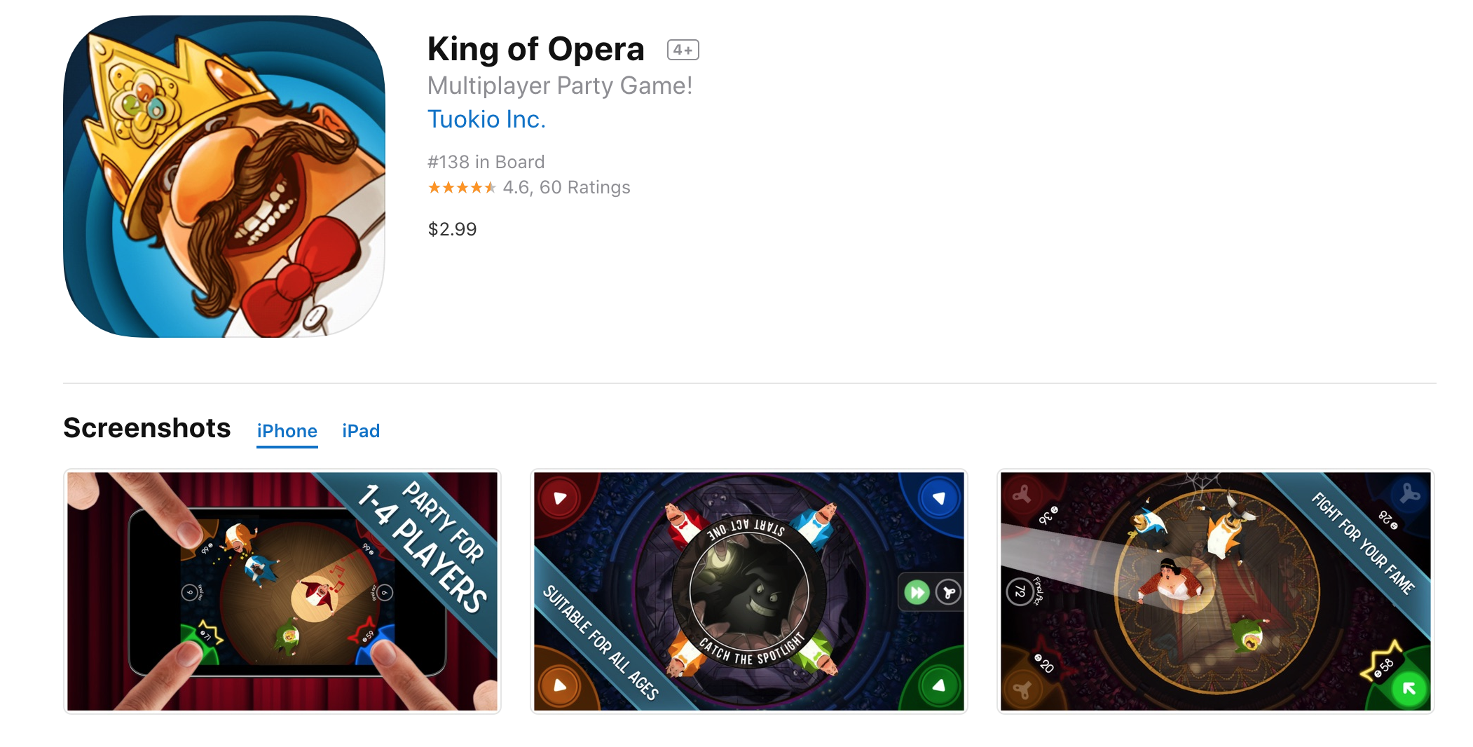
Around the time when I was in university, and only a few people got an iPhone 3. This game is phenomenal and I can see someone grouped up and play it when it is not Angry Birds. That was a time when you have to borrow friend's phone to have a go at Angry Birds.
There are many "4P corner multiplayer" game like this at that time, however King of Opera is the most polished and nothing is lazy.
This game is where the "same screen multiplayer" aspect came from. However it is not that simple to copy :
- The game works for 1-4 players, I want to make a strictly 2 players game as inspired from BBS2. Therefore you are at each side instead of corners.
- The game works because it is an opera hall and the character is fat, and he looks good from above, and he can spin, and that is the core mechanics of the game. Everything was designed as a top-down game. And when compared with Duel Otters it is a game of single minigame. In Duel Otters, you will greatly limit a variety of games you can make if you limit yourself from a top-down perspective. Also the otters do not look cute from above. So I must somehow find my way about this on my own. An example is the Baseball minigame that started it all, I managed to turn top-down into a front-view game by having the otters hitting the ball to the horizon. Which, Cats Carnival copied entirely without any new invention. More on each game's analysis later.
King of Opera gave birth to a completely new problem of "how could you make same-screen multiplayer game without resorting to top-down perspective?" which I enjoyed solving very much for each game by various wacky designs. (Which often goes against real-world logic, but the theme is funny so it still works.)
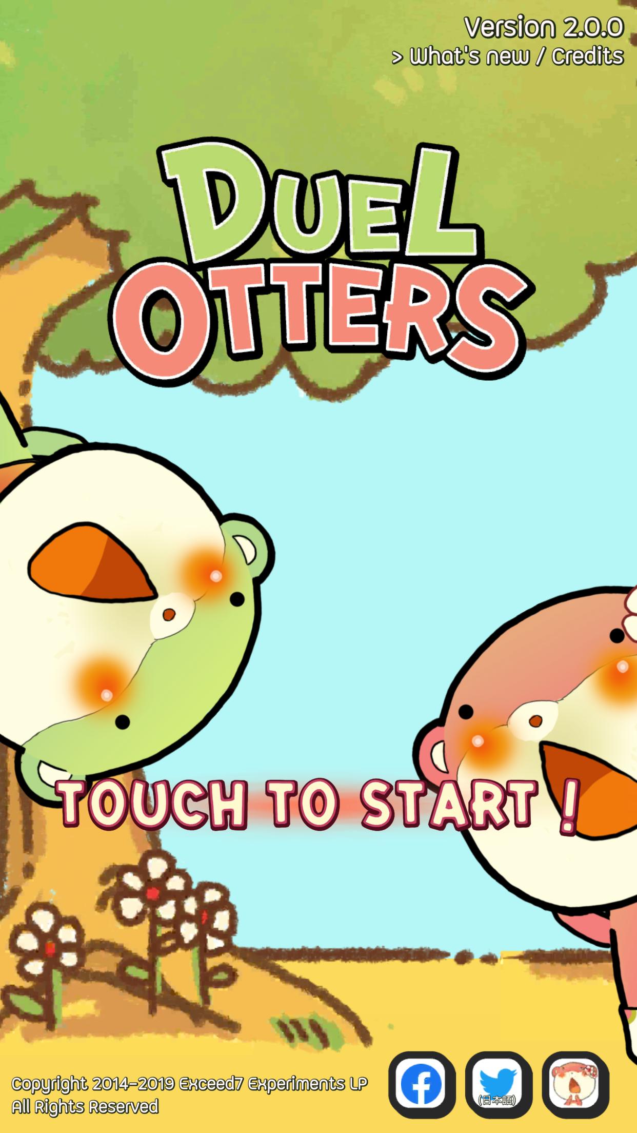
Title Screen
I have made some title animation on mine, but I lose on this one! They have a better personel on making arts and animations. And unfortunately it was hard to motivate my artist to work. Maybe it would be different if we were an actual company with fundings so I could give salary. (She made the character art, mode selection BG, and about 3 game's BG artwork.)
I appreciated Cats Carnival's OP because they came up with their own solution. What's really nice is that the music goes exactly with the sequence, which Duel Otters is that way too. (No more in 2.0)
My random "Otters falling from heaven" title screen which I don't know what my artist was thinking is cool too. However it was once asked to remove the halo from Apple Store team before a featured promotion, since it looks like they are dead and therefore is not suitable for kids.
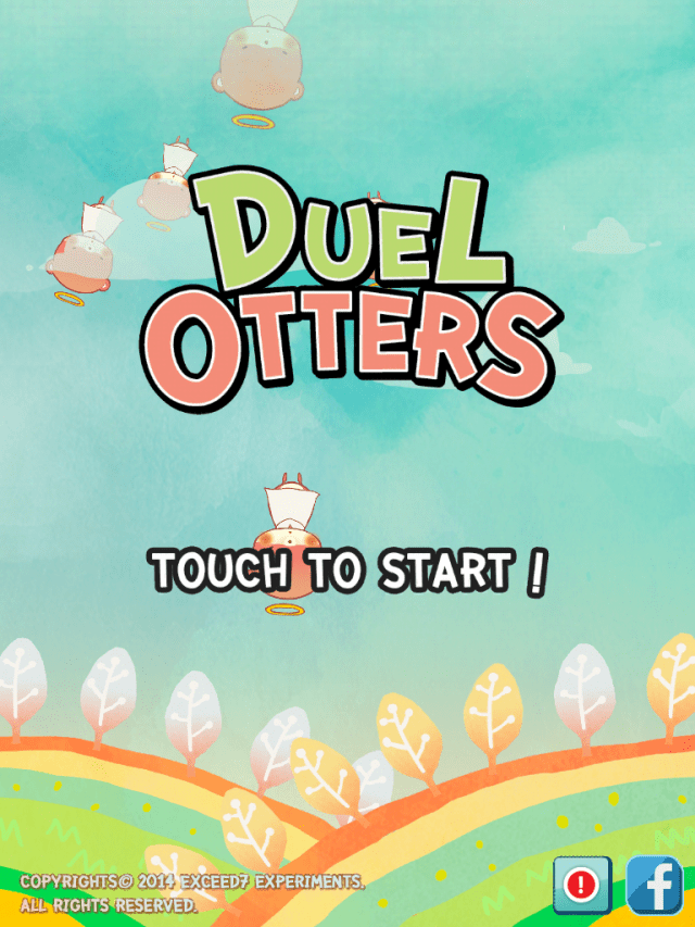
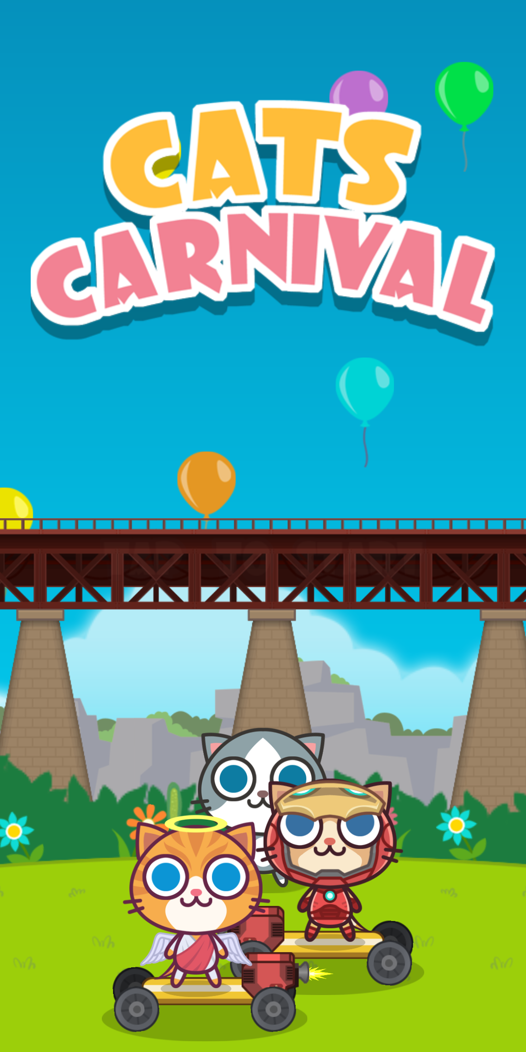
Also I got a separated mode selection screen, which the beach is also drawn by my artist when we were still a team. I liked this screen!
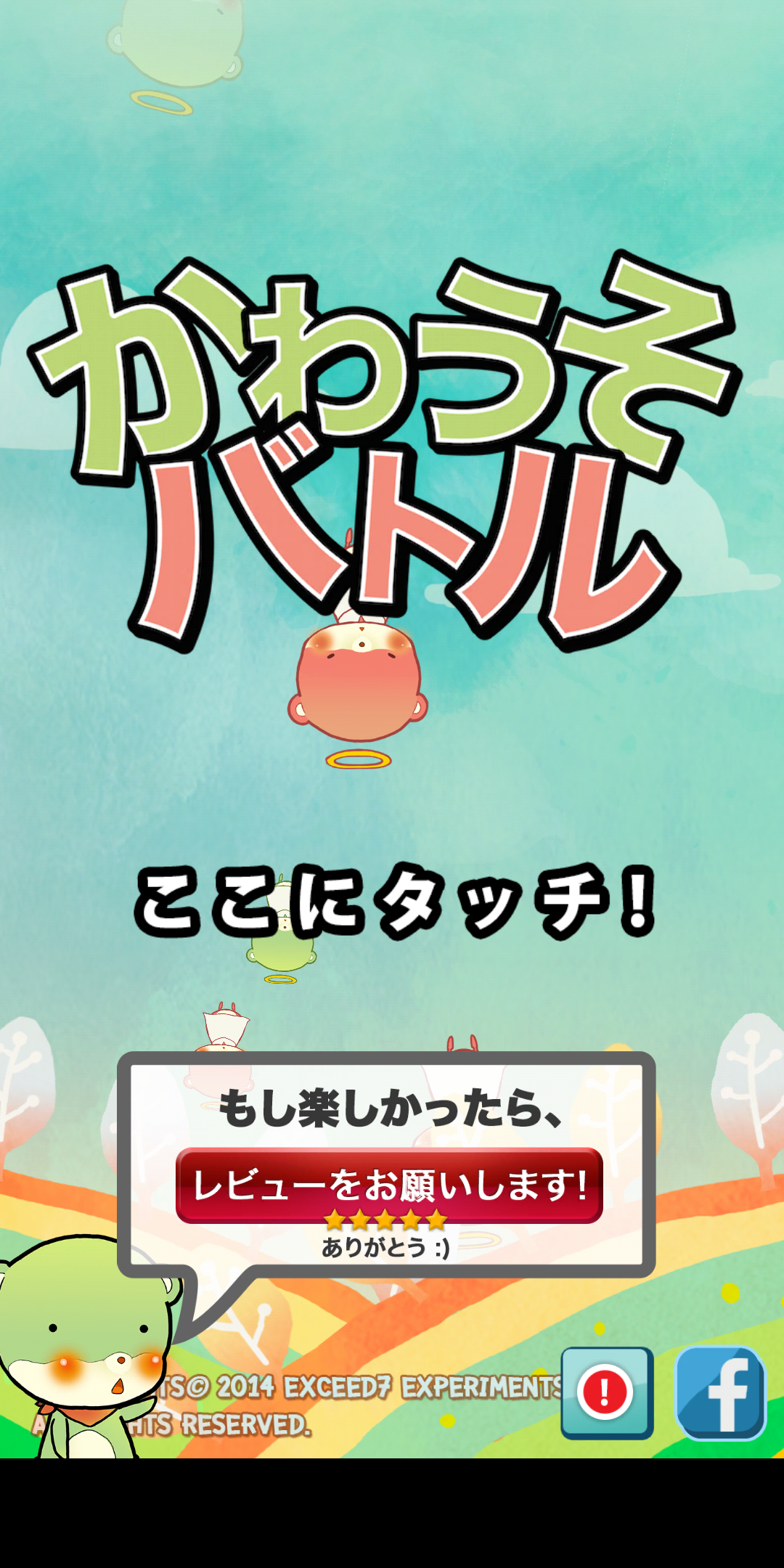
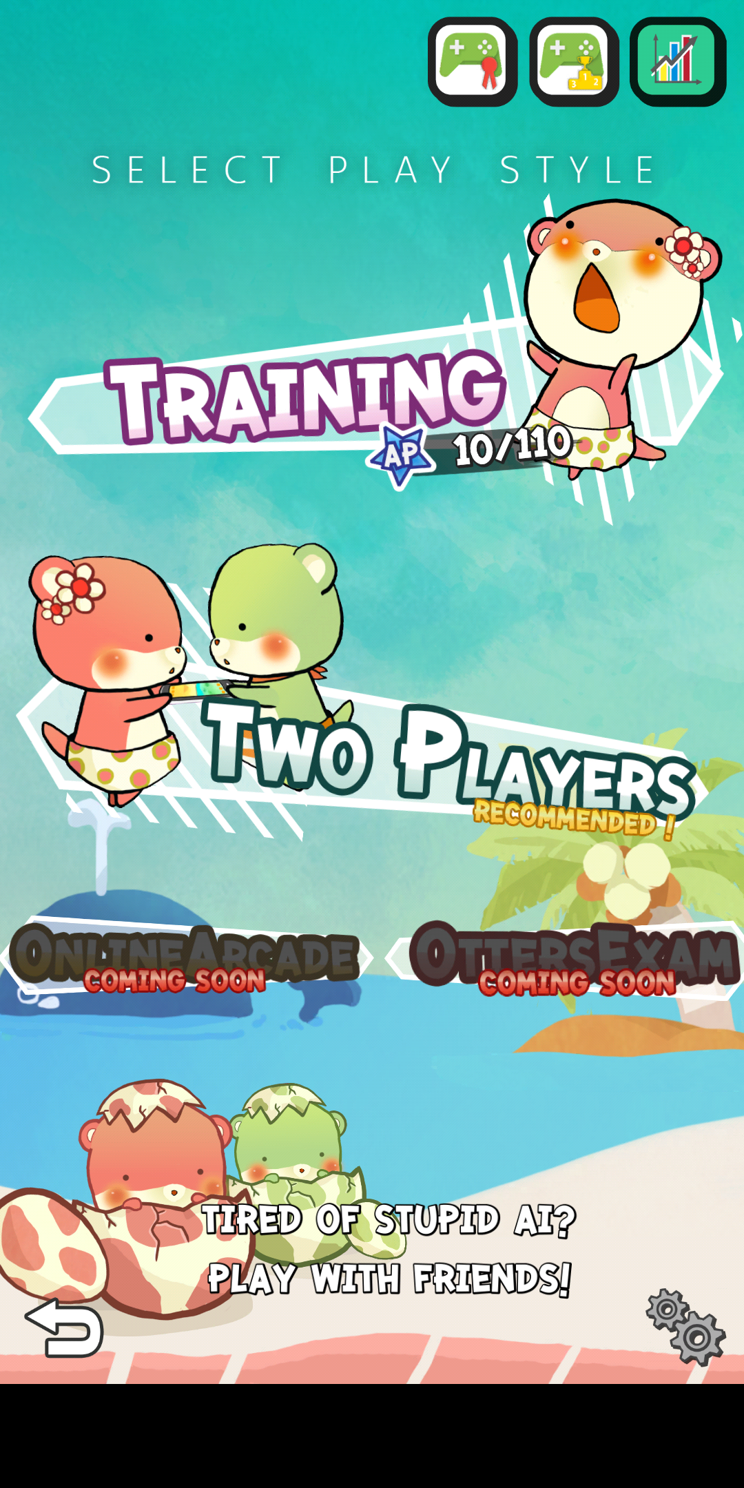
Though this title is changing on 2.0, so that's why I want to write this article as a legacy to the old screen.
Game selector screen
Probably one thing I am really proud to be copied, because there are many inventions here that got transferred without them knowing.
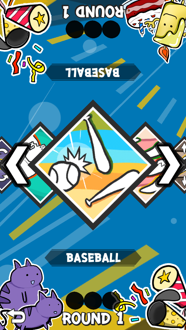
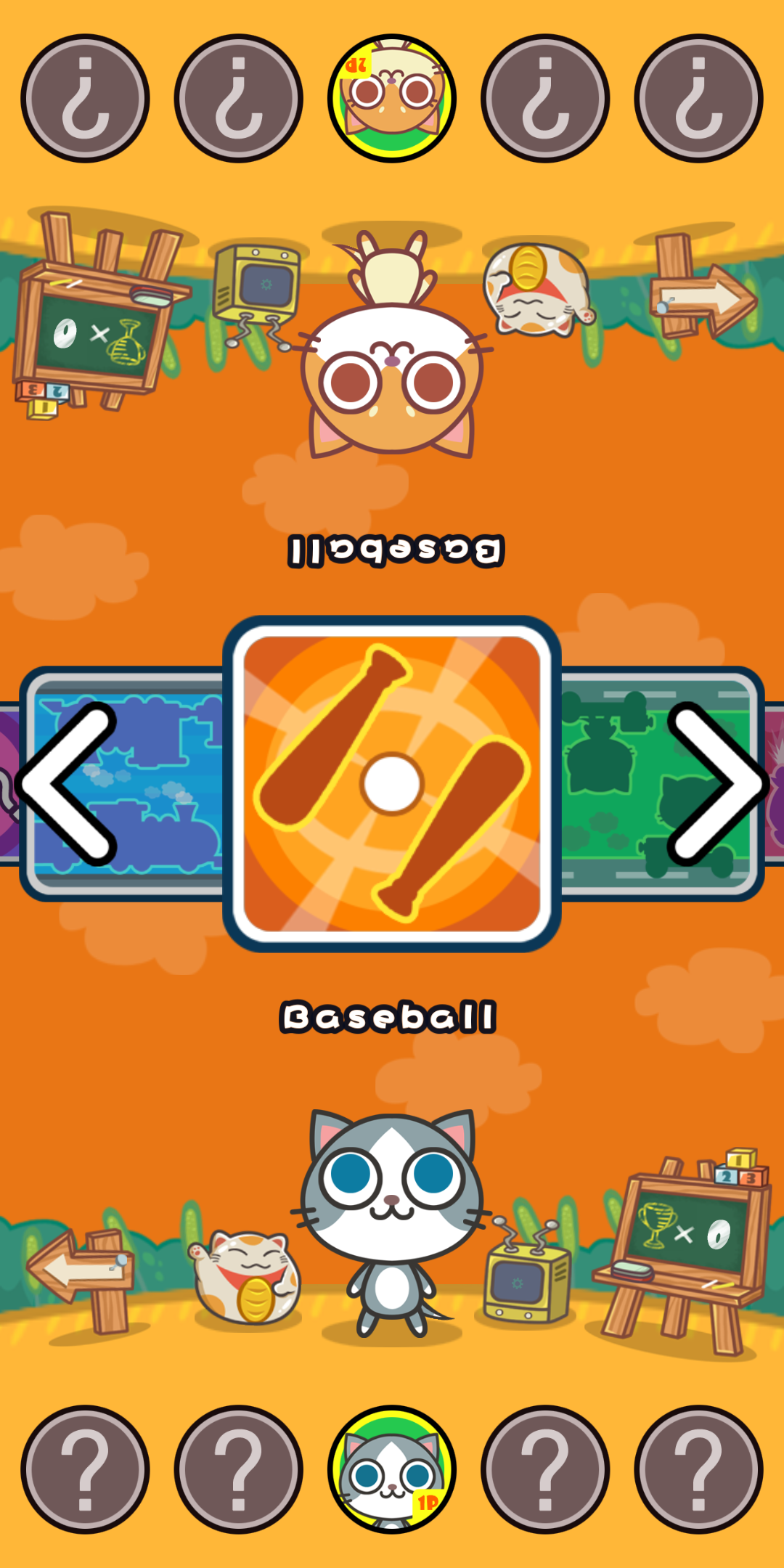
Well my game selector screen was... abstract. It's one thing I regretted designing it but it kinda sticked around for too long and I got no time to remake it (until now). I draw everything on the corners, which are mostly random (but the cats and candles are characters from one of the games.) About that BG, that's a very lazy "no art" BG because I couldn't get my own artist to work more. It's just some primitives spinning and bouncing around! Cats Carnival ones with real arts looked much better. Let's talk about innovation here.
"How to make it work for both sides?"
The game banner have to somehow looks OK from both sides.
The game's name
It's a polish, which you don't realize if you have already seen one. The prototype version of Duel Otters there is no game name displayed, but instead it is displayed in the next screen. Also I gave up how to make the text readable from both sides and simply display 2 texts for each. Cats Carnival copied the same solution.
In BBS2, this is done very stylistically by displaying a series of catchphrases that describe the game.
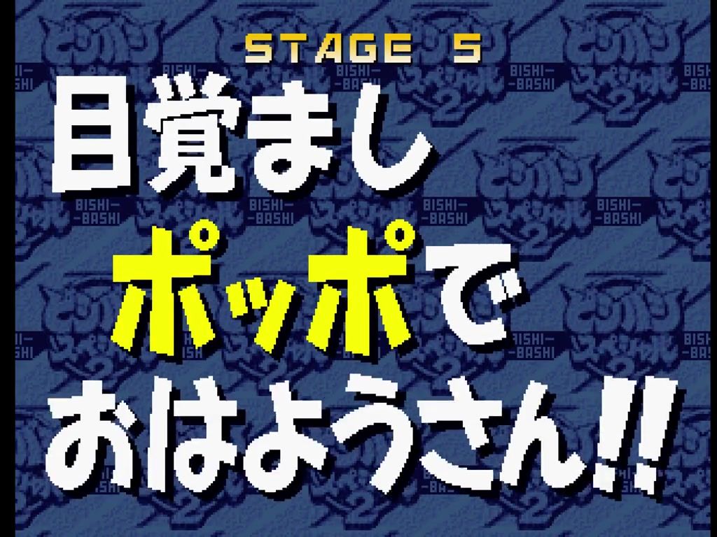
In game selection screen, there is a word that sounds quite puzzling but inviting at the same time on each game's banner.
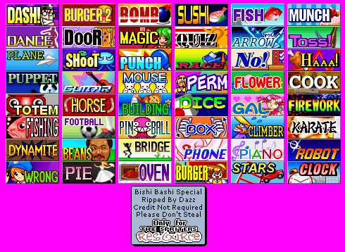
The pros of this is that you are left wondered what would each game looks like inside! I decided to "blatantly" take the "ambigious word" format for the game's name. Who doesn't want to play a game that says "BEANS" with a completely unrelated face?
This is where the "blatant copy" meaning of the devs is starting to get different from players. I value innovations highly, and I am ashamed to copy a feature such as this "ambigious word" polish. While from the player's side, they probably don't even notice where this feature came from, or even acknowledge that this is a feature at all. And to Cats Carnival devs, they changed the game's name around (like my "Pump" to "Fish" which is equally puzzling) but they don't know how this is a "feature" at all. They just see that it works. Here I explained why it works. If they made this game from scratch, maybe they will name the minigame in a different style like "Rapidly tapping" or even no name at all.
A player can identify a Rockman clone, but will they realize that it is not just the 2D platformer aspect or the free-boss-select aspect, but also "slow character progression" is also in the design? The game is gated by stage progression, and when you cannot pass the stage, there is a small amount of things you can do in order to fix that like the permanent life-up, farming for lives, or prepared enough E-tanks, or armor pieces.
Ok we are back. For the game's banner, this requires a new format because this BBS2 design cannot be viewed from the other side. So I have made an icon that looks nice from both side.
One obvious solution to design the icon is to make a mirror, as you can see from the Cats Carnival's design. However in Duel Otters I have tried to make each game's banner non-mirror but still looks OK from both sides as much as possible. As you see the baseball ball, the most obvious "ok from both side" is not necessarily have to be on the center like Cats Carnival's mirror solution, if you get a bit creative.

However Cats Carnival has one invention I liked, it's the Random banner.
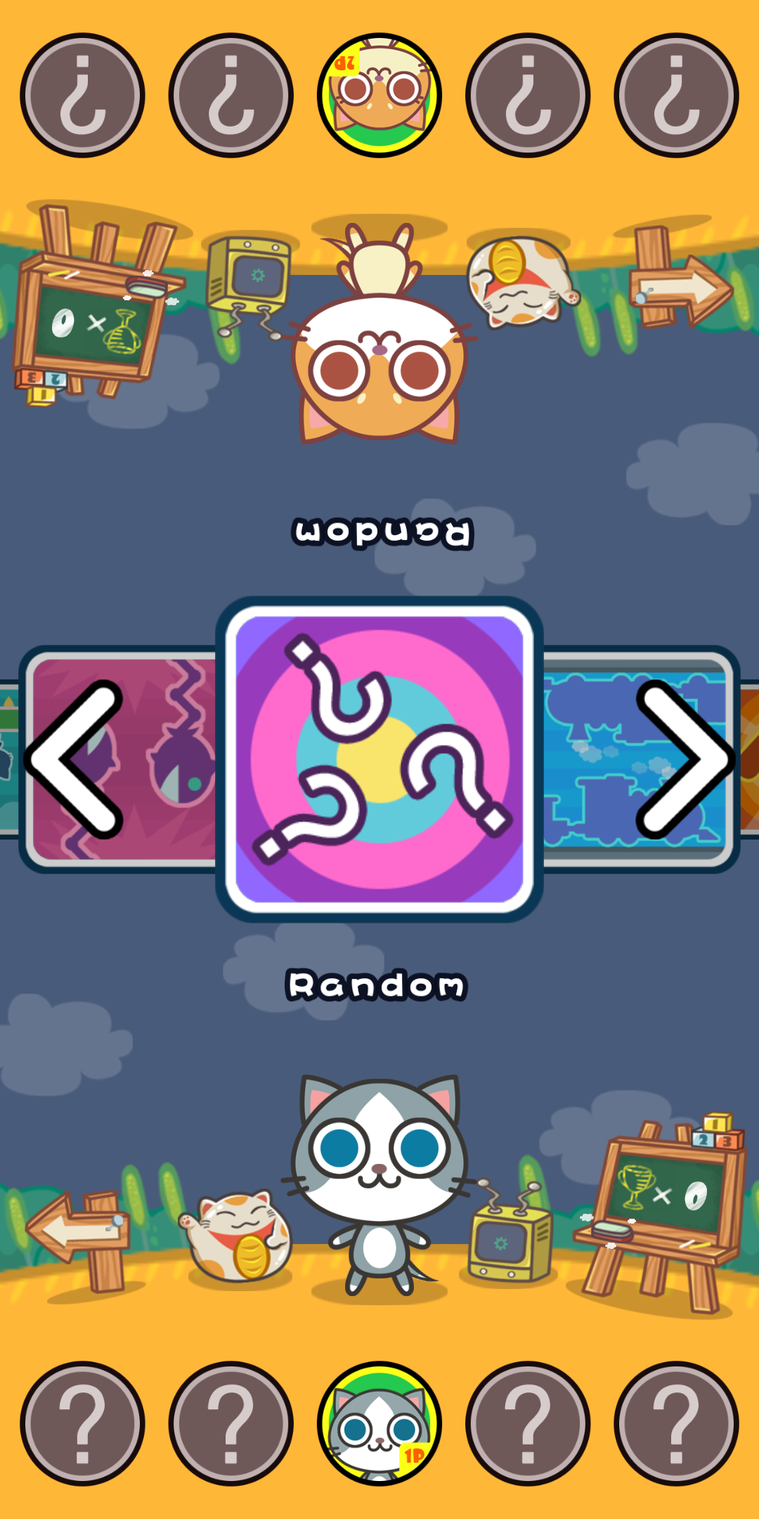

Nice, even the background layered circles is also the same design as me lol. But there is a reason. I decided on that because it is a pattern that says "confusion" that looks great from both sides, and I think it is better than the common "twisted swirl" one might think of by a common sense. Cats Carnival probably copied without knowing this origin, and if they think of this by themselves they may arrive at the "twisted swirl" but that's probably harder to make in Adobe Illustrator.
But their invention is that they made a question mark works for both sides by using only 3 of them in a different angle, to make all of them "non sided" at the same time. My solution was much more lazy, just 2 rows of ? for both sides to read. I appreciate a new invention even if it is on top of a copy, I told you! Credit where the credit is due. HOWEVER MY QUESTION MARKS ARE HAND-DRAWN. You simply can't beat that. (ドヤ)
There are also multiple monetization-tied features on Cats Carnival, which here Duel Otters diverges in approach since I want to keep it a "clean game" in order to become a good household game. You can earn currency by watching ads in Cats Carnival to unlock things. DO 2.0 also have its own currency "Chilli" but they are less in-your-face. The game selector screen will be just selecting games. Unlocking will be in other places.
Cats Carnival have a score counter, but Duel Otters has a match system where you aim for best of 3. We are different here and I appreciated that. You can clear the score anytime in Cats Carnival which I think is a nice touch. Everything are animated really well with cute details like grass being able to move to the wind.
Well I became better at digital art from 2014, in 2.0 I have drawn a new background which also animates. And I have introduced a new polish which allows the games to be shown more on narrower screen, plus your hand will be less likely to be over the banner when choosing. The otters at both sides has a meaning since you can now switch colors without rotating the device.
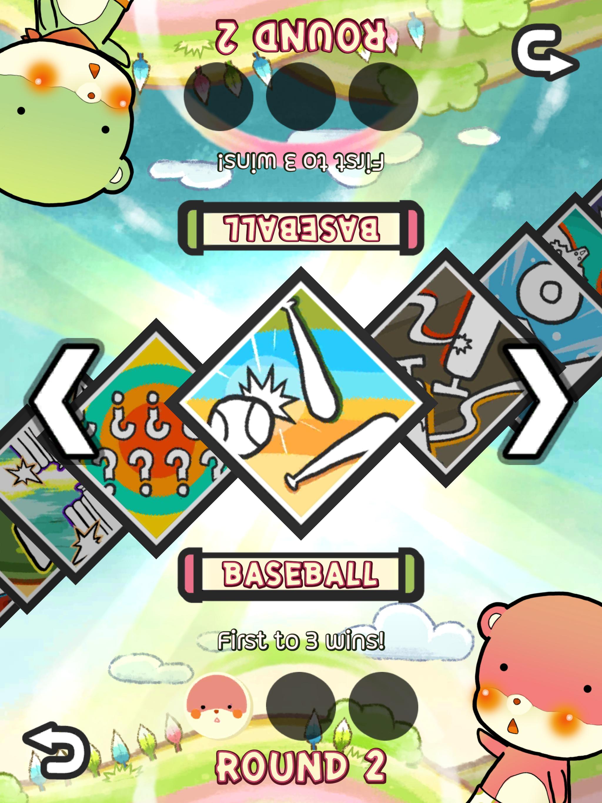
Cats Carnival also copied the drag control, which my former teammate Ben programmed. In this new version I have reworked it in to a better one UX-wise. Please try it when it came out!
Also one thing about Cats Carnival that I thought was the funniest in this screen, is the fact that they used an off-vocal version of Renai Circulation (恋愛サーキュレーション) from Bakemonogatari as a BGM. As a proof, you can hear I showed that in the barcamp stage talk I linked above.
Though that was in 2016, the current 2019 version of Cats Carnival used a new music already so that's good on them! (I wondered if they got sued or not.)
Game presentation screen
Cats Carnival doesn't have this. But I was inspired from "catch phrase" screen in BBS2.
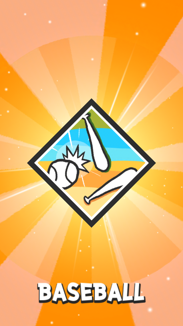

You may think it serves no practical function other than wasting your time, but in 2 player situation when one side picks a game, the other side often wondered "what did you just pick?" so this is the solution to that. It's this game.
Tutorial
This is one of my proudest copied invention because I came up with my own solution deviating almost entirely from Bishi Bashi Special 2, and almost 100% of it was transferred as-is to Cats Carnival. Even non-functional polishes got copied!
In Bishi Bashi Special 2
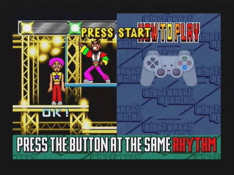
- There is an animated tutorial for each game with button guide, which is very well-made.
- It serves 2 purpose, to teach you, and unexpectedly, it could hype you up for the game. I found the latter benefit fascinating.
- One could skip it quickly, but you must go through it every time. I think it is a correct decision that you must go through it every time. It became an identity.
- However it's difficult to get the game into a simulated state to show how to play like BBS2, being a lazy programmer.
- And even if I could, we have a bigger problem that is how are we supposed to show how to play to both sides separately so each can view at their own pace, or at the same time? When one show how to score for the lower side, it maybe a losing situation from the upper side, for example.
It is getting messy, so I decided to sacrifice some game space for pre-baked image showing how to play in steps with some simple texts. However they take account of difference of the side as well.
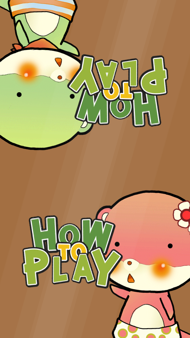
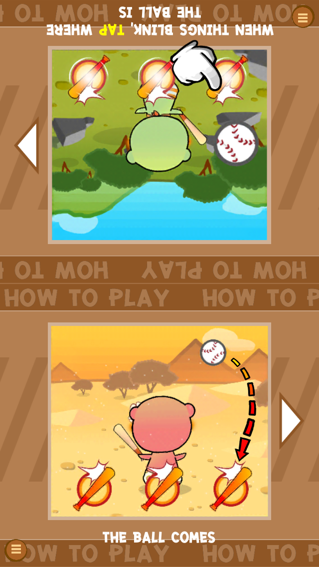
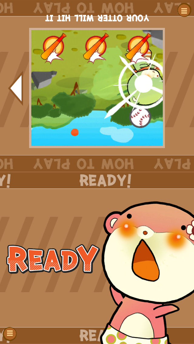
And look at Cats Carnival..!
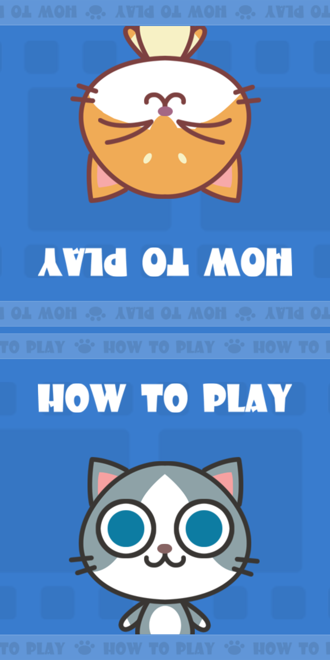
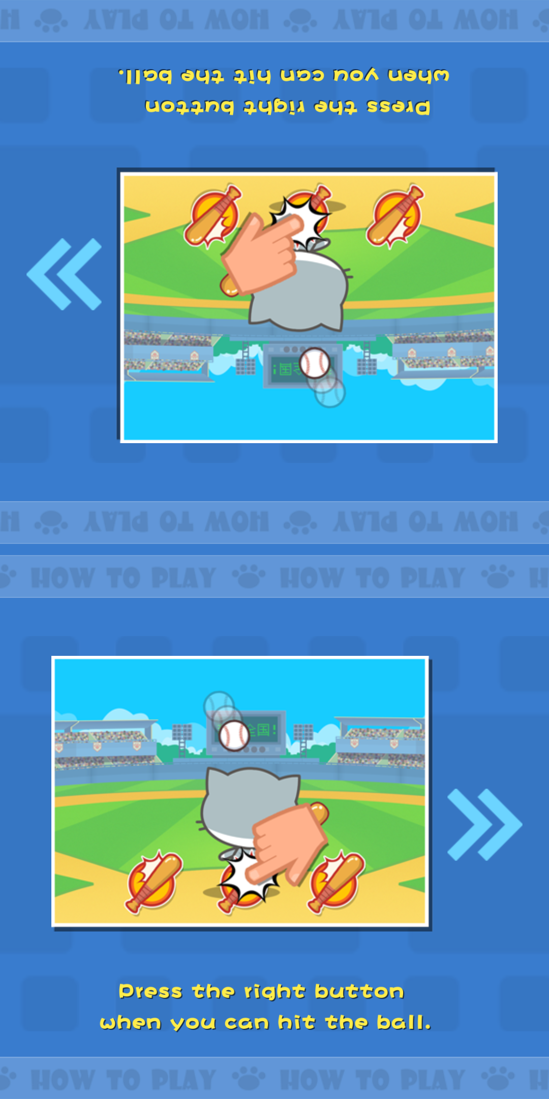
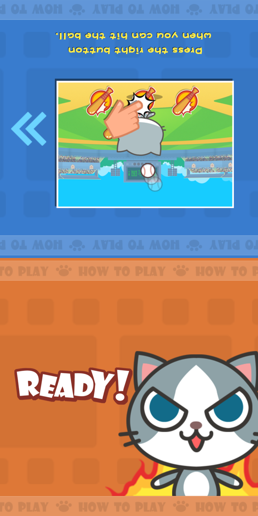
I was smiling the entire time that day I found out about Cats Carnival, and arrived on this screen. (After seeing the Baseball game.. more on that in a moment.) I mean... you can pretend everything else you copied was a coincidence and maybe some kids would believe you, but you are not going to get away with this one.
- The "How To Play" with the character is an artistic choice. It was copied as-is. Thre is no need functionally to have the character show its face here.
- The monochromatic theme of the screen is an artistic choice. It was copied as-is. There is no need functionally for it to not have any other hue of colors.
- How the banner comes in horizontally (as opposed to by any other means, like just appearing or fading in) is an artistic choice. It was copied as-is.
- How there is an animated ">" arrow to indirectly indicate that you must touch to continue is a functional UX-polish. It was copied as is. However I used stepped animation curve as in spirit of Tom and Jerry as explained, while Cats Carnival used a default easing curve. Also your vertical balance is weird Cats Carnival.
- There is a word "Ready" while waiting for the other side to continue. This is a functional UX-polish since BBS2 you viewed the tutorial together side by side sitting and it is easy to tell each other "Are you ready to go?" (also in BBS2 you cannot stop the tutorial flow, since it is animated), where Duel Otters it is difficult for both to coordinate while reading each steps. I decided to make each side disconnected with the wait step at "Ready". It was copied as-is. However they added an exclaimation mark which is nice, however I have no ! simply because it is the same Ready as the next screen's "Ready Go!" and I want to keep ! for the "Go!" while having "Ready" neutral.
- The "Ready" is shaking while waiting for the other side. This is an artistic choice, you can make it stay still, flashing (hard to do programmatically), or pulsing. It was copied as-is. I guess shaking is the best right! Again, Cats Carnival's is smoothly animated while Duel Otters used a deliberate stepped animation.
- The background is scrolling in parallax with the marquee bar that says "How To Play". This is an artistic choice. It was copied as-is. I was the most baffled by this, it is simply not THAT mandatory to copy even the marquee, however I think maybe that was too cool to pass up. Heh! So _my design was cool. Maybe you should use
<marquee>in your next web project too. - The half-screen flash as a response for a touch. This is an artistic choice. It was copied as-is. Though mine is a one-frame flash which looks more responsive than smooth fade Cats Carnival used in my opinion.
- There is a character reappearing after you get to "Ready". This is an artistic choice that may not be obvious to you that you must do this, it could simply be a word "Ready" if you came up with the "Ready" UX by yourself. It was copied as-is.
- How you can tap-skip when it is still "How To Play" to skip to the displayed state of the tutorial is also possible in Cats Carnival. This is a UX-polish. It was copied as is. If you think of this by yourself, it is possible to arrive at an inferior design that skips directly to the "Ready!" phase without seeing the tutorial.
What I appreciated Cats Carnival added on top of plethora of copies :
- The flame on Ready is animated frame-by-frame. Something that take a lot of effort to do so. My otters stays still, however intentionally since I want it to looks funny being "staffed" after animating into the screen. We have a different intent here, good!
- My How To Play animated in pieces, but yours shake instead. I guess you liked my shake animation, which is nice.
- The background changed to orange when "Ready". It is a nice extension on my idea. However I have my own reason, as my background color already differ depending on games.
- Some elements on my tutorial animates, but I guess this is too much effort to copy and hard to maintain in the project because it is kinda has to be custom-made per each games. Cats Carnival's solution is to use something like onion skin trails (like how you can see the shadow of baseball ball coming in) to express movement baked in the image, which works too and is a good solution. I appreciate this invention.
- The scrolling background is a film strip, instead of my pointless slashes. This is going to the theme of Cats Carnival's result screen as well. Very well done details on "world building".
However I must point out what you, as a copycat (pun intended), missed :
- There is a black screen after the tutorial. That is not a loading as everything was already loaded when entering the scene together with the tutorial. The black is a deliberate UX-polish to transition to the game, which I used a black texture on top of the tutorial. If one do not care about this, you ended up like what Cats Carnival currently is, it is easier to cut to the game. That little black screen requires some programming, and potentially some bug fixing when you could touch the game when you are not supposed to. This "intentional black cut" is present on many other screens as well. (And in the screen where that is not present, it is also intentional.) It is one thing I am very proud of. And the music is even cut to silence to match this.
Baseball
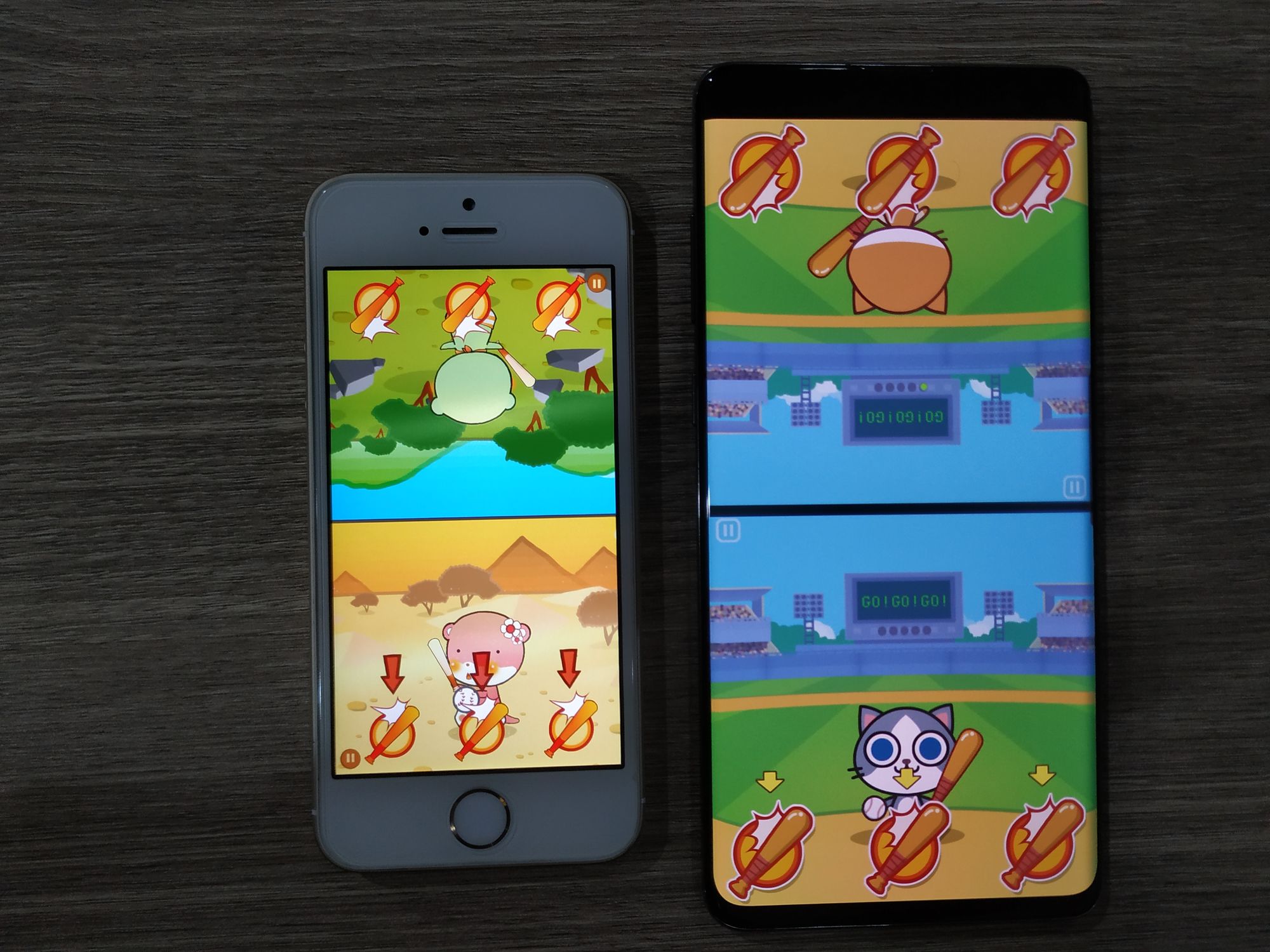
If anything to be the most mad about, it is this Baseball clone. Since it is kinda unique that it solves many problems in upside-down design and free up the idea about doing front view. The gameplay mechanics is simple but I thought up about it for quite sometimes how to convey when and where to hit and what is the best format and presentation of it. It is the arguably the face of Duel Otters. And it is important to me in real life as the catalyst transitioned from my previously badly designed game "Factora" to Duel Otters.
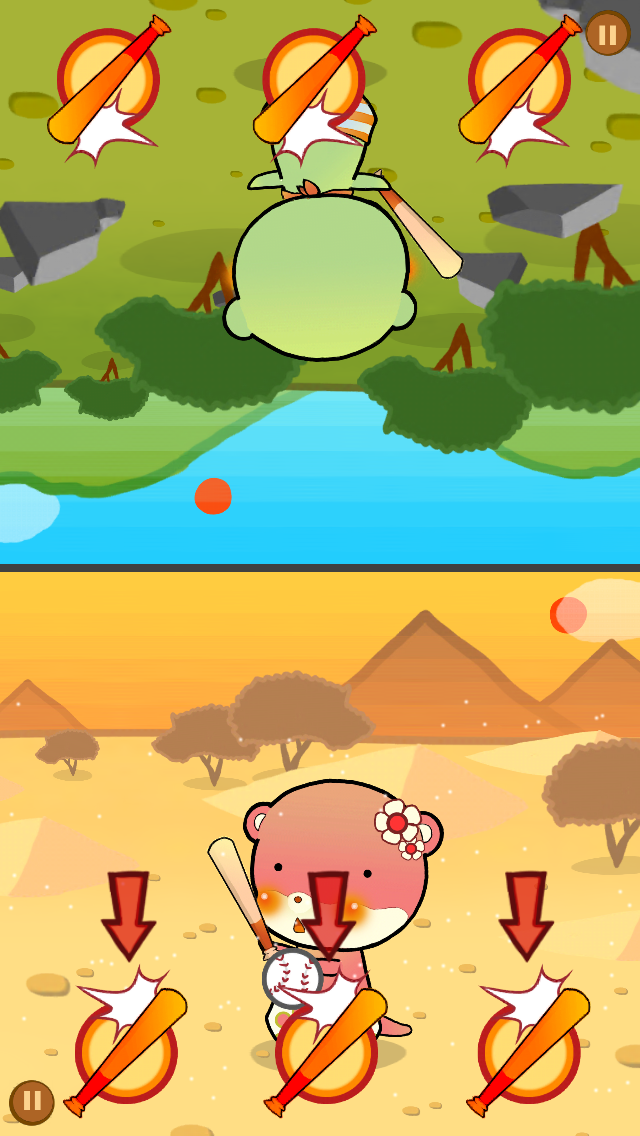
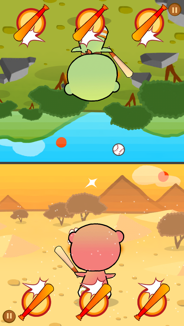
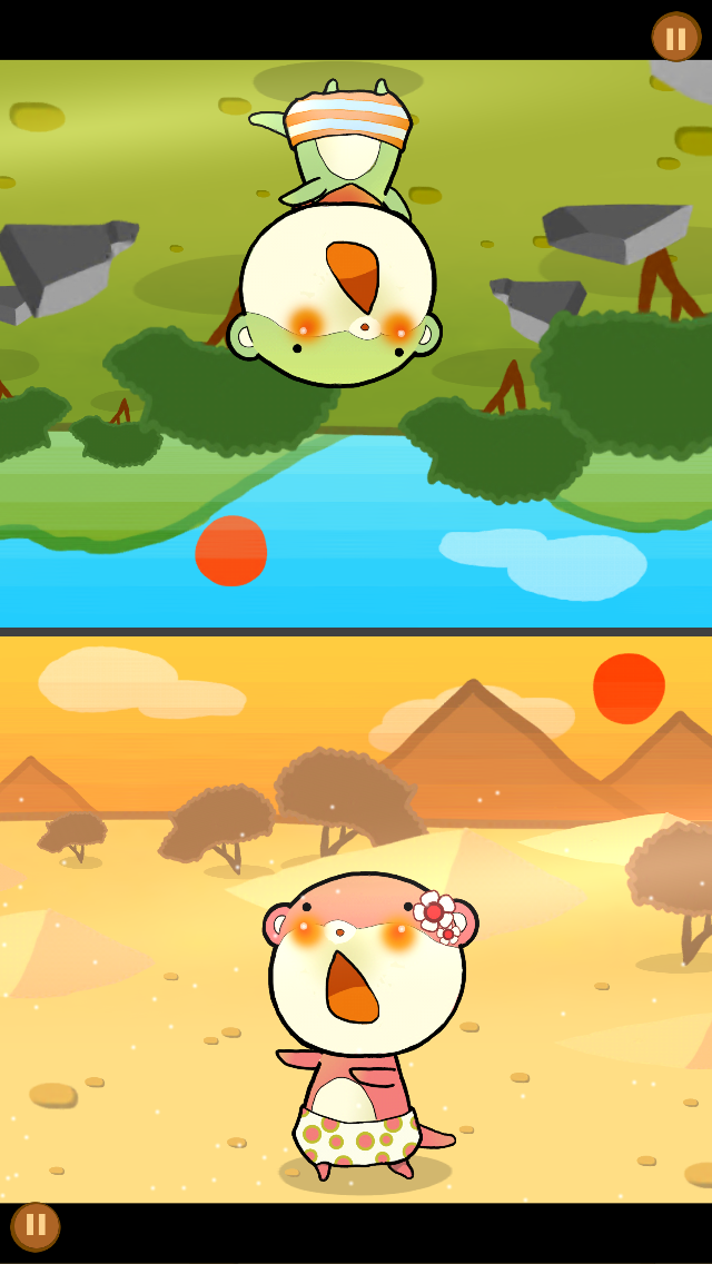
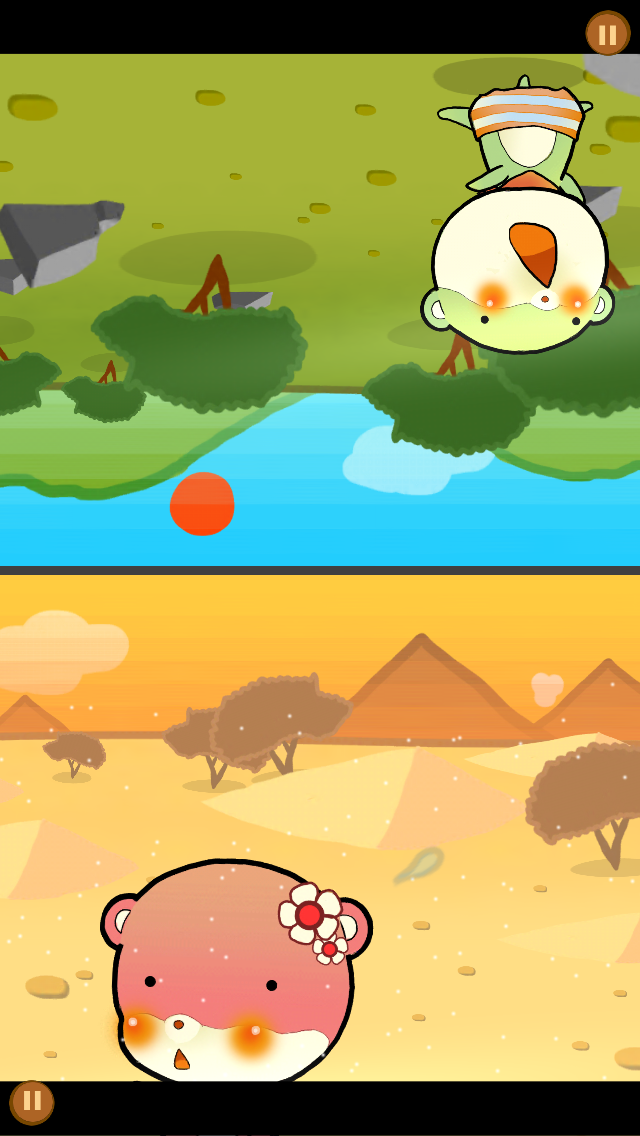
It means a lot to me and frankly, sets a theme for an entire game. This is common in creative design when something small ended up influencing everything else. (A "concept art" is something designed to enables this.)
One story I liked was Overwatch's Wrecking Ball "Lounging" emote. The story is that the animation team did not know how him supposed to move because his personality was still blank. After finishing this animation, they knew they had nailed it and everything else follows! He ended up as this cocky hamster, which do things as he pleased. Everything about him is really summarized in this single emote.
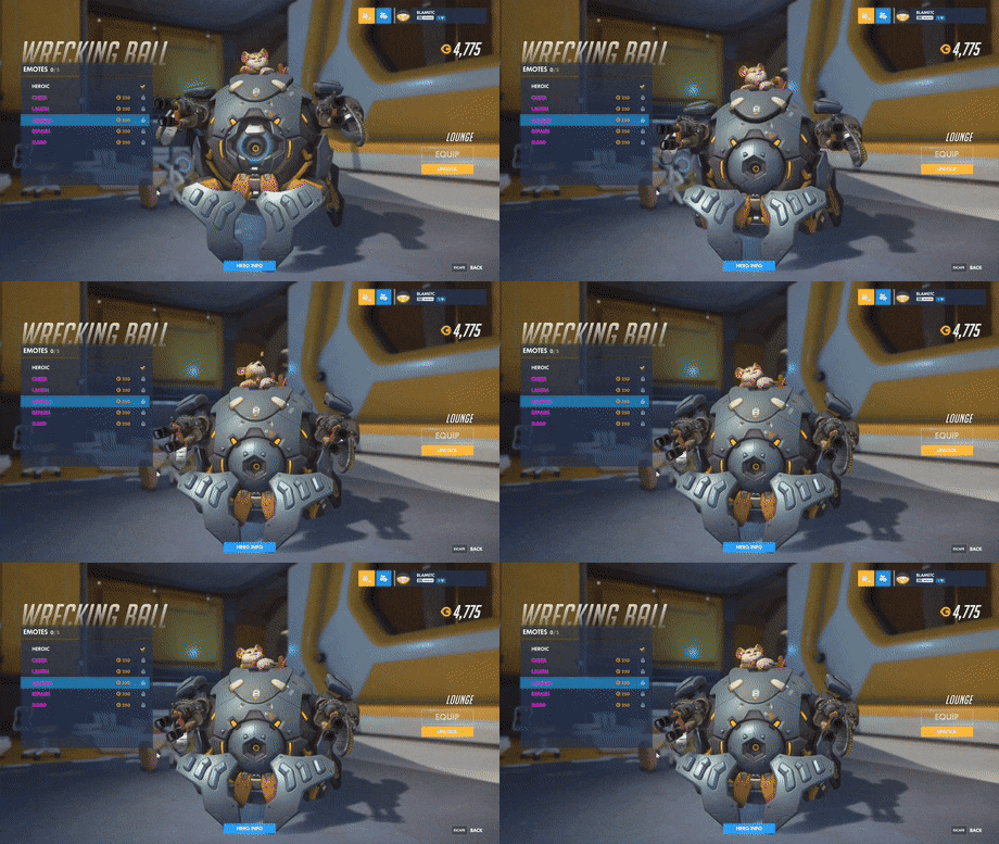
My Baseball game is kinda the same, even down to the "no score number" UX-polish. It all started from this single game. Anyways I am not that mad anymore. Just hope that you realize there is always more than meets the eyes.
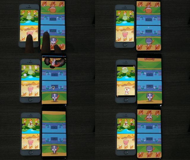
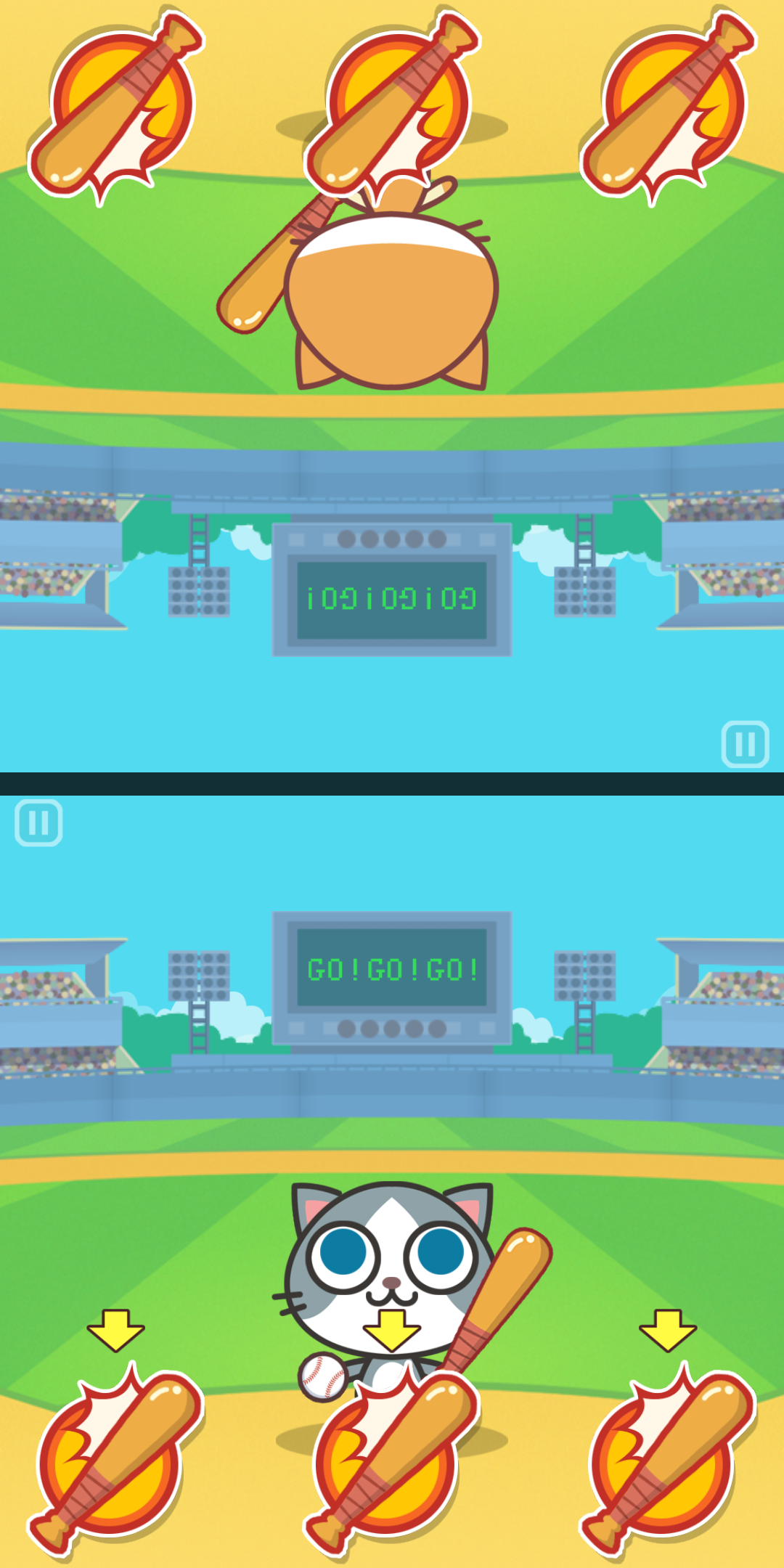
- There is a "game intro" (on every other games too) before Ready Go appears. This is something I came up and decided that every game the camera have to move in from other places or something has to set up for the player to see. BBS2 doesn't have this and I want to make it a new identity. This practice was copied, but Cats Carnival has a different animation so I don't think this bother me that much. (It is simply a camera panning in this game, which I used in my other games too. Maybe the character running into the screen was too hard to copy or they don't have a side view sprite.)
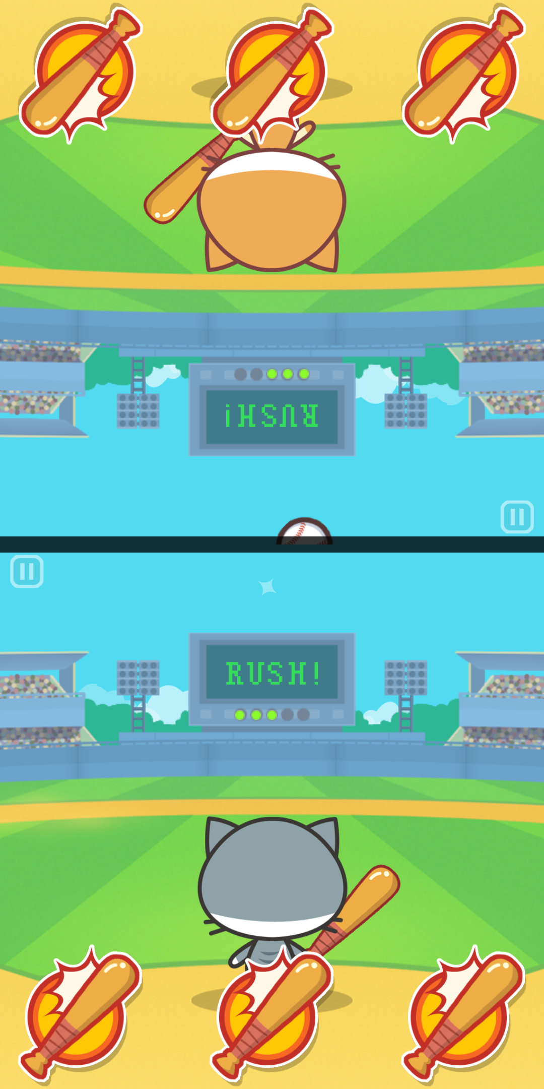
- The baseball bat icon indicating where to touch has the same bat angle, the same hit graphic style at the same corner, and the same color. I get it that red is the color of attention, but you don't have to be this similar to make it work! For example it could be just a bat without that hit effect, you know? I guess my solution is the optimal solution you cannot afford to do any other design? In that case I am pleased! Could I get a new thesis paper about this somehow?
- The "3 arrows" as an indication that the player should take action to serve the ball, is a UX-polish I thought is very cool. If you came up with this game yourself, the ball could be served automatically, or simply coming from the sky in the first place but that's weird I guess. Or you could even make the button flash! Why must it be an arrow? Can you answer? It was copied as-is.
- When the ball is in hitting range, there is a UX-polish that the button flashes when it is guaranteed to be a hit when you press it. It was copied as-is. This time why don't you use arrows? You know you don't have to follow my idea that strictly...
- Anyways, they got lazy and used additive blending of the same sprite for a flash, which cost more performance-wise then my newly made effects-over-button which use the same sprite atlas as the button. I am glad I made something complex enough to cause laziness to copy.
- When the ball is in hitting range, the ball itself also flash as a bonus just in case you didn't see the button flashing. Cats Carnival did the same. My goodness, their "attention to details".
- The ball that goes to the horizon and blinks away is both artistic choice and UX that solves "the top-down problem" at the same time. It was copied as-is. Though, in Cats Carnival the appearing side the ball seems to come from the edge of the screen instead of from the sky which I think it is weird. And also that is harder to react since you got less time to see it coming.
- The character warps to the destination instantly while still looks like they moved there with some help from effects that appears later. For example the diagonal bat slash effect which appears behind the character. I was proud of myself when I could make this looks realistic like the character is hitting the ball somehow, and I guess this solution is too good it was copied as-is.
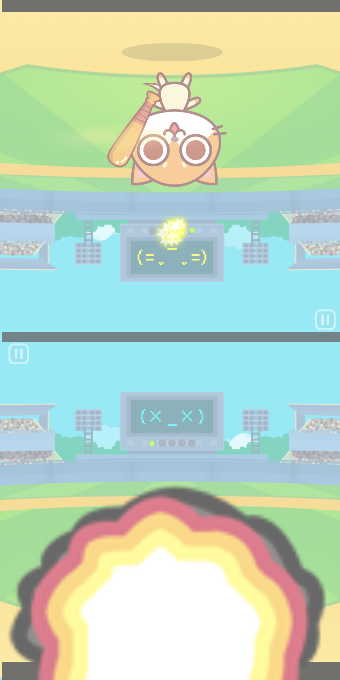
- The bomb somehow has to explode when you missed it. It has no reason other than it is being my artistic choice and my sadistic nature for that Tom and Jerry feel. It was copied as-is. Why the ball must explode? Can't you think of anything else? I guess mine was optimal again? As a bonus, the bomb SFX which now is a character of Duel Otters since every games explodes in some way, was made entirely from a soft synthesizer with noise wave plus some filter automation. There is no pre-made samples involved.
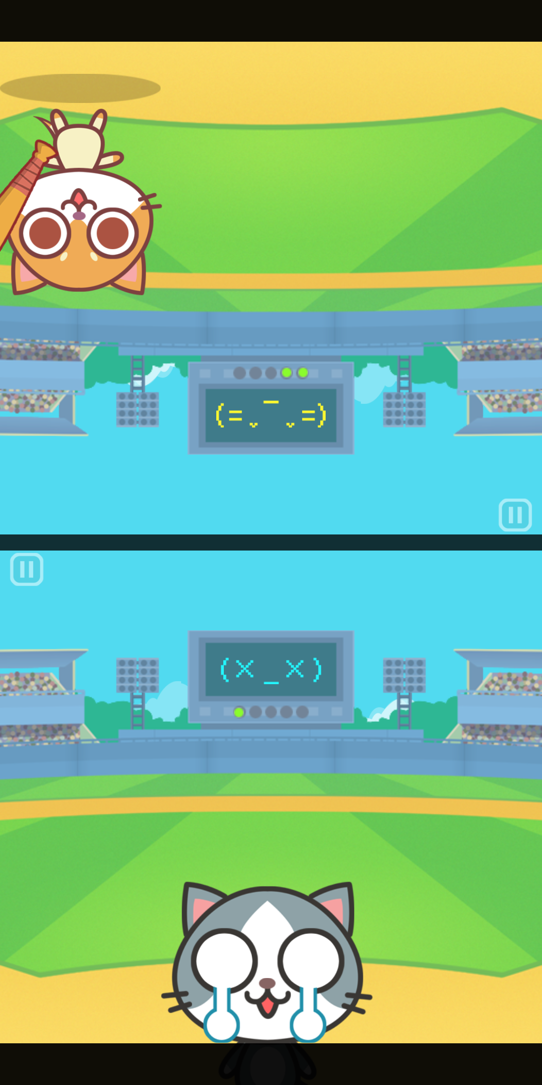
- After the bomb exploded you can simply cut to the new round if you didn't see my polish before, but I added a touch that the character has to go and get the ball. It was copied as-is. Nice idea isn't it? Anyways the cat cry and go to the ball where my otters didn't. You may think you have get ahead of me with this deviation, but it is a design choice that the otters cannot show any sad emotion in order to keep them in-character. They can only act surprised or poker-face. They can't even make a hurted face and simply poker-faced to death. This is by-design and not a bug.
- There is a black letter box as a "cutscene indicator" of sorts when you miss the ball and the character is going to get the ball, which I added it in other games too. Note that I didn't invent this, in many PS1 era games (Notably around the Crash Bandicoot/Spyro times) you moves the black letterbox down and everyone gets it that you don't press buttons and enjoy the show. It was copied as-is. This could be argued as a common sense, but your other original games didn't feature this "flavor" I keep for Duel Otters. This Baseball games feels like it matches my design personality.
- The "white cut" to a new round is a very convenient design which allows you to reset in the white frame. This "round" concept is one of the character in Duel Otters, and is improved in 2.0 to accommodate more kinds of screen sizes. It was partly inspired from BBS2 which doesn't have a round concept, but often use this white flash to indicate something coming up for players to take action. It was copied, but Cats Carnival used a slow white fade instead of a white flash.
- There is a line of wind particle which is an artistic choice. It was also copied lol. (But I think it is instead a scrolling sprite instead of a particle) Of all things, you definitely don't need this wind in your copy! And I have a wind because it's outdoor. Your cats are inside the stadium.
This is probably the most blatant ones and yeah.. if you have a lot of resources I guess you can easily take anything. However there are still nice things you missed :
- The sun-as-score design is degraded to a more normal scoreboard which lights up when you score a ball. Though because the light is circular, it works for both sides. Nice idea.
- The stage is a mirror. My design is not a common sense as in you must play baseball in a baseball arena. Also it is different forcing you to not be lazy in placing things.
- The screen shake when the ball explodes didn't take account of the black letterbox you copied me. You forgot to extend the letterbox beyond the screen to "accommodate" the shake.
- I have an animation that the character facing sideways prepared so the hit looks more realistic, but your facing forward cat when hitting looks funny and works too.
Things I liked in Cats Carnival
- The screen at the back has a cute interaction depending on game's situation.
- I like the word choice RUSH! And it marquees in among other words. This is difficult to do in design as it requires a texture mask. Great design.
- The art is great and not the same as mine. Except the baseball bat icon. lol why
As a bonus to Duel Otters fans, this game's original idea was from my own hardware game I made with my friend Guy/Minikoong, in a hardware class back in university.
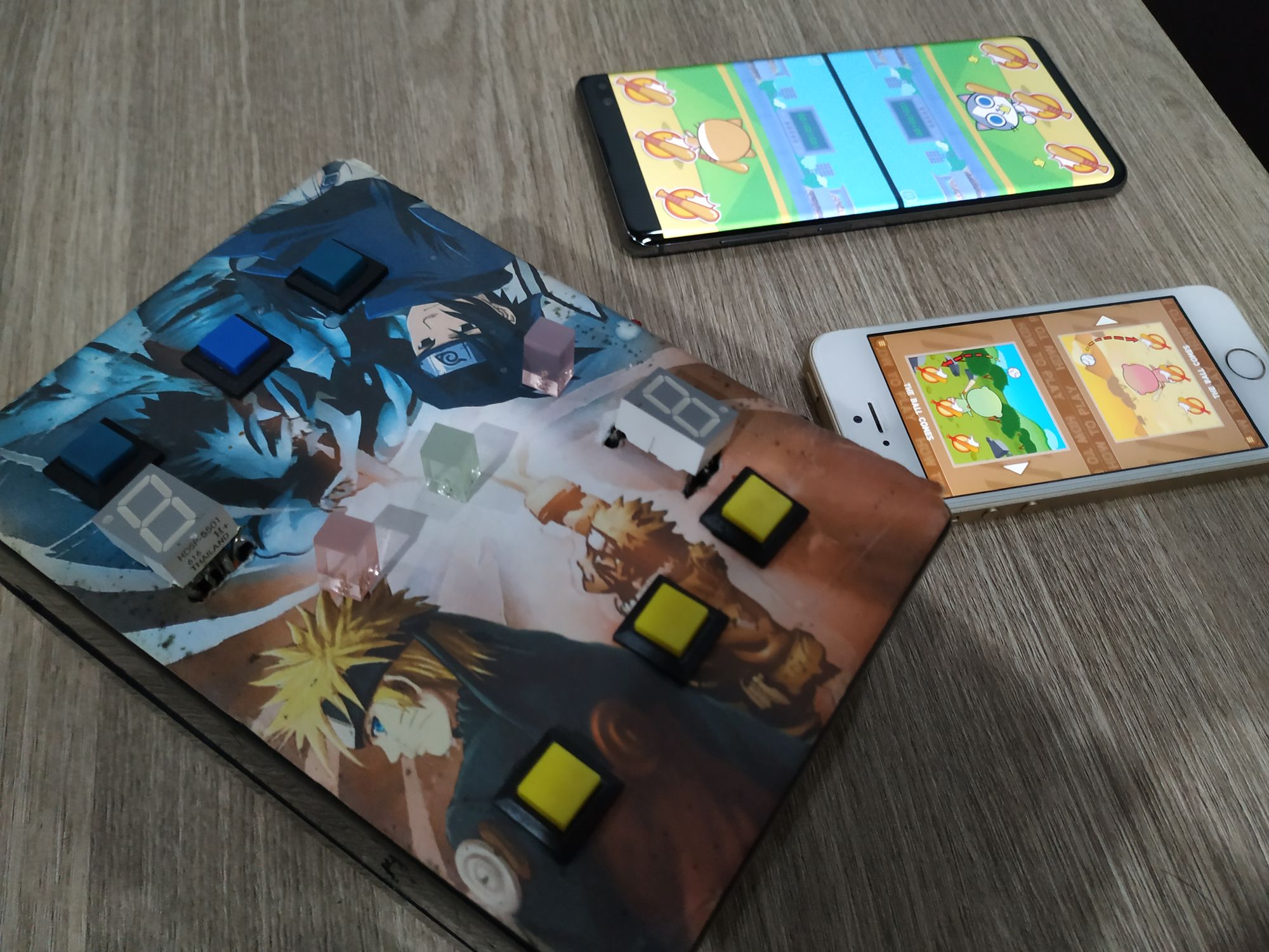
The seven segment lit up to your current HP, and when one of the center LED came up, you press the corresponding button and whoever did it first can reduce the opponent's HP. You see! In everything you copied easily, there are story behind it that you may disrespect or ignored in the process. It's a good idea to learn to appreciate every little things.
Rocket (Duel Otters) / Air Combat (Cats Carnival)
Here's an another game I think is quite unique, but the idea is 50% from multiple games of Bishi Bashi Special 2. Though I forgot which games I assembled the idea from, there are some games that you are required to assemble pieces according to shadow. In Rocket, it is simplified so you just press "wrong" until it is right. So I give half of the credit to BBS2.
And yeah, Cats Carnival copied this. You own BBS2 the idea now too! We are both idea criminal now!
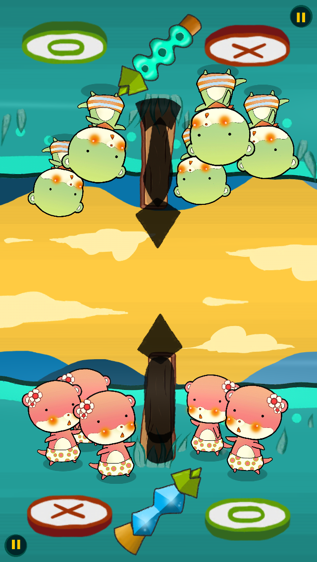
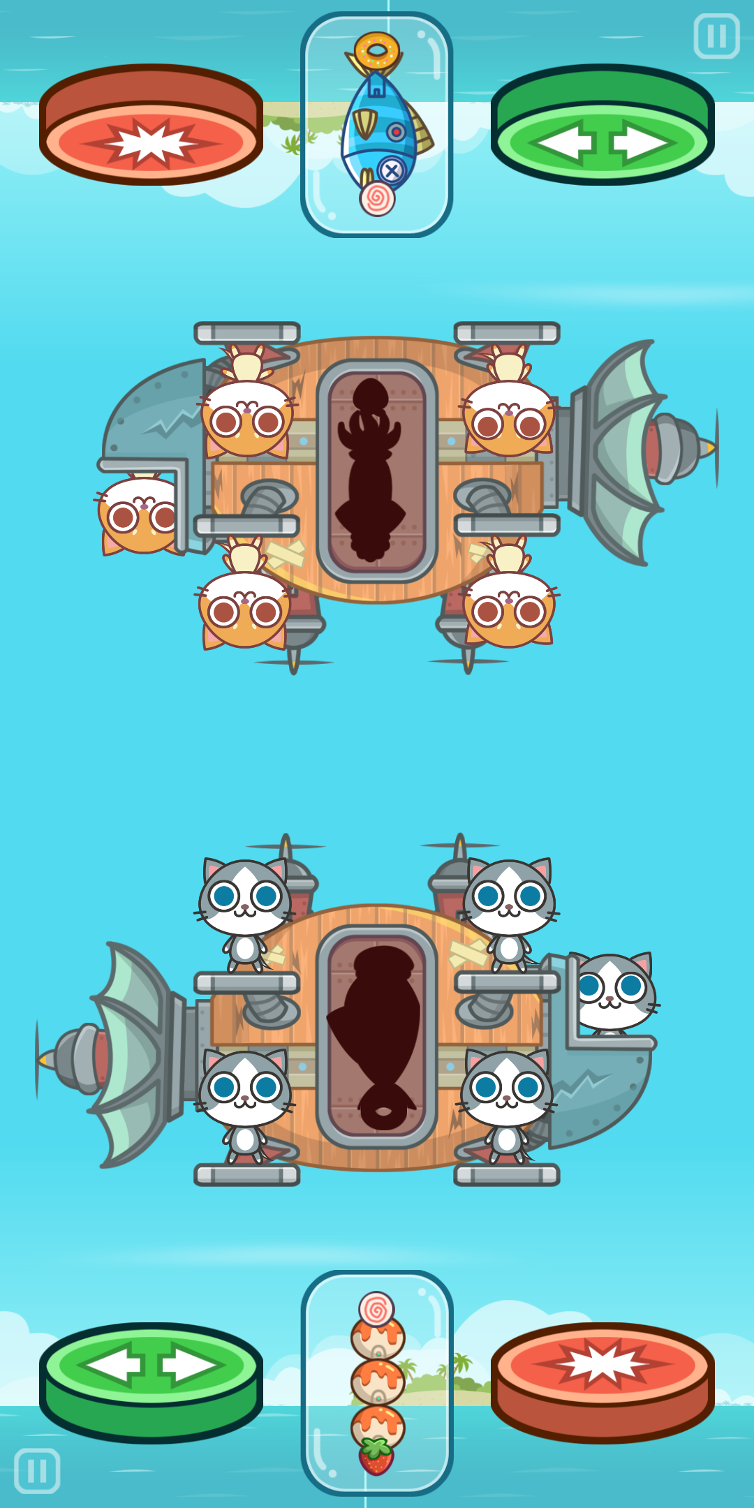
- You stole the "weird shit as-a-rocket" idea. If you came up with this game by yourself, it could be a different rocket-looking parts. But props to take this idea further to food, seems like the rocket is made entirely of food. I simply ran out of ideas and use random shapes. It's my lose!
- Character number as-a-score idea was copied. So this is also the solution to the upside-down understandable score problem. And also the number is 5. You know, 4 could also work too. Why not try it and explain why 5 is more optimal than 4? Anyways, my reason for 5 is that it is an odd number, and I could place it on both sides of the rocket in an unbalanced way and it looks great. 3 and 7 are too low and too high respectively.
- There is a word that says "Nice!" when you hit a correct one but in Cats Carnival it says "Cool". It is an artistic choice, you don't have to copy it or simply display some effect that is not a readable words, you know? The origin of this effect is because I am a music gamer and I am a sucker for a readable "Perfect !!" popping up when I am doing perfect. Not really required for this kind of game as there is no timing that require a feedback. Now that you know the origin, at least you have copied a part of me into your game now. I am going to use my lingering spirit to curse your game next. (just kidding)
Things I liked in Cats Carnival :
- The theme is very creative. Mine was pointless, random ugly rocket shooting from a mysterious wood board which has nothing to do with the rocket. Yours are more cool, practical, airship fight. I really like your idea.
- The art is beautiful. Rocket parts looks cool. The ocean is great with island. Most importantly the airship is very detailed and nicely animated. Mine was lazy.
- The intro is not just a camera zoom but the airships are actually flying in.
- Yours has the pilot as a reason for the odd number of lives, so I think your design is also clever.
- The color of button is inverted and works too because you changed the meaning to switch and fire, instead of wrong and right. This is a very good deviation work. The "fire" translates nicely to the color red, and it goes well with the graphics. This is how you copy things folks! Don't do it mindlessly like the Baseball one!
There is a single pixel of seams on the sea that prevents it to be endlessly scrollable but yep that's just a small mistake and still tons better than my pointless grass field with a woodboard. One disappointment is that the airship didn't fall down when all the cats are out, so that cat at the head is not the pilot after all??
Frog (Duel Otters) / Butterfly (Cats Carnival)
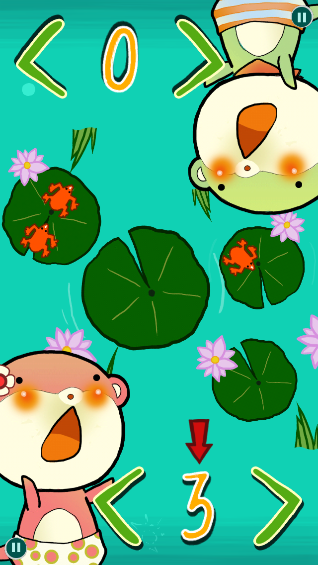
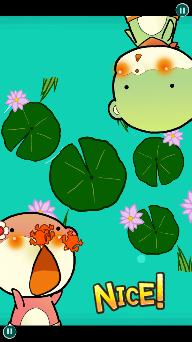
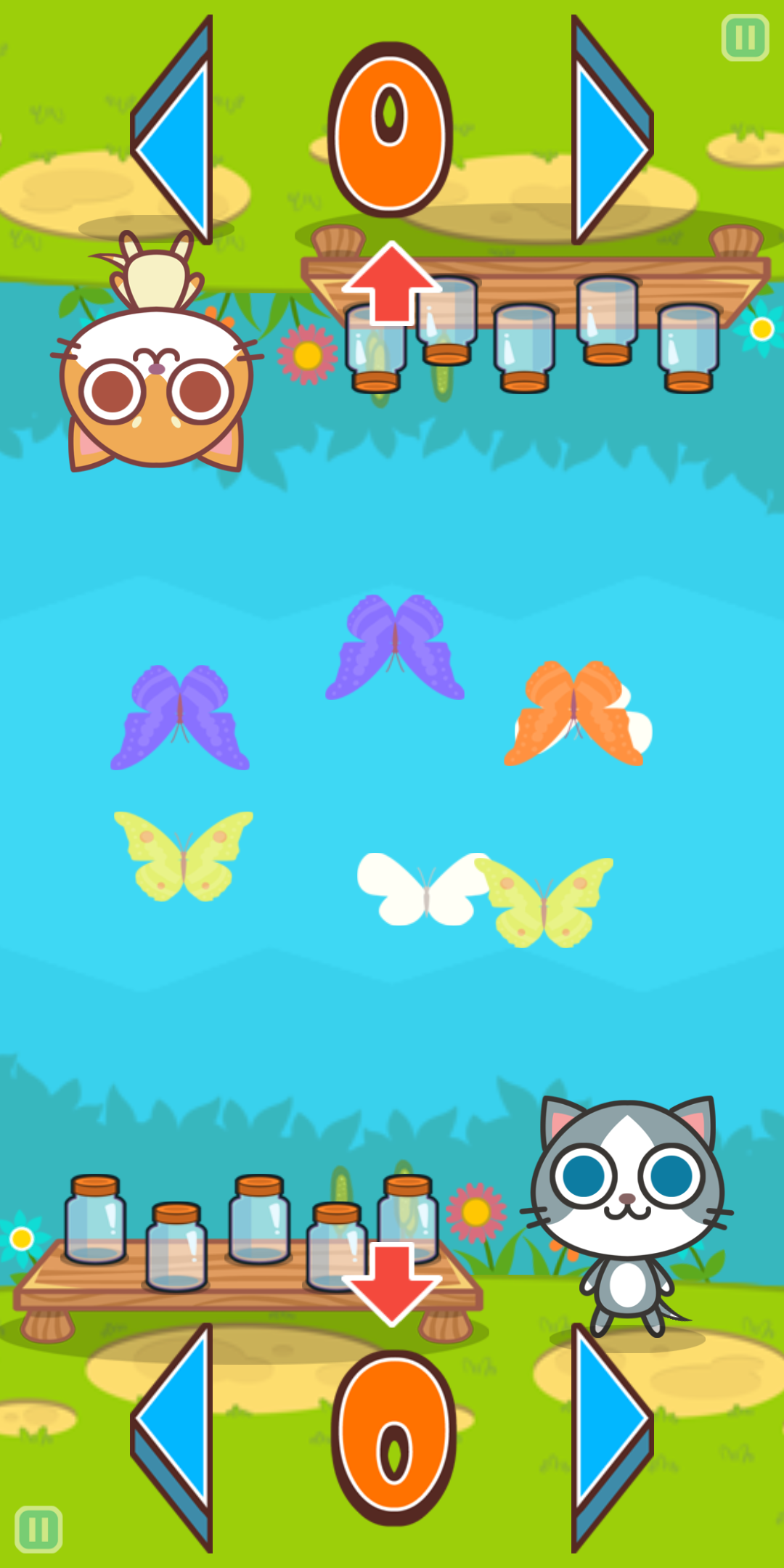
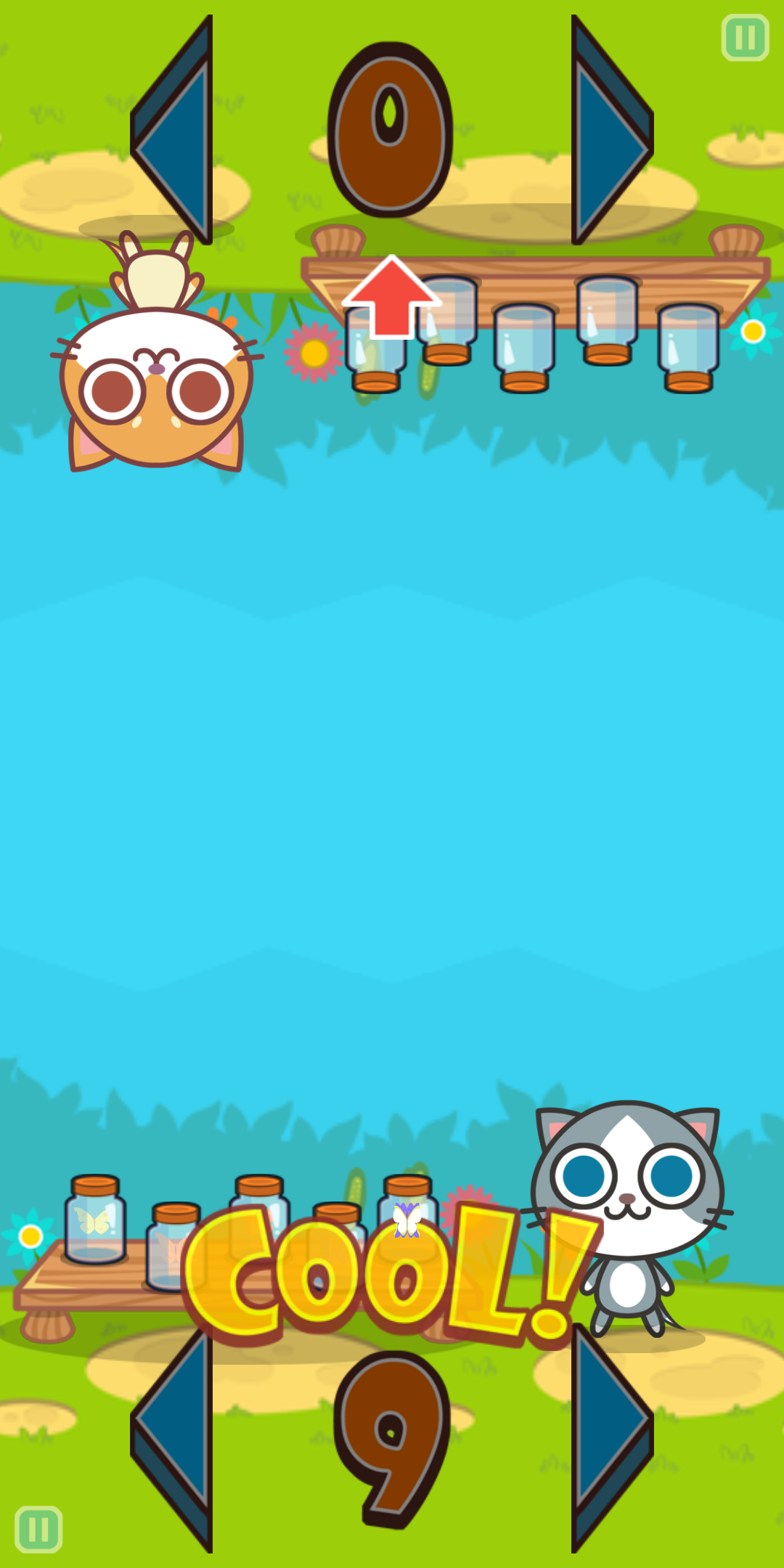
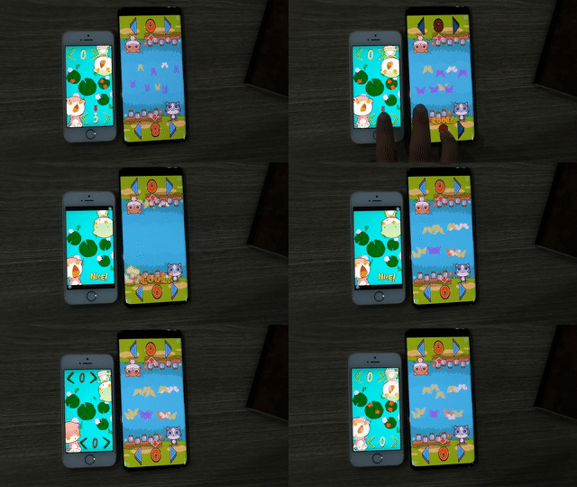
You press the arrow until the number match and tap the number.
- There is a "take action arrow" polish the same as Baseball game, when you left it idle for too long. This is to remind the player that the number is actually a button. Without it, I found that the player try to tap the character to confirm the choice. And so this is a polish that comes with experimentation and testing, which Cats Carnival probably easily copied without knowing. I take the beta version to a trip with my friends to realize this. (I am a bit mad that you could enjoy your trip without working on a game and get this same polish as me.)
- Again, mine displays Nice! but you displayed Cool!. You have again take my music gamer spirit into your game without knowing. Prepare to be cursed. Also Cool is an actual name of highest judgement in a game Pop'n Music.
- The greyed out button polish is there in Cats Carnival too.
- The idea of multiple things zooming together to one point after you score a correct answer is the same. If you thought up about this game from scratch, there are many more approaches to take. Such as the game could be independently played so each side collect their own color of butterflies without taking from a "central stack", but some butterflies could overlap and create confusion, or maybe you don't need the
< >button but a draggable handle to aim for the right number, then release-to-commit so you don't need a commit button. That could work as well! But once you copied, your idea has been clouded by my< N >layout and my gathering frogs of doom. Your poor butterflies could do nothing now but gather to a single point.
What we are different :
- Your art is insane as usual.
- Nice, and kids friendly theme. Yours have butterflies innocently go into a jar, while my otters literally eat the frogs. I guess by making something eccentric enough it could became an idea DRM because you have to got some amount of guts to copy it... anyways, canonically these otters like to eat chilli more and eat frogs only when they got no chilli.
- I thought I was evil when I allowed the frogs to overlap, but your butterflies moves! I like this hardcore-ness that is hidden in your design. Also the number could go over 10.
- The scoring is different, the first to win 5 rounds of Butterfly wins the match, while mine is counting from the total number of eaten frogs and a fixed number of rounds. Mine could have an interesting catch up scenario and less impact is on the first few rounds.
- Nice "top-down solution". My Frog game is top-down because I thought the lotus leaves will look great. Yours used "somehow upside down world" solution I myself used in some other games. But I like your creative theme you came up with the butterflies and the jar.
- The butterfly flies into the screen instead of my lazy flashing. I guess it is hard to make the frogs jump into the screen. I wish I choose a dragonfly or something but that's not looking edible.
- However MY ARROWS AND NUMBERS ARE HAND-DRAWN! You simply can't beat that I told you!
- That's not all, MY L AND R ARROWS AREN'T A MIRROR OF EACH OTHER! The drop shadow are different and super realistic, it wouldn't work when mirrored! However I am surprised by your solution too, your arrows are a mirror but has a perspective that allows a mirror. Good design.
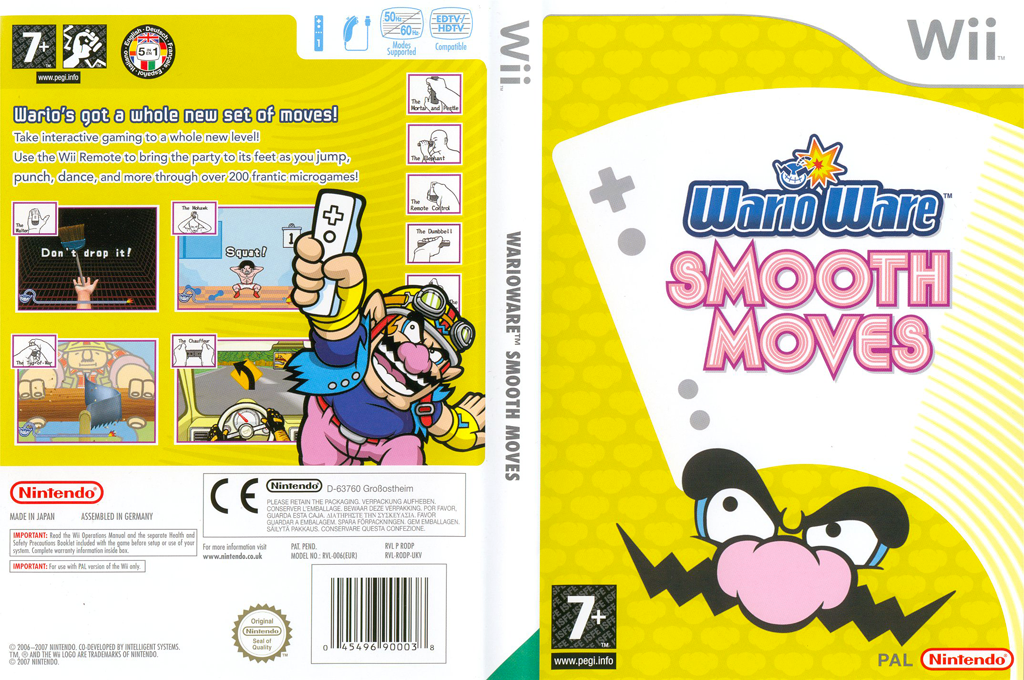
However Cats Carnival devs, I am sorry to tell you this is not 100% my idea. It's from my distant memory from Wario Wares micro-games. I forgot which one but maybe the Smooth Moves on the Wii. There is a game which you must tap button to count something in a limited time. And I remembered it is a frog too, so I kind of feel bad about this. Turns out Cats Carnival's deviation can get away from the original idea a bit more than mine. And one more thing, Ashley-sama is forever the waifu.
Chilli (Duel Otters) / Hamburg (Cats Carnival)
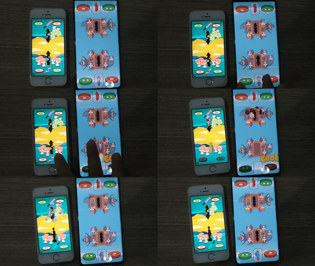
I got lazy to take screenshots and move files so let me just take a screenshot from the actual phones.
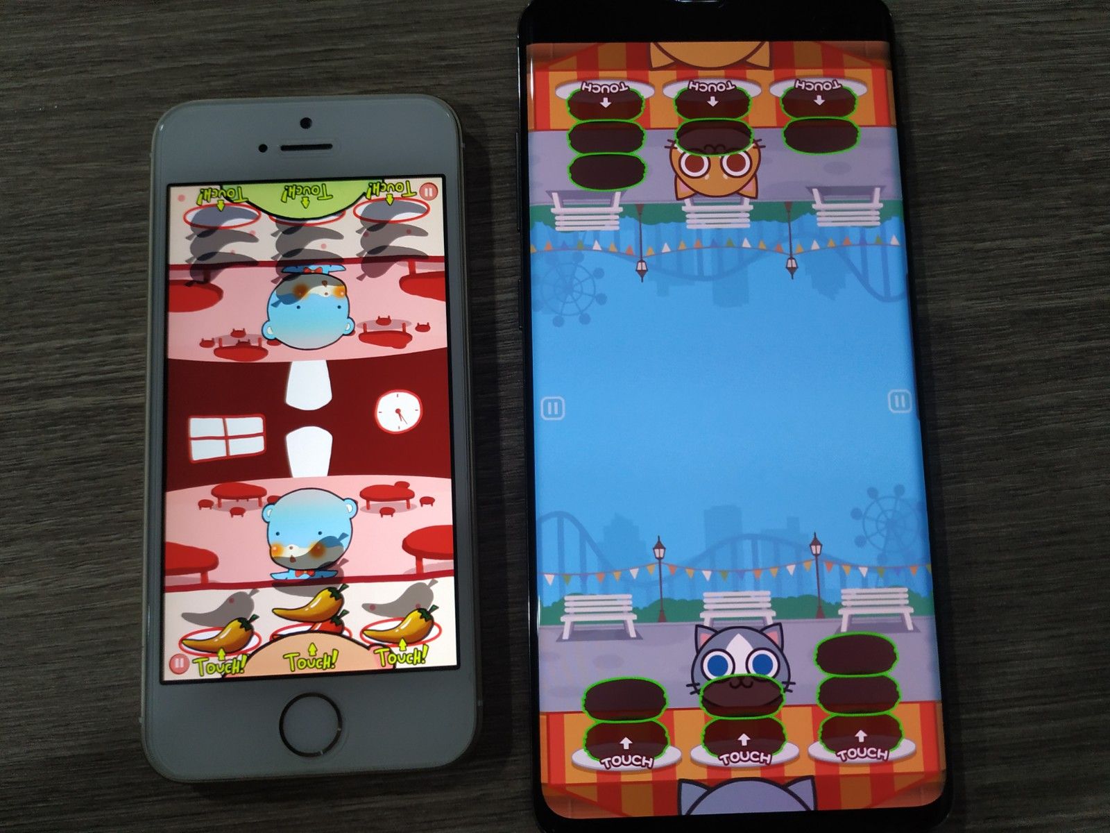
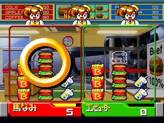
Revelation : this game was blatantly copied from BBS2. I first designed as a pieces of hamburger parts falling down (an idea from an another BBS2 minigame where you move your left and right hand to get a good hamburger, very fun game.) But got lazy and change them all to chilli. I have no right to analyze the difference in mechanics between us, because we are both idea criminals now. Sorry Konami...
However I made my own artistic take personally, which Cats Carnival never fails to copy :
- There is a word "Touch!" under where you should touch, and Cats Carnival did the same. WHY you have to add the exact same word as me? It could be "Press" or "Push" or "Tap". Why don't you add the "Touch!" to the Baseball game too? Why don't you position the arrow above instead of below? UX-wise above is the better choice since the hand is not occluding. Is it really mandatory that it must be the same as Duel Otters on every damn thing?? (Or maybe your boss briefed you to copy as close as possible or you will be fired, in that case I feel for you but I still blame you for "such a lack of imagination".)
FYI, BBS2 has 3 rows because the original arcade edition featured 3 push buttons. That's why it is not required to say anything since it matches with the machine.
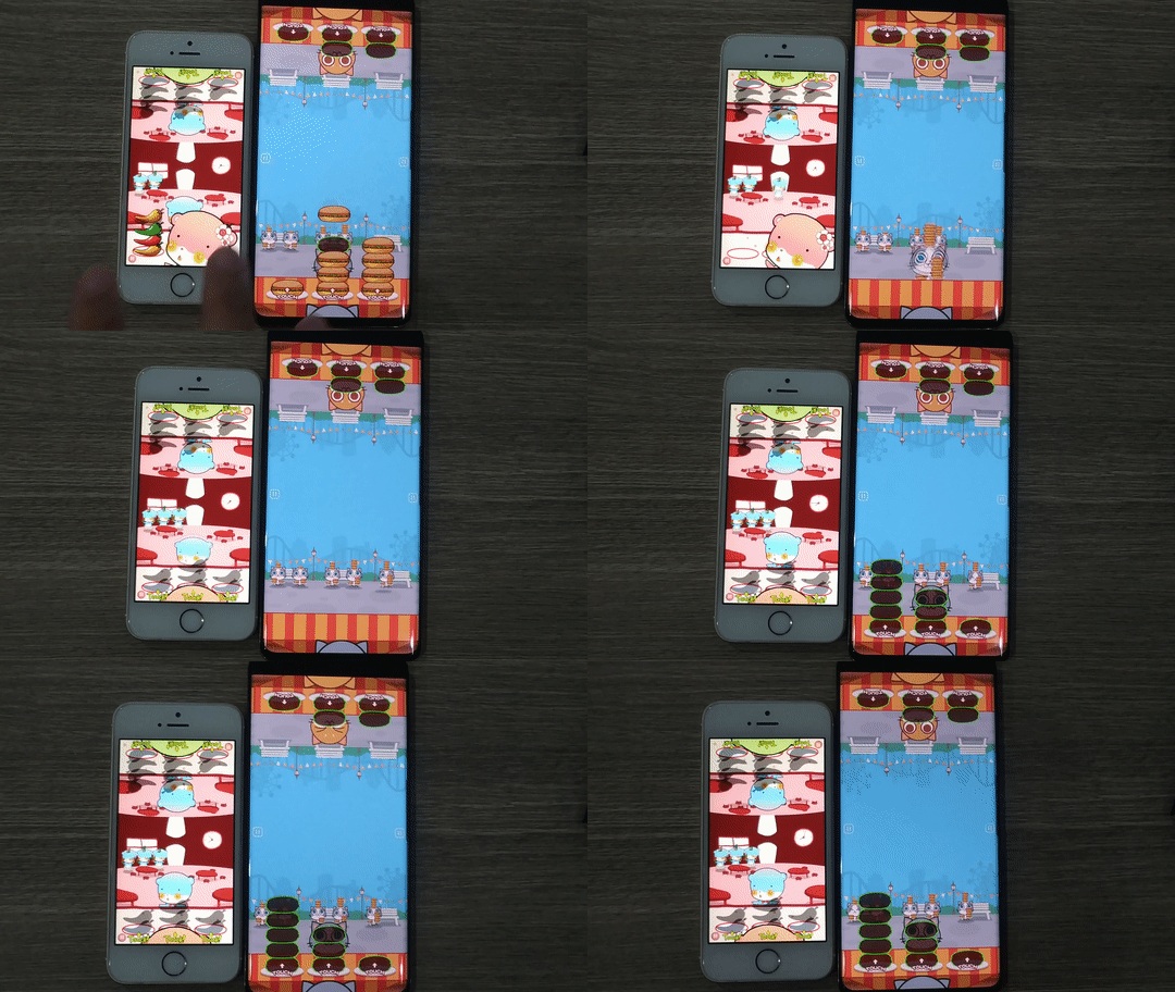
- There is an artistic animation choice where the customer is waiting for you in a front-view perspective. This maybe a common sense for a game about serving food. But that's not all! My creative mind thought that the pattern you made should be transitioned onto the customer for no actual benefit as you are not required to remember past patterns at all (admittedly I don't know where to place the center column, so it goes to the head. It's kinda cute.), and then that customer moves to the back, to act as a score indicator without number at the same time.
You see this design actually results in UX improvement as well as looking cooler that just displaying a score.
Of course, Cats Carnival copied this with amazing effort to get everything exactly the same. The center column also goes to the head! What a nice idea right? Except that they got chairs and the cat bounce to the back, but mine is just cheering from behind for no reason. I guess you win this one? lol.
Anyways, even though this polish is my idea, the one who programmed this painful pattern transitioning visual and along with this entire game, was Boat/Seniel, my former team members. At first I think the transition maybe hard to program so it could just appear on the customer (and so I could make an invisible stack waiting on the customer object, which turn on at the same time the main stack goes invisible), but he still programmed the transition for me. (thanks!) So in addition to me, you have to apologize to Boat now. - I did the art but I think as always your artist is better than my 10-years old like drawings.
- I just noticed that there is a different intro theme depending on games. This is a really nice touch. However the song when playing is the same. I reused songs too, but mine has a seamless intro that didn't repeat and a victory music to match! Want to know how I did it? Here! I will forgive you if you get it.
- PS. The thing in your game is called a Hamburger and not Hamburg.
This game is renamed to "Restaurant" in the new 2.0 version.
Pump (Duel Otters) / Fish (Cats Carnival)
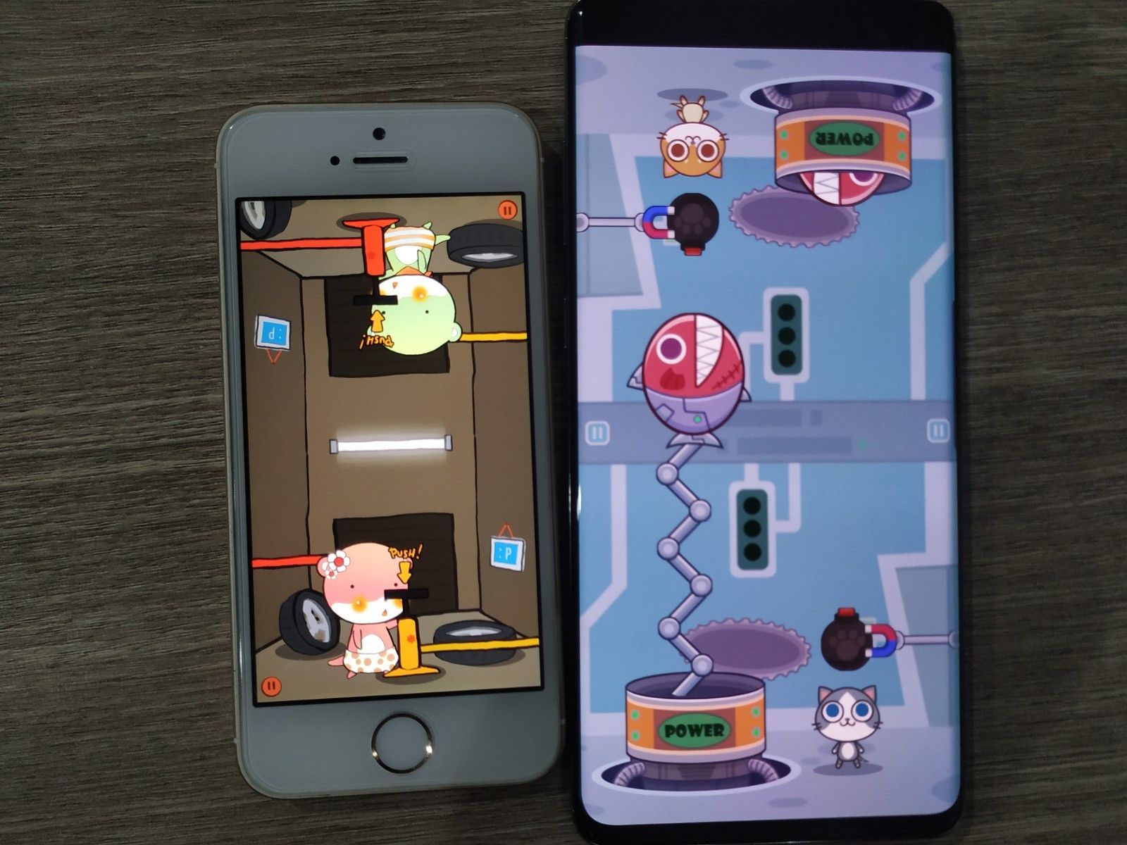
Since ancient times we human compete for everything, and I thought the most barebone form of that is not hunting a mammoth, but rather a contest who could tap at the highest frequency. Therefore I think no one owns this idea and it became which dev could make the visual more interesting for this stupid competitive game. (In Monster Hunter World you do arm wrestling or dip your head under hot spring, for example.)
In my game it pumps air which expands the opponent until it explodes (I told you everything must explode in my game in spirit of Tom and Jerry). Cats Carnival did a very likable things this time. The fish will go up to ignite the bomb, at the same time linking 2 sides of weirdly upside-down room idea they also copied me. However you play in 3 rounds in Cats Carnival. I decided this to be the fastest game possible to quickly settle something with your friend, so mine is played in only a single round with no score counting at the end. You just win or lose. (Several games in Duel Otters are in this "no score" mode, where in Cats Carnival all games seems to feature a score.)
Hockey (Duel Otters) / Space Craft (Cats Carnival)
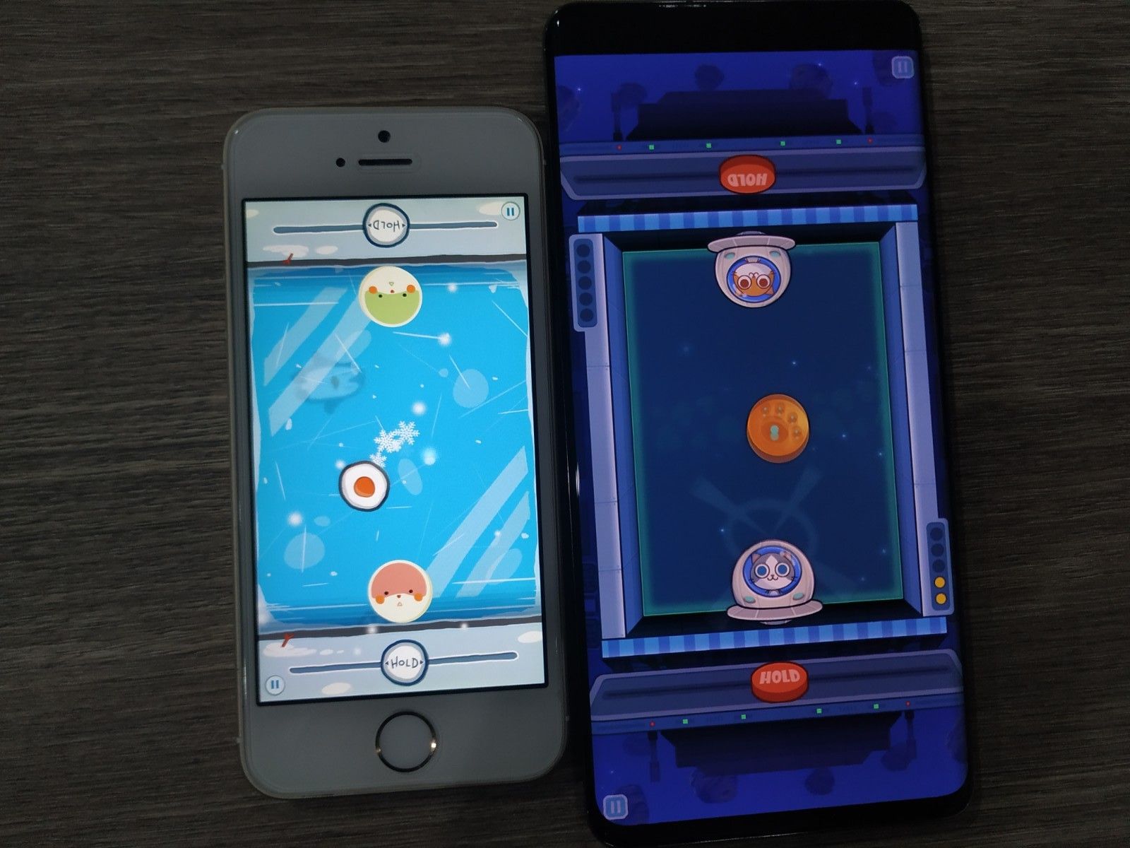
This is one of the most obvious idea when one talked about "top-down game played on the same screen". Just search the app store and see countless air hockies.. So I think it is normal that Cats Carnival could also accidentally arrives at the same idea. And also this game is in Bishi Bashi Special 2 too with the same space theme as Cats Carnival. I wondered if they tried to copy me and accidentally arrived closer to the original? Also the hit effect when the ball clashes looks similar to mine, but more lazy animation-wise.
Also Cats Carnival's button also says "HOLD". Submit to my superior English again huh! But they got a delicious perspective going on so that get my praise.
Mine is referring to "Air Hockey", but themed after an actual ice hockey. Air hockey is a tabletop arcade game with air propelling the puck from all around it. Sometimes when I play the dance game Pump It Up, the puck randomly fly to my way which I must avoid in addition to stepping to the arrows.
What I like in Cats Carnival is the fact that they didn't explode when you lose a point. Finally they got their own idea! (And of course an EXPLOSIONNN is better.)
Cats Carnival's non-copy games
I appreciate innovations even if other parts are from my games.
Circus
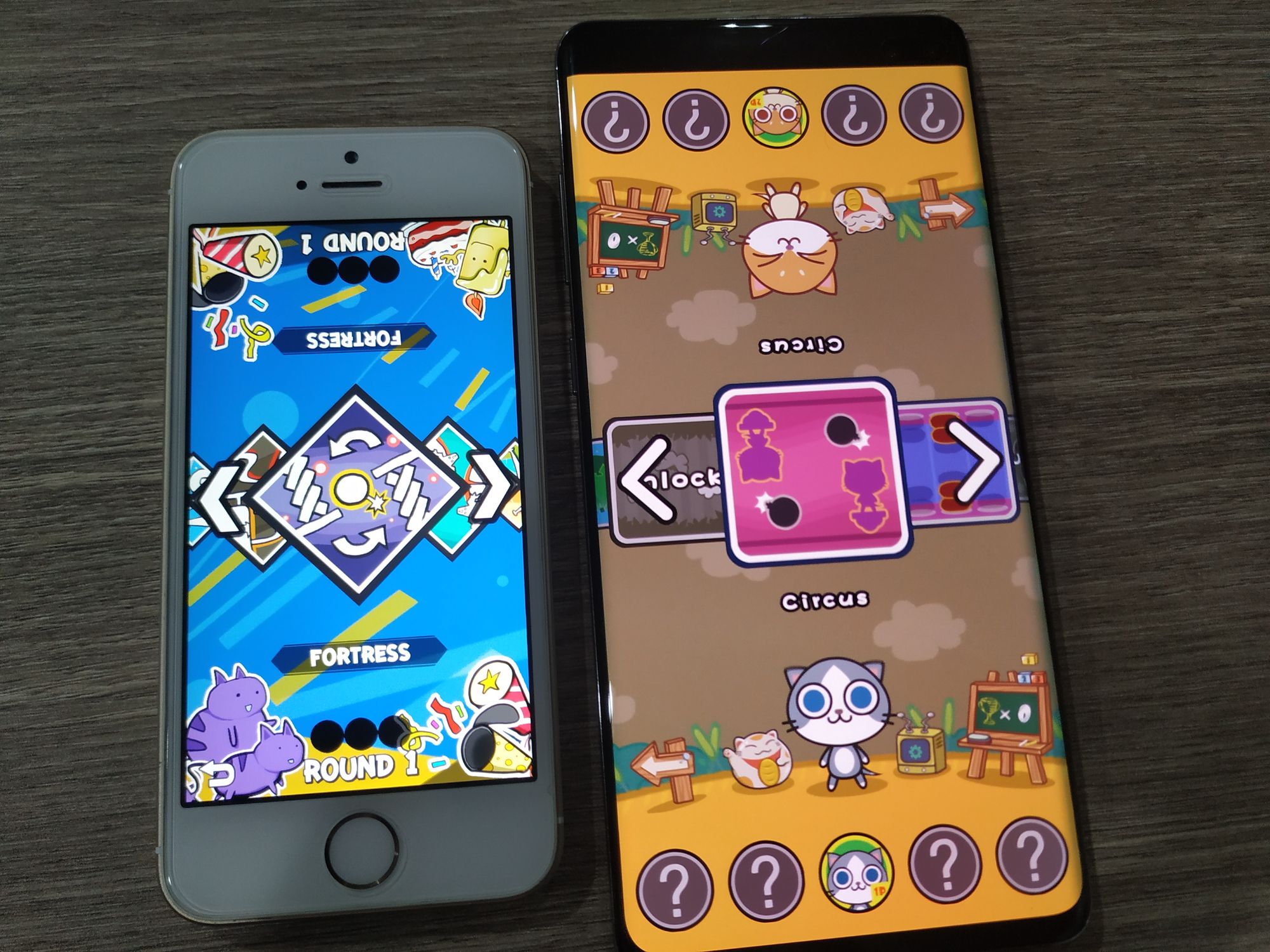
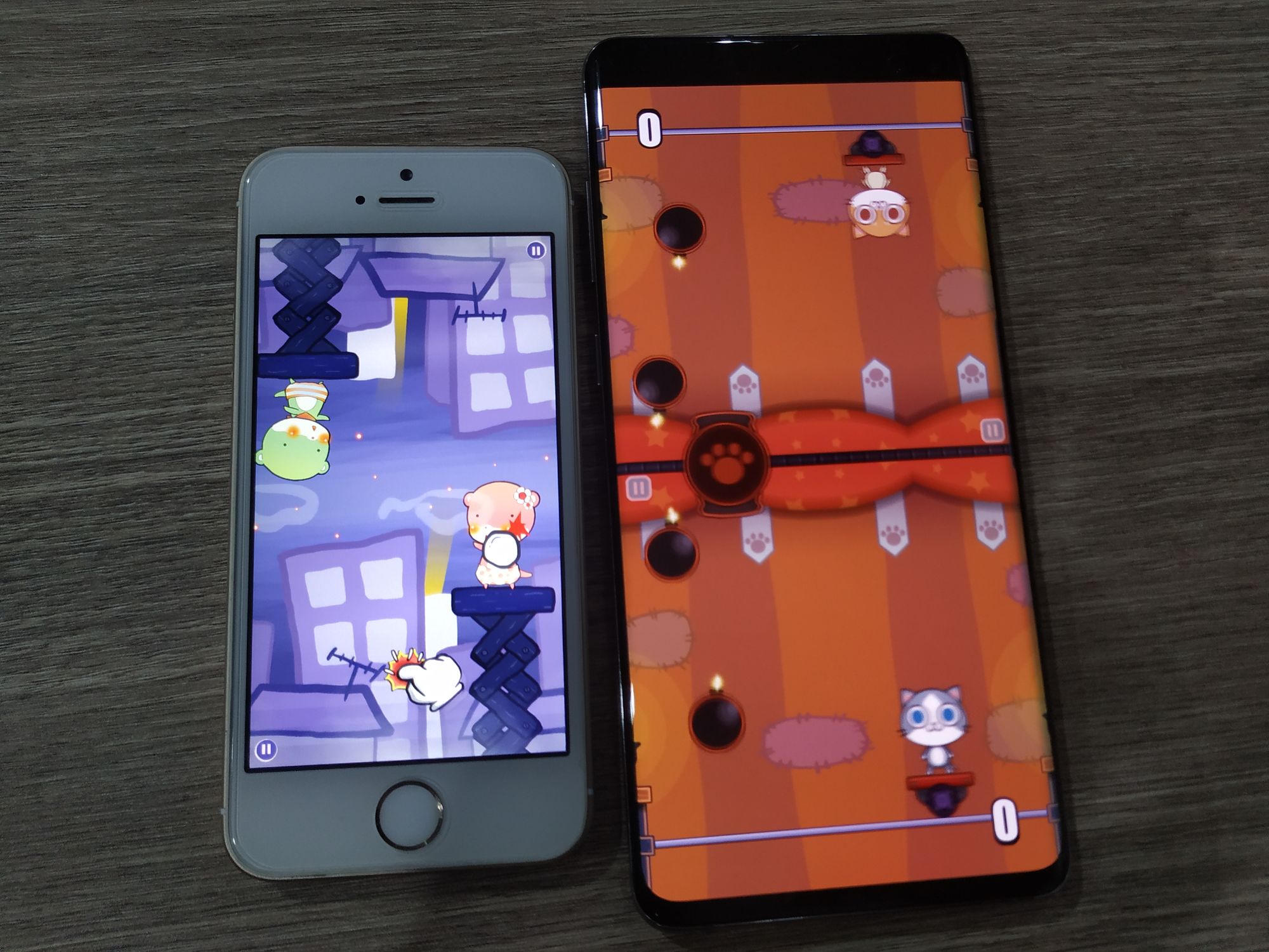
At first I thought this is my Fortress (renamed "Repel" in the 2.0 version) clone from the game banner, but it turns out to be a completely different game! Good job!
How you play is you have to avoid the incoming bombs independently, and they have coded a Draw situation which you must replay the game. Duel Otters has draws too but is tie broken at the result screen, in the same spirit as BBS2. (Which has the most awesome tie breaking system in the world.)
You see here, this game featured a score number since it is the first game that wasn't copied from me, and therefore get their dev character instead.
And also, I have avoided a game that you could play independently without caring about the other side. Chilli/Restaurant is one example of this, you are just racing who get to the target score first. In new games I tried to have both sides cause something to each other as much as possible.
Super Curling
This game is the most complicated of the bunch, and is a nice change of pace. (However a tone of this game is "tame" is not a good fit for Duel Otters, I appreciate you go to your own direction this time.)
In my country curling is called Pétanque (https://en.wikipedia.org/wiki/P%C3%A9tanque), the goal is to throw things the closest to the objective. In which you could try to knock other's ball to be further away from you.
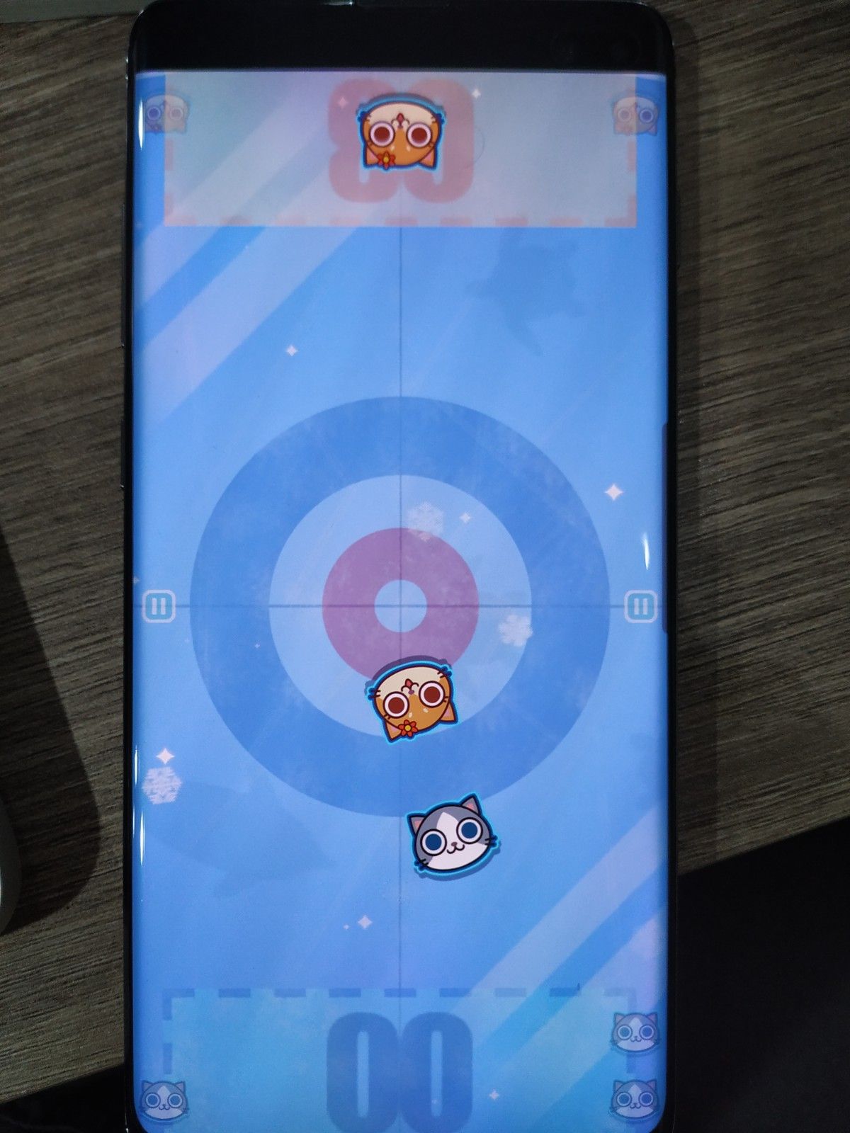
However! The stage theme is awfully similar to my Hockey game, it even featured the same "sea creature swimming under the ice" artistic polish decision as me. And the falling snoflake particles too but that's common sense I guess. There are exactly the same 4 sheens of ice on the opposite corner. However they don't have my awesome trapped animating air bubbles. And the ice's dirtiness is instead a whole-screen overlay texture. To Duel Otters fans, the scratches on the ice of mine was individually placed from a little image of scratch marks, so that it take less space on the sprite atlas and save your phone's storage and also better performance.
And I drew that game, so I kinda feel accomplished when someone with higher painting skill than me copied the design. The fish could be frozen instead of swimming you know? And if the fish is swimming, that means the ice is probably not safe for playing Pétanque on top of it.
And I just noticed in this game, the orange cat suddenly got a flower on its ear unlike any other games. I wondered is it because this game is a baked sprite unlinked from the animated character, they could edit it to look even more like... never mind. I think the idea of putting a reproductive organ of a plant is a common sense of human, and I did it too!
Anyways nice try gameplay-wise. It's the most unique in my opinion.
Racing
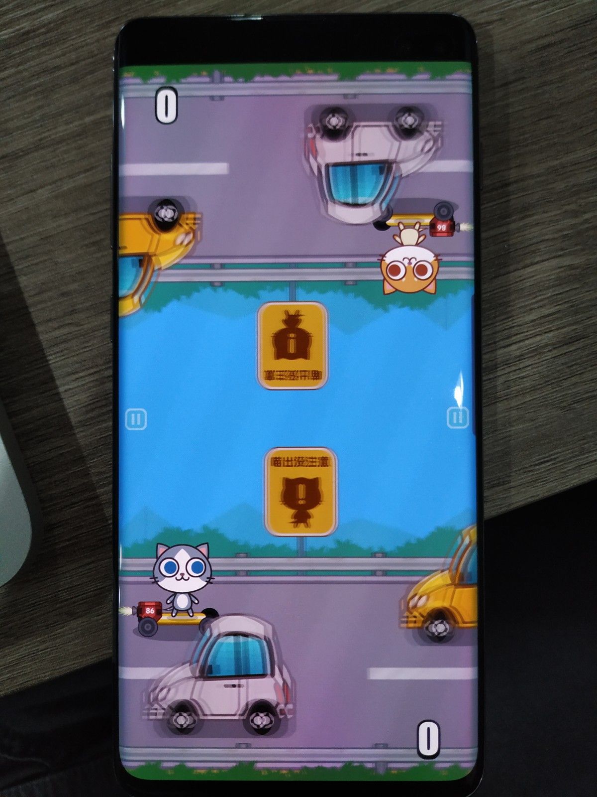
This game is great. You tap to avoid the cars and whoever die first lose. Again since this game was not copied from mine, they have no other idea other than displaying a number as the score.
However, this have potential to be their flagship/identity game if they didn't copied my other games so much. By copying half of the games from me you have no choice to being compared and when the player see my publish date which comes earlier (or this article) they know it is not the origianl. I like this simple game a lot and it is a shame that they didn't come up with the other games with the same level as this one.
Trains
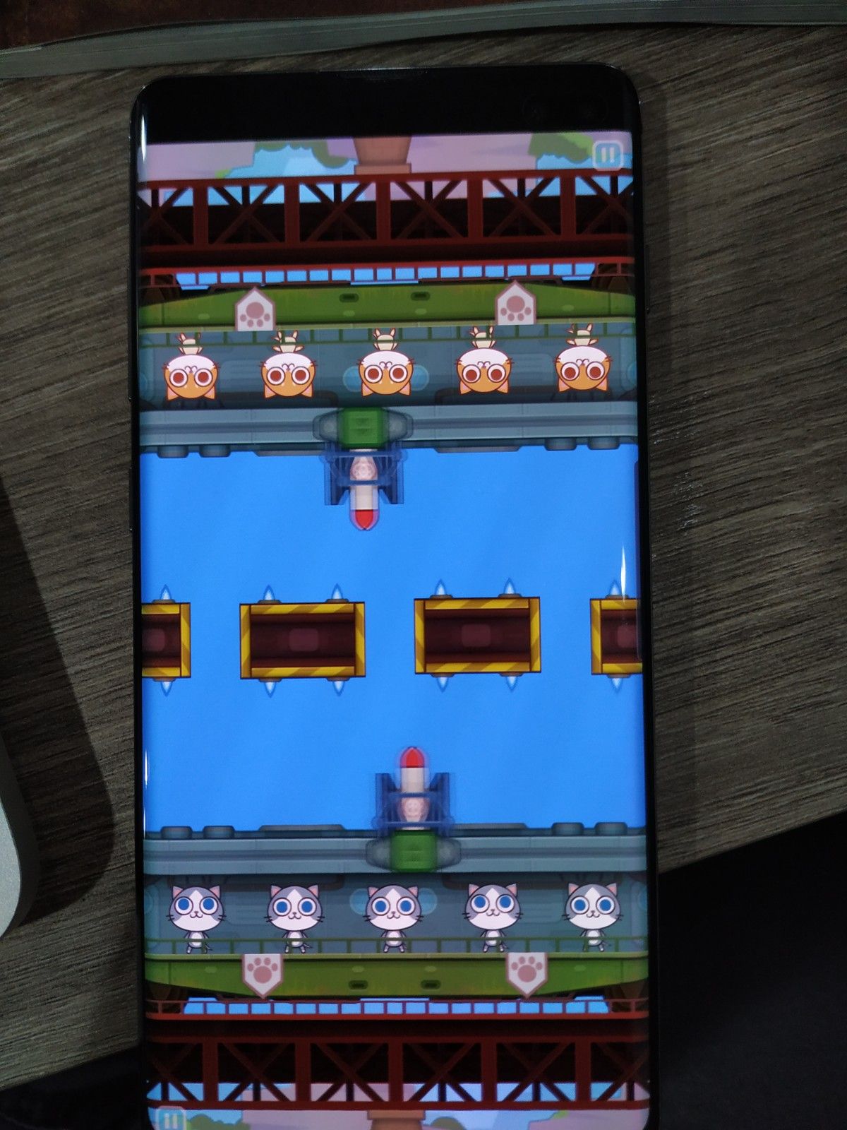
Also a good game. You press when the moving rocket stops at the gap. A time-the-moving-thing is a common idea, either the thing you aim moves or the target moves. But I like the random obstacle at the center. I mean, it doesn't have to be equipped with spikes, as if it is a Rockman stage. But I like random shit like this.
What's insane about this game is the details on the intro animation. It's stunning and better than any of my games. It show what the team is capable off by themselve. It's a shame I keep seeing the same exact artistic polish as my game on the other copy games. They can get this level of creativity but they didn't take the opportunity.
Also it is nice that they use character-as-a-health, the same idea as my Rocket game. When it inspires the other game like this I am totally fine with it. Just don't make it so obvious like the other ones...
Jumper
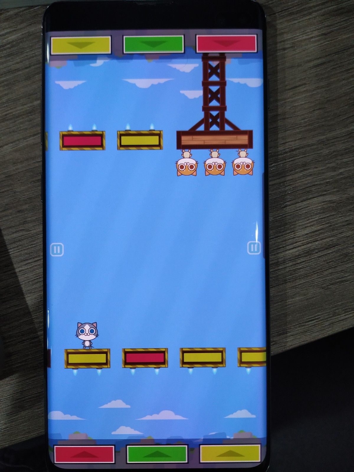
You press the color sequence correctly. This kind of games is a staples in Bishi Bashi Special series, which feature 3 colored buttons. I wonder if they had played it also? But I decided not to take that idea (yet.) Though I may not do so now that I see you took the idea and I respect other's idea.
(At this moment I realized the spike from the previous Train game is probably a jet thruster.)
Result screen
They have an oscar award stage of sorts, and mine is a discotheque with a fridge and a rice cooker. Theirs looks cute and well done, and I am glad my design is weird enough that they don't want to copy it.
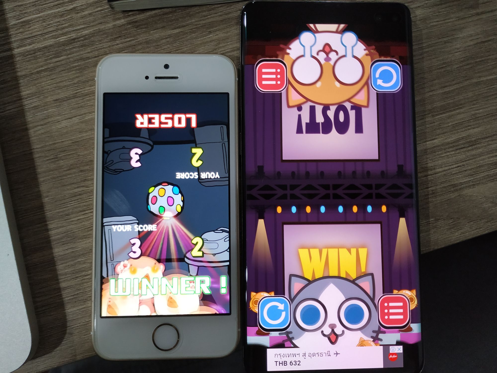
Also they made the score number running up to the final score the same style as me. However I duplicated the number for both sides.
Bonus, "Loser" and "Winner" are wrong grammarically. You are supposed to say "Win" and "Lose" to the player as opposed to "this side is the winner" or "this side is a loser". So Cats Carnival's wording is correct. (But it should be LOSE and not LOST) However this is by design because I like how LOSER sounds extra painful to the loser. (especially without the "!", for some reason.) I even choose a geometric font unused anywhere else in the game for this for an extra painful feeling I get from the font.
Store listing
You thought that was all, but never underestimate a game studio that is motivated for living rather than passion.


Well, just compare the store text :
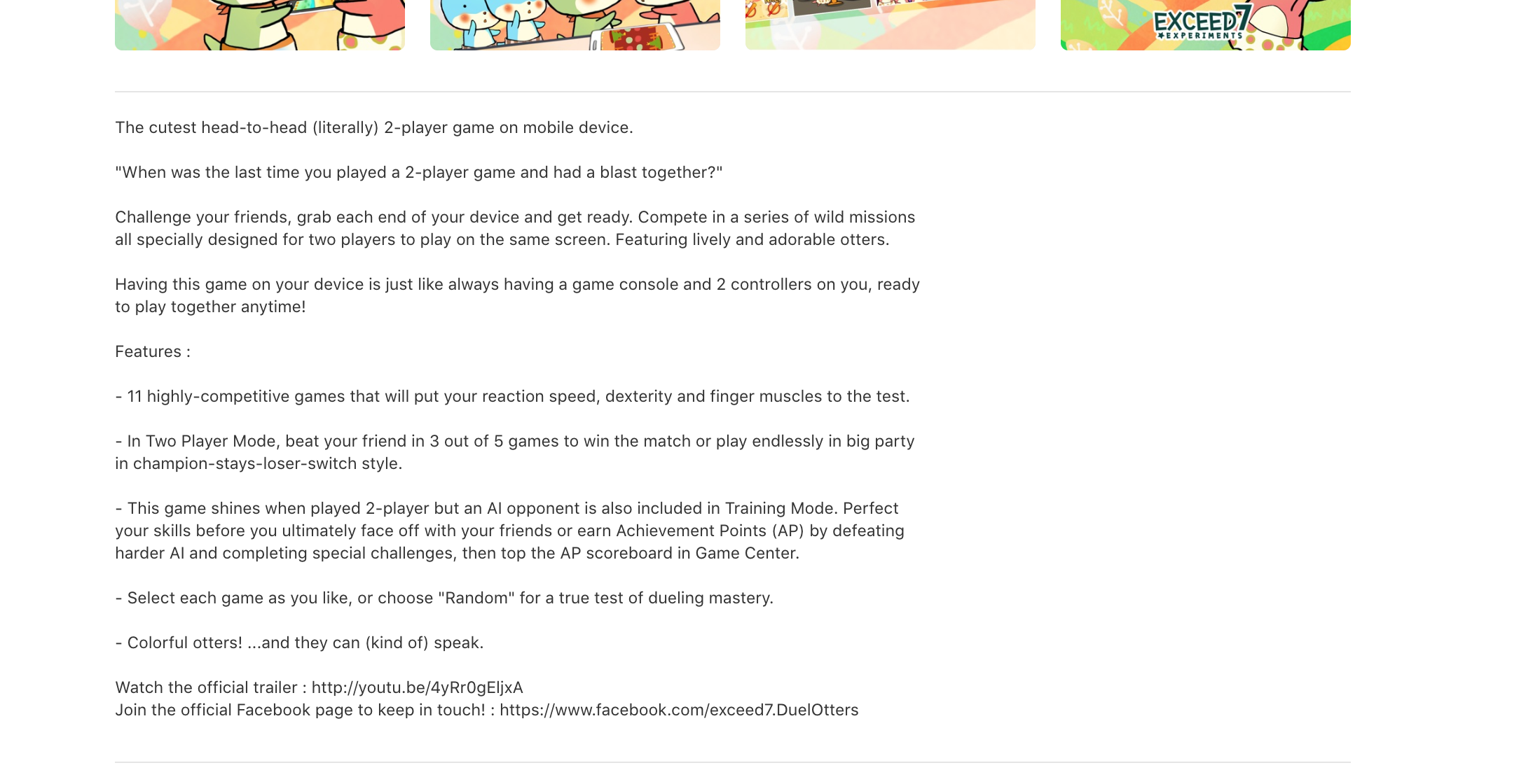
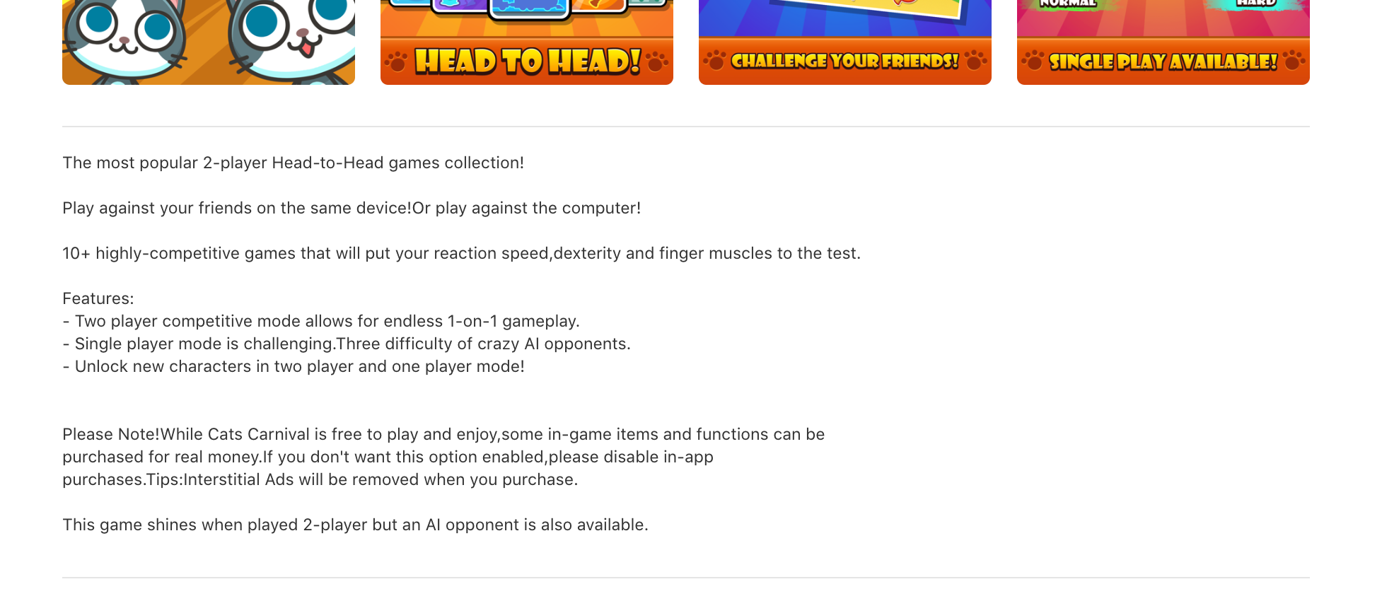
- My keyword head-to-head and 2-player, which I considered hyphenated weirdly due to my poor English skill, was copied as-is.
- "The cutest" was simply changed to "The most popular". Both are baseless claims however. So we are equally bad at this.
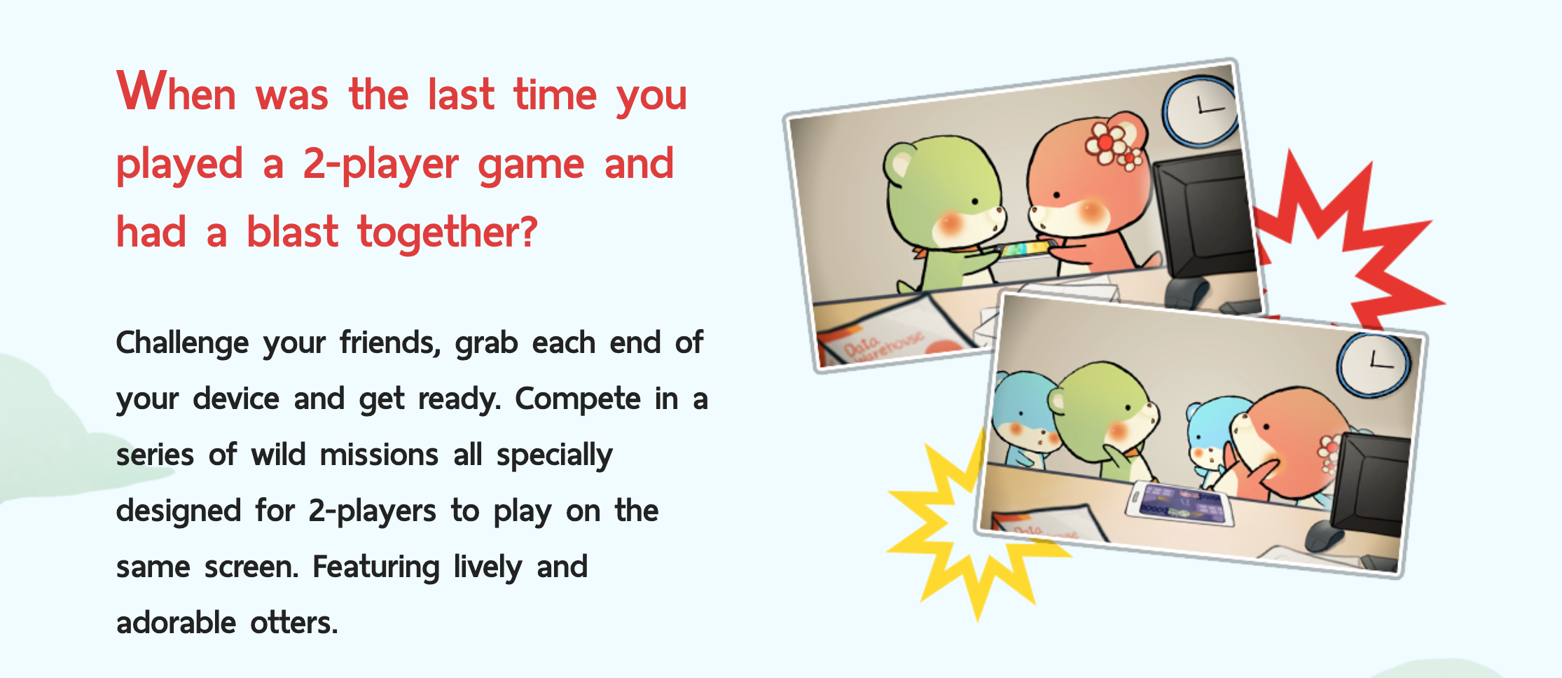
- Thank you for not using the flavor quote "When was the last time..." I took a week to polish, and took a lifetime inspired from my own life.
- The "
nhighly-competitive game" is most likely stolen from me, lol. And this hyphenation is wrong grammatically. There is no need for the hyphen on the -ly form since that's what adverbs is trying to be. You don't have to make the same damn mistake as me. - This "highly-competitive" and "head-to-head" thingy was emphasized multiple times in their store picture too. I think they liked these so much. But keep in mind, these wordings came from weeks of research over already existing competition such as Science vs. Magic a game which comes before me and have their own ground, or Mucho Party which is an another great mini game collection game with a unique face capture technology, also there before me. Compared to those games, do you have any shame copying even my wordings? (Even more so, a broken English coming from a Thai person.) Anyways, I have refined my marketing wordings more in v2.0.
- "that will put your reaction speed,dexterity and finger muscles to the test." this is the same damn thing as mine! (you are just missing one space after the comma) Wtf...
- It's a common sense to get ahead of something you copied by having some kind of (unimaginative) extensions. A common idea is character customization, your game has it. And "more" of something, because my game got 2 AI difficulties, yours has 3. You may stop here if you got no other "completely new" idea, but my v2.0 got a more non-obvious upgrades such as an arcade mode with reimagined games for score attacking.
- "Challenge your friends" in their first picture is from one of my sentence too. But this one is quite short and generic, anyone could have said this and it doesn't have my weird English character in it. I think it's fine. Just a coincidence right?
- If you are still not convined their store listing is copied from mine, I lost it when I arrived at the bottom and found "This game shines when played 2-player but an AI opponent is also available." It's the final nail in the coffin lmao.
This extremely cringey "shines" is undoubtedly from my "This game shines when played 2-player but an AI opponent is also included in Training Mode.", from my 2014 self, that no one English native ever use it in a context like this. I planned to remove it in 2.0's store wording because I don't like it anymore.
And to even more point out this is a copy, they have already talked about AI mode above, while in my instance that line is the first time I mentioned about AI so it is natural.
That means they must be really deliberately want to make sure they have all my things and my personality all over the place by placing my keywords again at the bottom, to ensure the same search hits as my game as much as possible. Maybe in my new 2.0 store words I should randomly left the "shine" in there somewhere? (But it's cringey af...)
In all, this maybe a deliberate tactics to steal traffic from my game. It's amazing that my broken English could cause them to follow this much. (Though I scored 990 in TOEIC. Now could you copy that and share your score? My score expired long ago by the way.)
But that's not all, I checked their Japanese localization too.
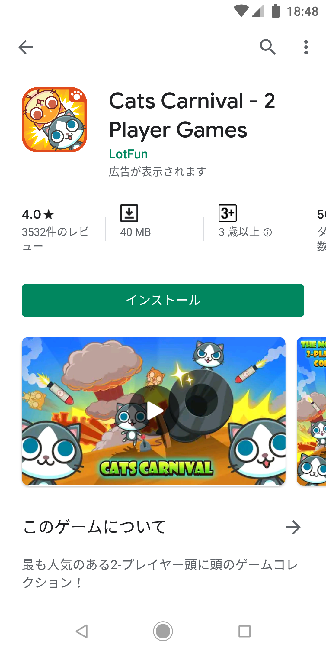
What went wrong here is that they used Google Translate over the modified sentence that they stole from me. And even with my mediocre N4.5 Japanese this 顔と顔 (literally "head and head") is definitely wrong. My 頭を突き合わせて te-form sounds more likely to be correct.
My Japanese text both in-game and the store text, came from my own grammar study with Tae Kim's online lesson for months, Weblio example sentence as a reference to assemble my own sentence one by one, and some help proofreading from my Japanese friend from my master degree study, which I earned my own government scholarship. Again there is more effort and story to things than meets the eye. I guess you didn't care enough to check out my Japanese version store page to know that these are available for copy too, because in that case you have also easily copied all my Japanese study efforts.
Affinity : your own "idea DRM"
A DRM protects software from being exploited and pirated. We are at one level higher. How can you stop someone to steal your nice idea and apply it to their own software easily, then use a superior resource and money to make an even better game than you? You are just a small fry with no funding, what to do?
If you happen to invent something simple but very effective like puzzle match three formula then it will be easy to follow. However if you make it complex then it may sucks and the idea is not good enough to be stolen in the first place. But there are something I called "affinity" in the game that is very hard to steal.
For example if you go see Cookie Run. Anyone can make an endless runner, with energy, with BONUS TIME mechanic complete with the same alphabet tokens, with upgrades, resetting scoreboards, fusion/melding/gacha/box whatever repeat inducing strategy jumbled together, with character progressions, and so on. However that game got an art, animation, colors, and story, fitting nicely together that it forms an "affinity". This is what could protect your game and while it doesn't prevent stealing ideas, it is much more difficult to copy everything exactly that forms an affinity. It force the one who copied to come up with their own style of affinity, or else it would be inferior than yours.
An another example is idol music games like Idolmaster, Bang Dream, or Love Live SIF. Both feature the same style of collectible troops, melding/fusion mechanics, energy as a gate, IAP to revive, and timed event as a new contents to drive gachas. However it's the IP (intellectual property) that builds the story and the world of respective game that gains followers. You can copy all those mechanics but you don't have the same affinity. Their game are DRM-ed. They have a real concert and connecting with the fans with their voice actors. You don't have those.
In Duel Otters, many reviews expressed that the game is "so funny". This simple sentence results from how the otters couldn't smile, how explosions are everywhere, how I am the sound designer and music composer to keep the sadistic tone of the game, how the animation curves are janky, and how I wrote my own library to make the music loops with an intro, then I could use the intro to get things even funnier. These are small but they gives an equivalent of set armor bonus skill in Monster Hunter. Only when everything are going together it started to shine. You notice many of my art looks like a junk 10 years old drawings, but once I keep on doing it enough, augmented with equally silly SFX and chormatic scaling melody of the main theme reminiscing of a circus show, I could create affinity from junks that doesn't work as well if you copy only a subset of it.
It is evident in Cats Carnival here, feature-wise and even visual-wise they got everything from Duel Otters. But they used only the eyes to copy, if you feel the game you notice that the affinity was lost considerably, but they don't know which part is missing to activate that set armor bonus skill again.
So make a game with your personality! That's an easy way to ensure good affinity building before you know it. A position "game director" is important because of this. Rather than 100 personnel brainstorming each part of the game it maybe better to have a core theme derived from few person's likings. When Cats Carnival copied my game, they take me and my artist into their game without knowing. And if you try to augment from the copy on your own it may create dissonance.
Conclusion
I have let everything out before I update my game to version 2.0, which I poured about 5 full months reworking the game. I hope the article is beneficial to game devs passing around. Honestly, I thought Duel Otters is a very hard to copy games by design, as opposed to a "vulnerable" game with good ideas but too simple like Flappy Birds or 2048. I was surprised someone put enough effort to replicate the game.
Everything came to be with a reason, and please copy with style in the case that you must do so. Don't do it like Cats Carnival. In fact, do it like the original part of Cats Carnival I praised and make the copied part unique enough like when you copy friend's homework. Fear the players the same way you fear your high school teacher!
(Though no hard feelings for Cats Carnival devs, you got some kind of reason right?)