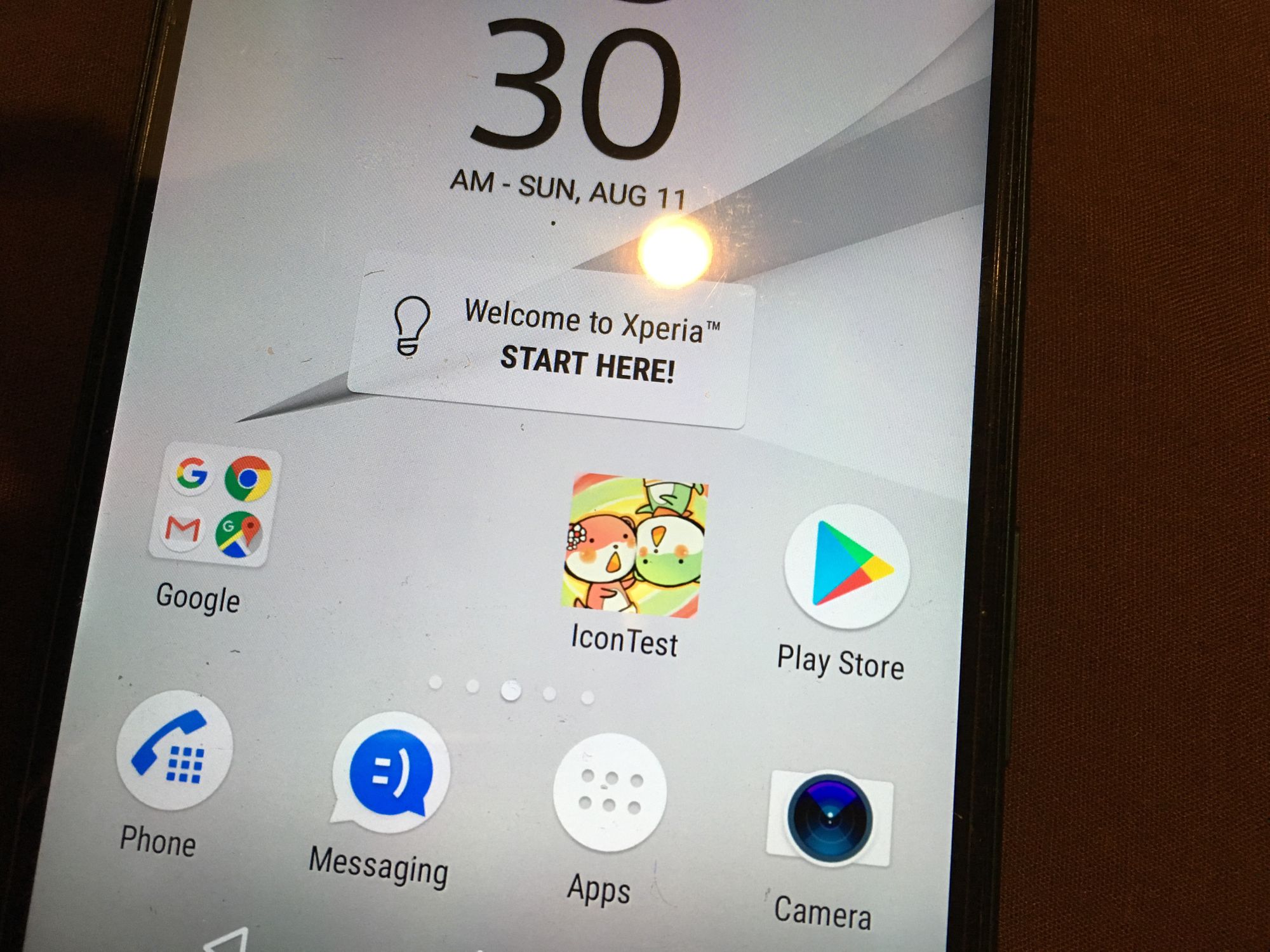
Unity & Android App Icon in 2019
I thought Android device fragmentation was bad. Now icon fragments too. Google introduced the first new standard in Android 7.1 as rounded icon. Then just one API level later, introduces adaptive icon. What do you want now?

It's getting out of hand
I thought Android device fragmentation was bad. Now icons fragments too. Google introduced the first new specification in Android 7.1 as Rounded Icon. Then just one API level later, introduces Adaptive Icon. What do you want now?
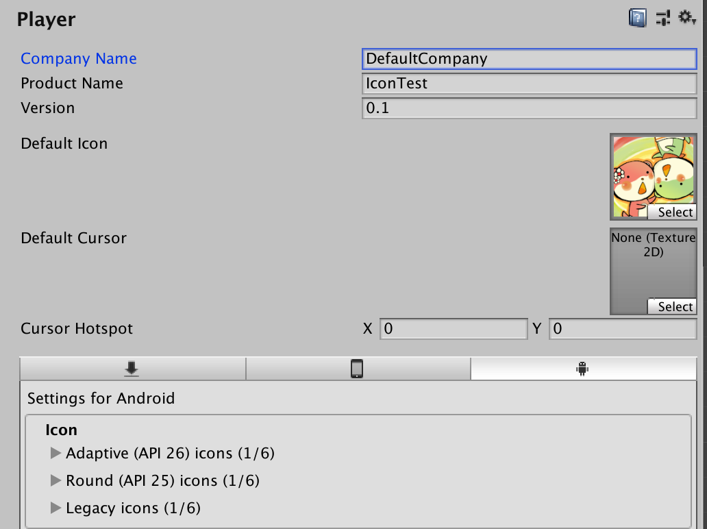
Now Unity, literally had to somehow unify this mess. The result is the Project Settings page now has Default Icon, Legacy Icons, Round Icons, and Adaptive Icons.
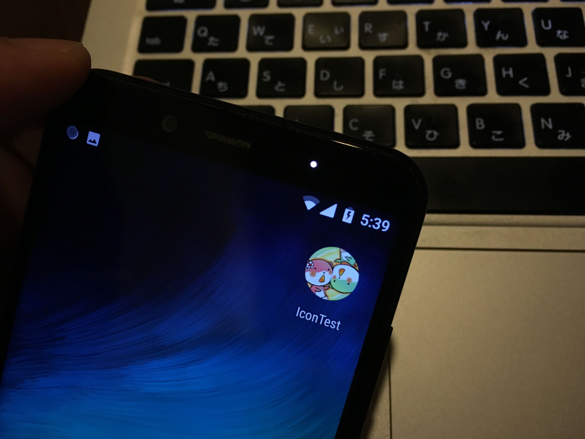
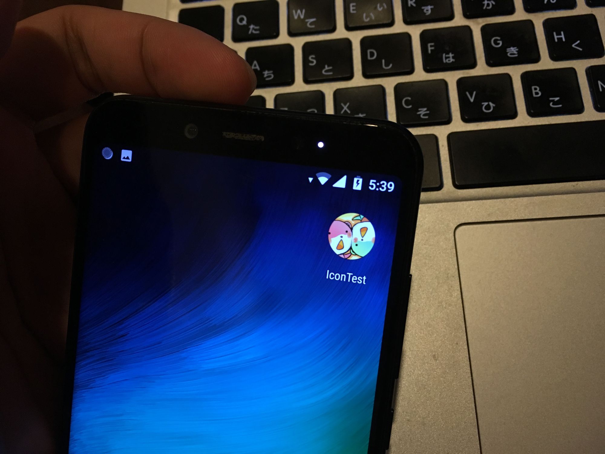
So, I wondered what it would looks like on each phone if some of them are provided, or all of them are provided.
For example, one of my phone loves to do this. Failing to get it right means your icon may looks alien when it is near the cool kids club that did it right. (Yes one game here in the first row is from the same company as the other one in the second row..)
What we want
- Submit an app with the new, futuristic Android App Bundle (AAB) way. Which optimize our game size at the cost of not able to do multiple custom APKs. Let Google server decide it all.
- Press export from Unity and submit without further hacking the exported project.
- Icon instantly looks great on all phones.
- No unintended part cut off on any shapes.
- No phone dares to put the icon inside any hideous white shapes.
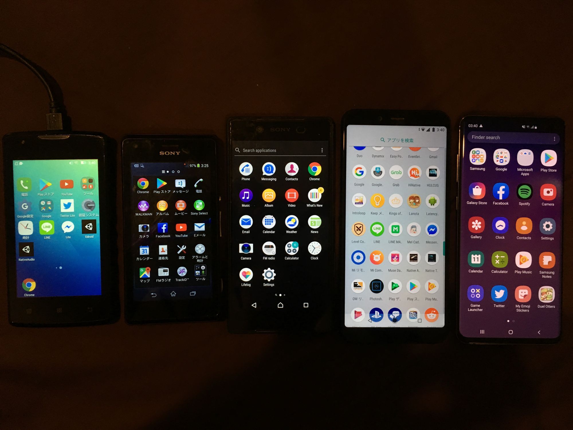
Devices
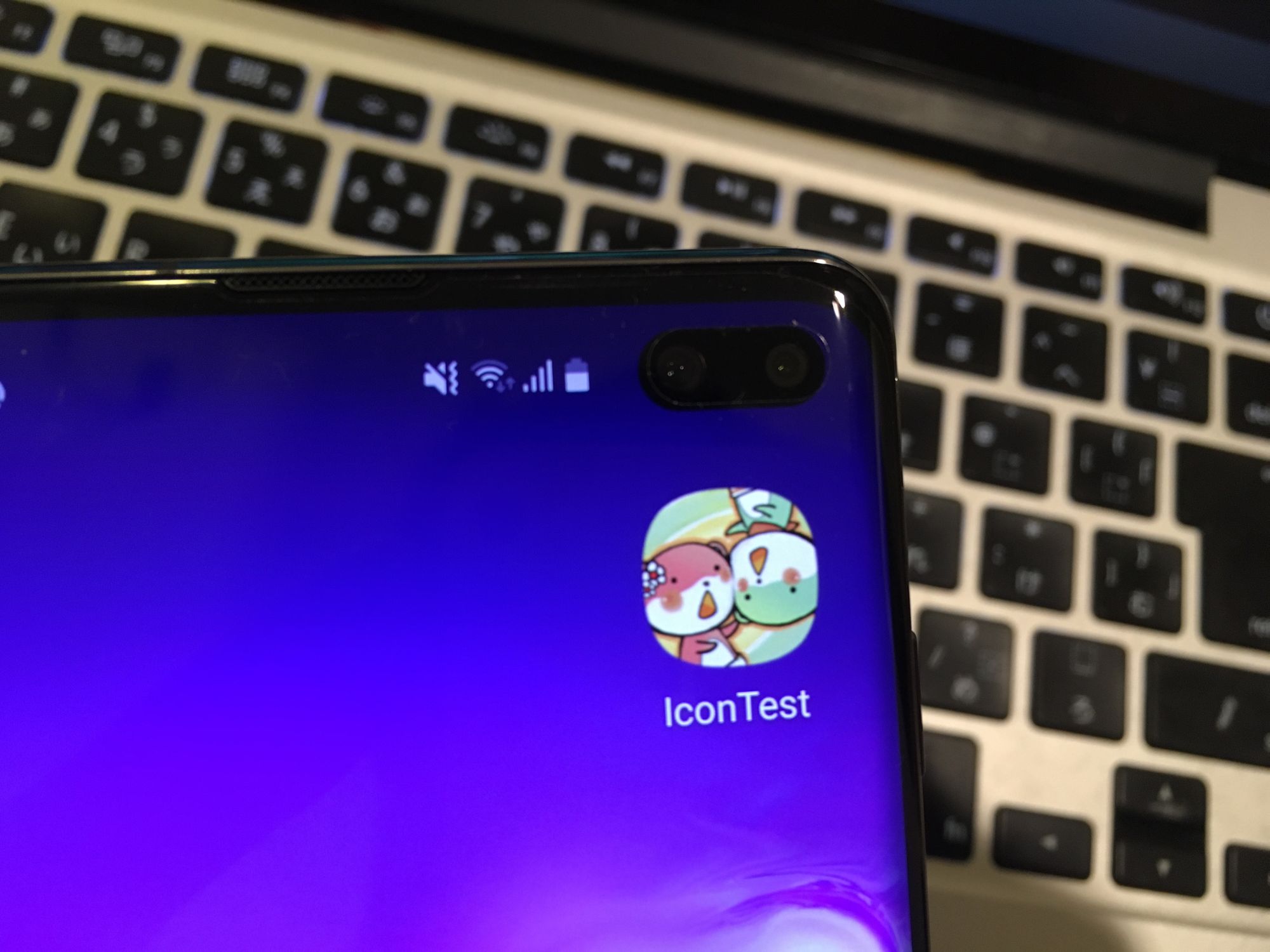
Before we begin, look at this group photo of my phones. The 2nd from the left (Xperia M) is not in the test, the version maxed out at just Android 4 something and nowadays people already moved on.
| Phone | Android | API Level | Rounded (25+) | Adaptive (26+) | Adaptive Mask | Remarks |
|---|---|---|---|---|---|---|
| Lenovo A1000m | 5.1 | 22 | ||||
| Sony Xperia Z5 (E6653) | 7.1.1 | 25 | ✅ | Has several circle icons, but freeform icon still exists. | ||
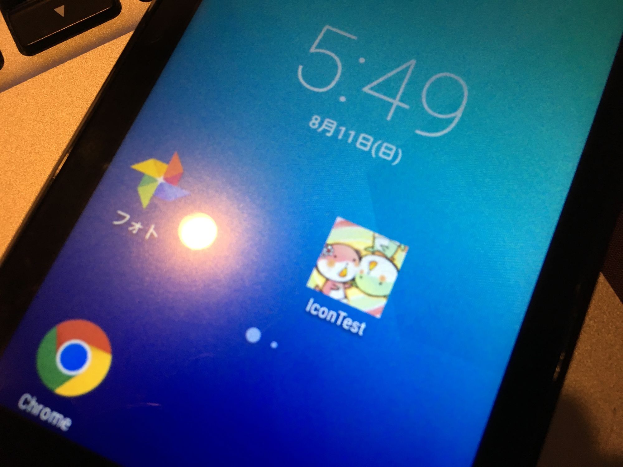
| Xiaomi Mi A2 | 8.1.0 | 27 | ✅ | ✅ | Circle | Android One phone. |
| Samsung Galaxy S10+ | 9 | 28 | ✅ | ✅ | Squircle | |
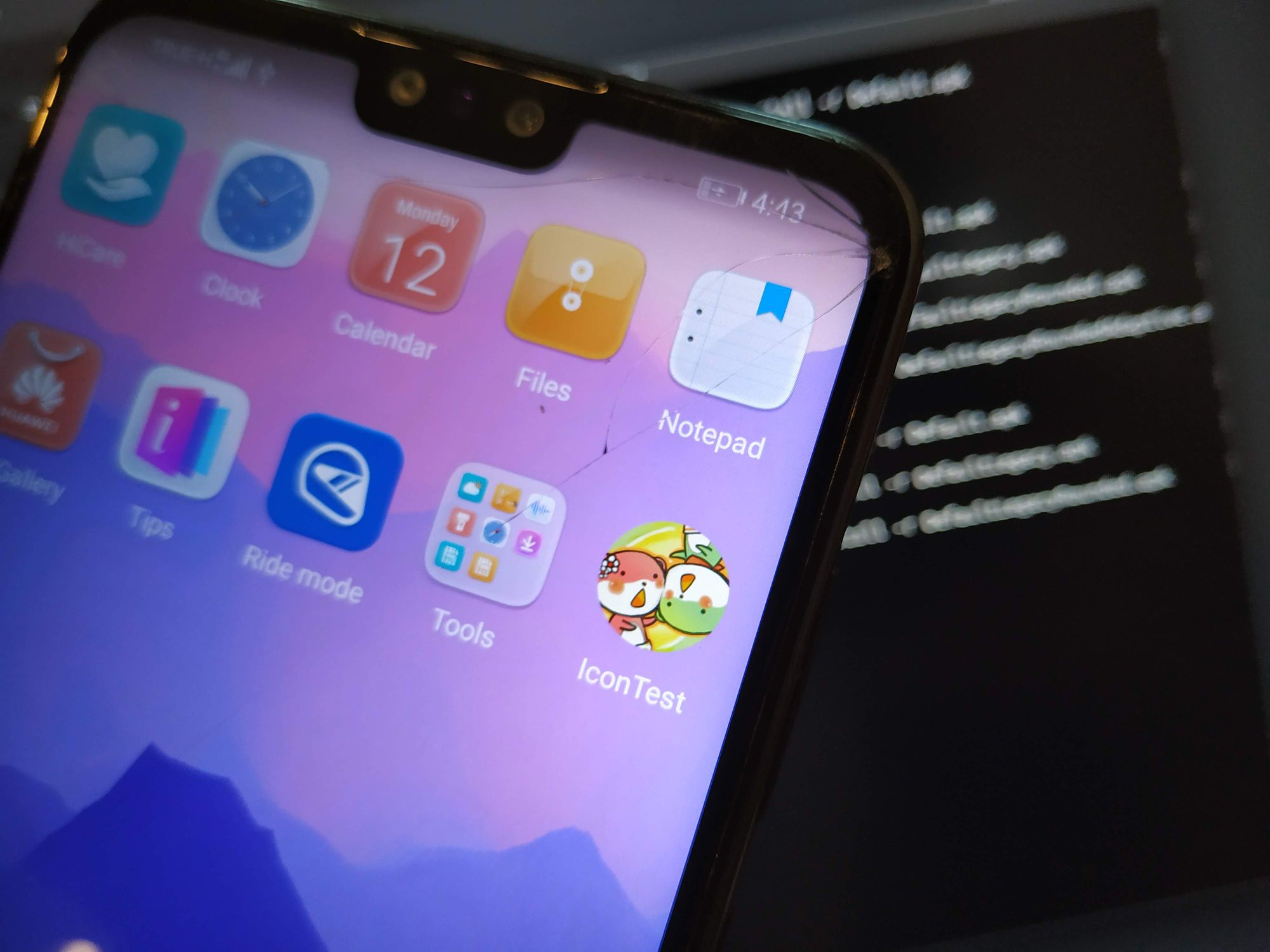
| Huawei Y9 2019 | 9 | 28 | ✅ | ✅ | Circle |
Squircle is an actual word, lol.
It may looked like I am rich :
- The Xperia Z5 is an unused phone donated from my friend named Guy because it drains all the battery in 1 hour and is smokin hot.
- Xiaomi Mi A2 is my primary day to day phone, however I got it for free out of sympathy from Chinese game developers I debugged remotely with, and they couldn't stand the fact that I don't have a debug device at hand with higher API level than Nougat.
- The Galaxy S10+ I won from submitting too many bugs for 2019.2 beta. I won 2017.1 beta black shirt where it had 1 Nintendo Switch grand price, then 2018 shirt+mug+hood too. Maybe it's about time I become Unity staff...
- The Y9 (not in the picture, added later) was my dad's phone that got submerged in water. Now the screen broke, 50% touch success rate, glitchy sound on phone call, expanded battery, but it is my only Android with center notch.
- A1000m was like 30$, I impulse bought to catch Mali GPU problem or something.
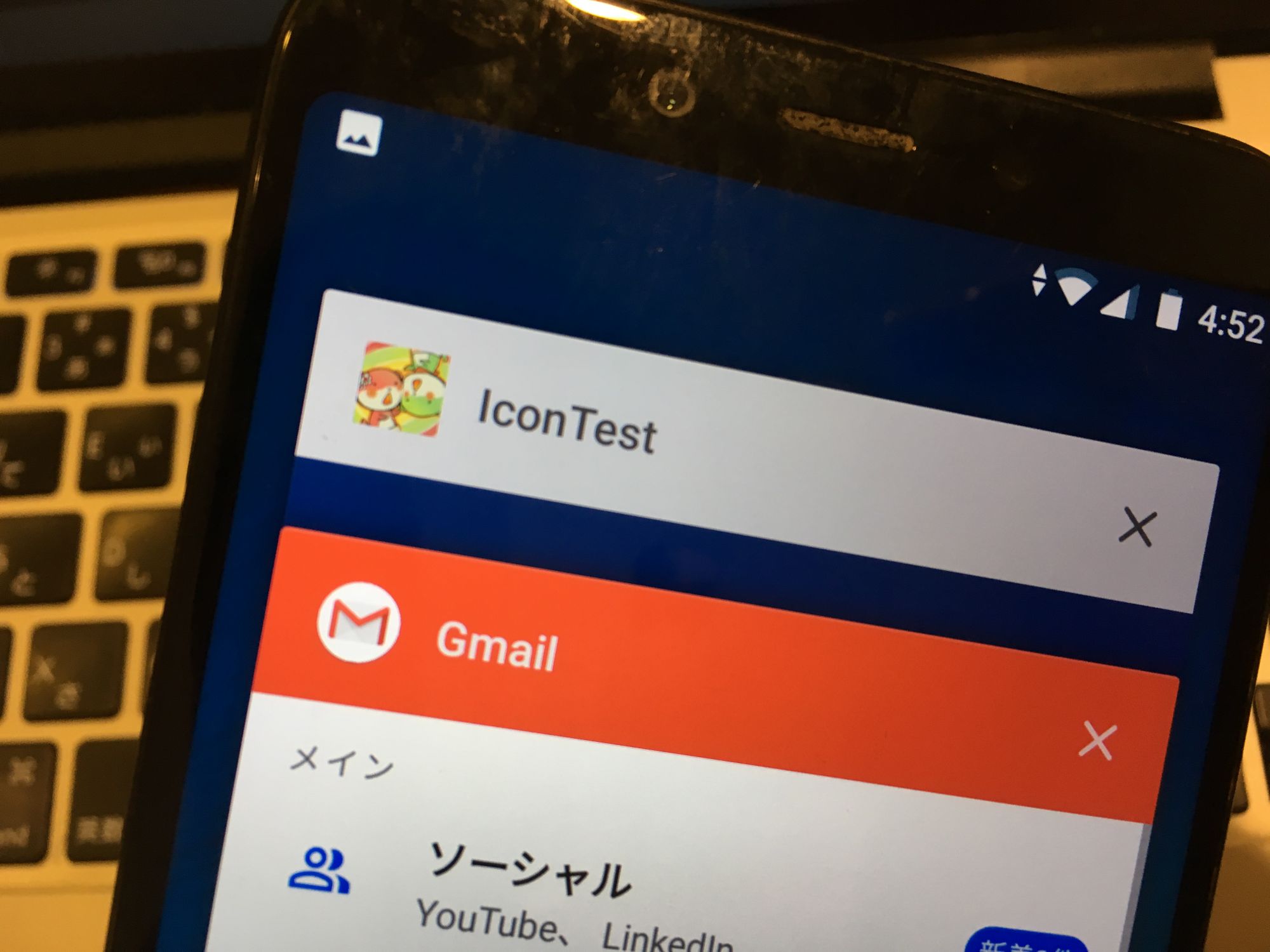
You notice that the A2 (4th from the left) is obsessed with a circle and put every non-compatible icon in the middle of a circle. This is worse than just mask the circle and risk cropping on many icons.
Unfortunately I don't have any device that is at exactly API Lv.26 where adaptive became a thing, that may reveal more findings.
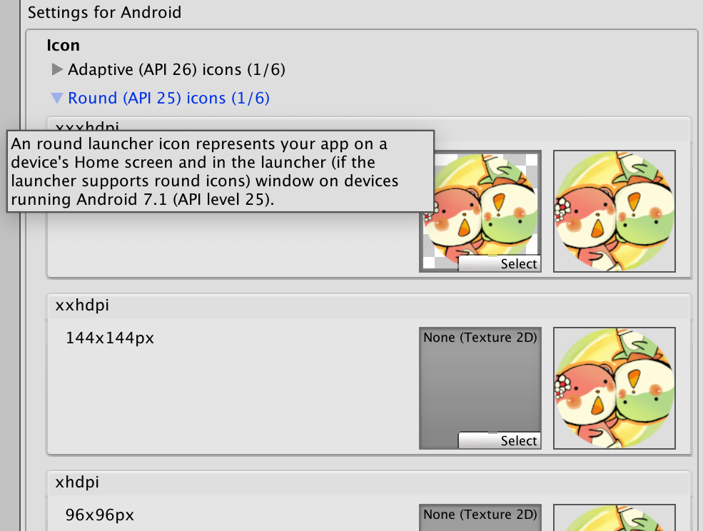
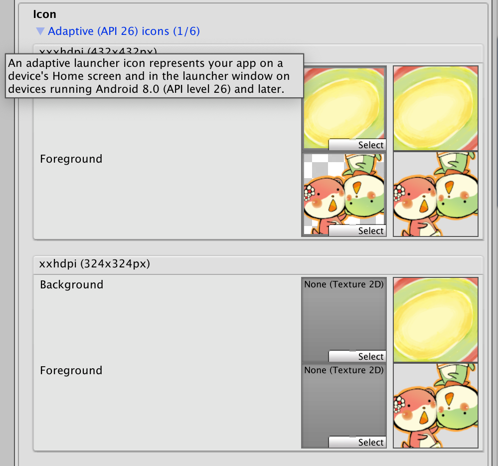
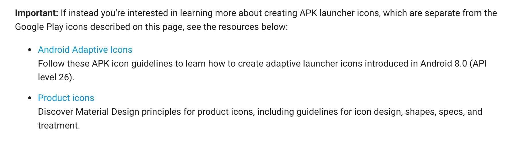
Explanation of each icon section
I am too lazy to type so just read from the images. Also look at the graphics so later you know which one got chosen.
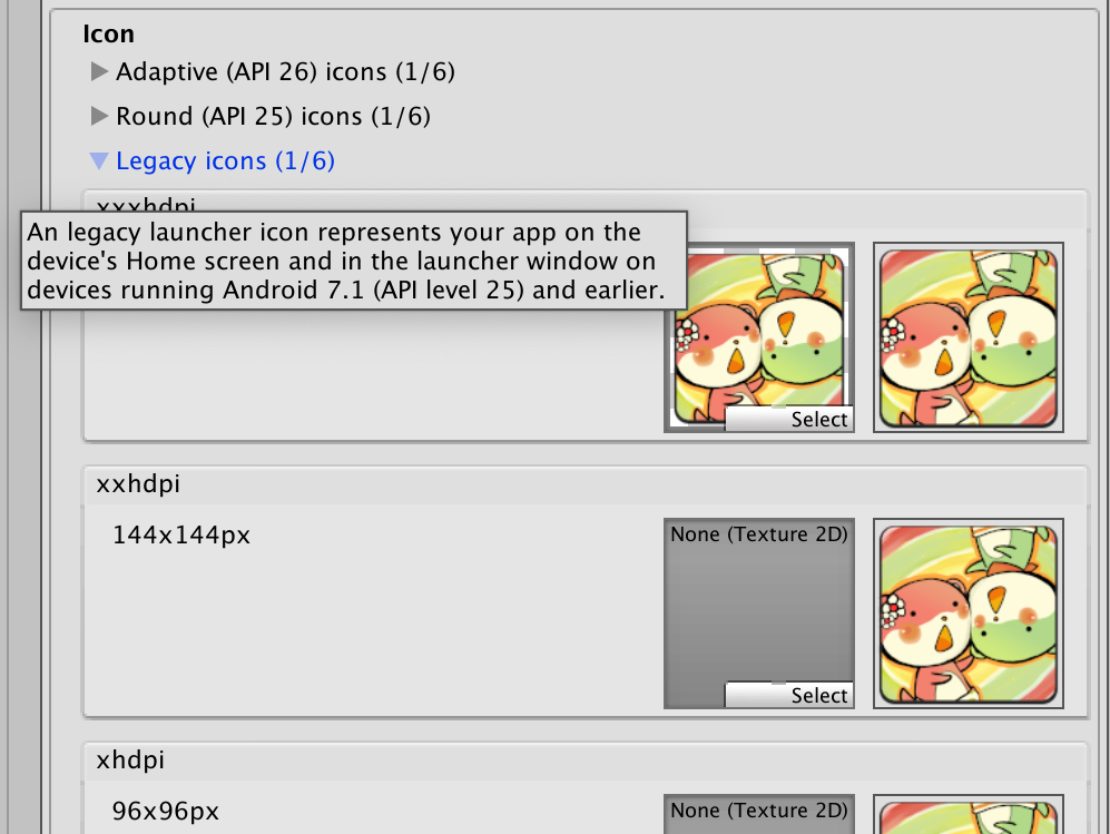
- The rounded one has steeper angle of the center yellow part. This is because if I cropped the circle simply, the red part is getting in the icon a bit and it didn't look good.
- Adaptive Icon, after you read the concept, it seems to work only for boring apps where you got a boring icon floating on a boring color. Because it is said that both layer could be parallaxed (at will of the phone), it is now awkward to design an icon that things aren't floating on the middle but rather anchored or coming from the edge. Games mostly aren't a corporate logo floating on a background for sure. I don't like this...
- Ideally I want the icon to always look like the Legacy ones, but I know what kind of problem is coming. If I use only Legacy, new phone is going to put that inside whatever shape it wants. If I put newer ones in, then some phone that could use all of them now don't want to use the legacy ones. I type this before I begin any test. Let's see if Google will bring me that pain or not.
The test will run phone by phone, 4 pictures per phone ordered by
- Default
- Default + Legacy
- Default + Legacy + Rounded
- Default + Legacy + Rounded + Adaptive
The experiment
S10+

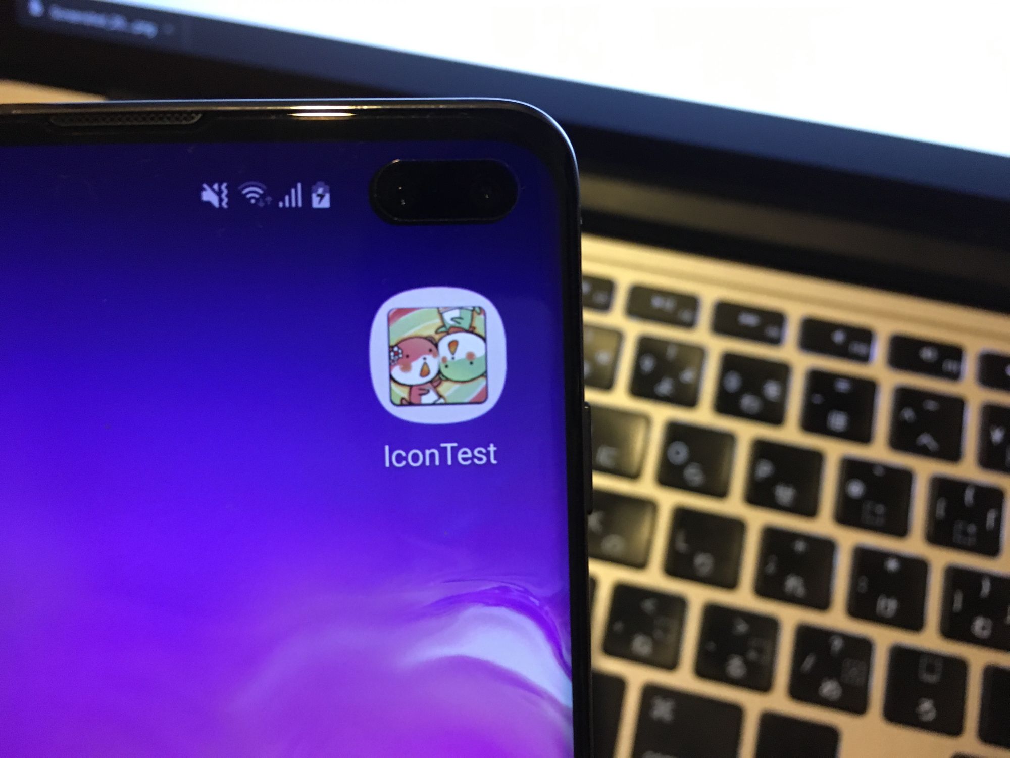
- The Default only unexpectedly looks nice. It masks reasonably.
- With Legacy present though, it always use legacy-in-a-squircle instead of more reasonable default in a mask. Why did you prefer legacy over default??
- It didn't care about rounded icon and still use legacy.
- Adaptive icon seems to zoom in too much for some reason. It's nothing like any design I put in.
- Even thought it understands Adaptive Icon, there is no parallax or other fancy effects. So my sophisicated 2 layers are kinda wasted?
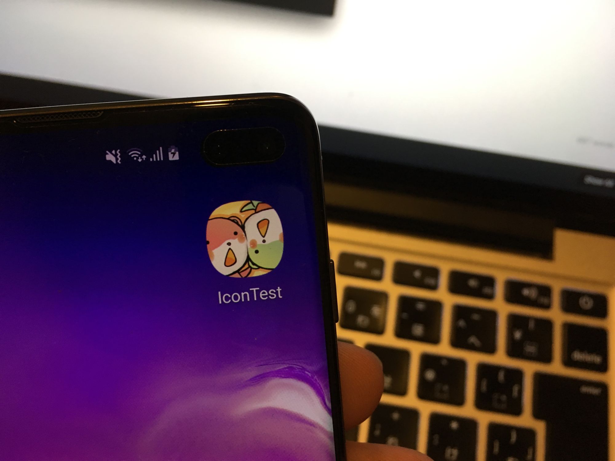
A2
- This phone is the most annoying as it insists of doing the circle mask no matter what.
- Default is in the circle.
- Legacy is in the circle.
- Rounded looked the most appropriate, as expected.
- API 27 means it is over 26, so it could also understand Adaptive Icon, even though I want it to always use rounded ones. We again get a weird zoom like S10+ case. But this time in circle instead of squircle. To be honest it is kinda cute, but I wish it zoom out a bit more. One eye is missing there. (If you could ensure everything important intact in a circular mask, then no other mask will be a problem.)
- Even thought it understands Adaptive Icon, there is no parallax or other fancy effects. So my sophisicated 2 layers are kinda wasted again?
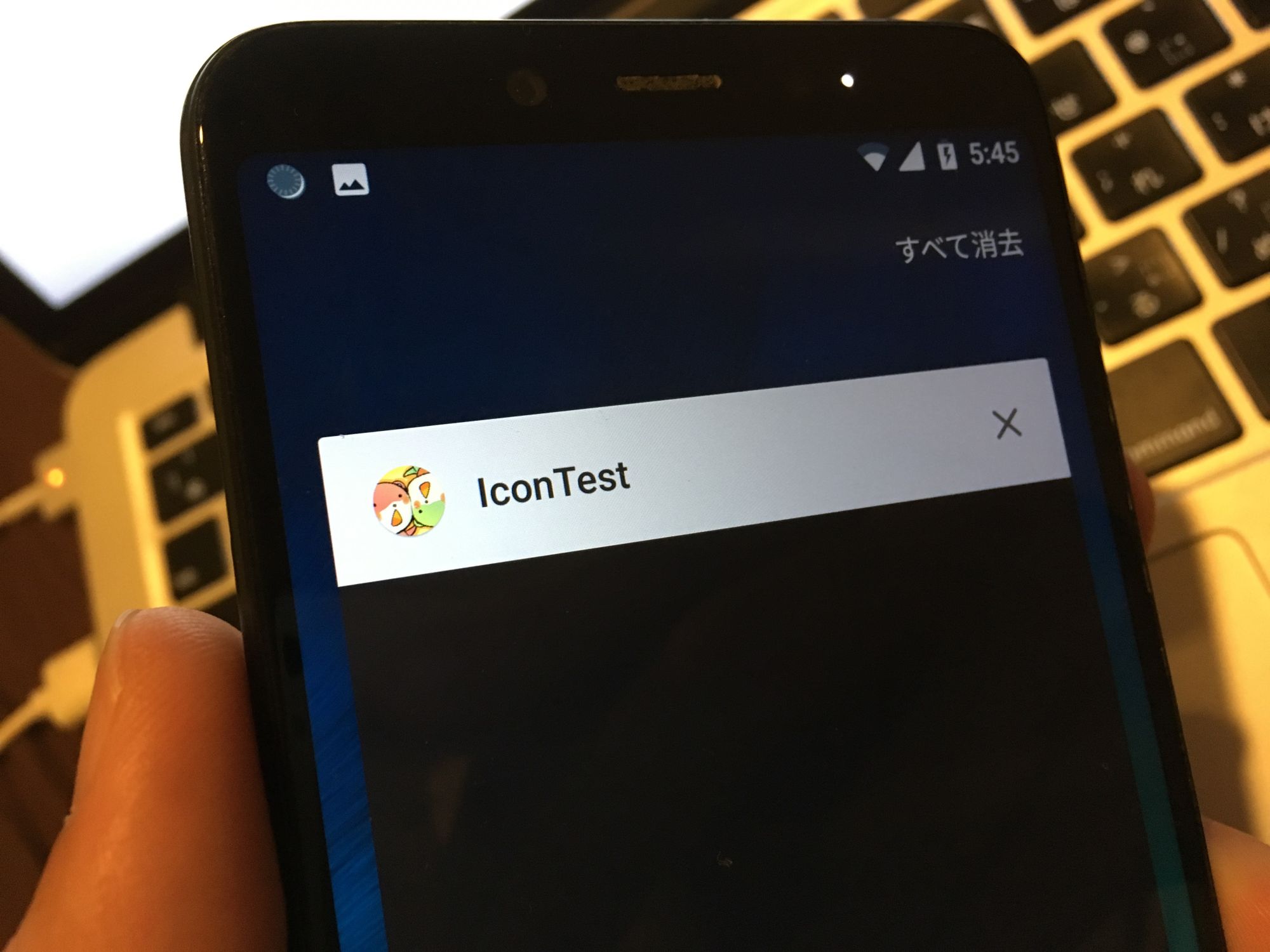
Note that the A2 do not display white circle if the icon is on the task manager, on Default or Legacy.
But if the icon is Rouded or Adaptive, then it is in a circle.
Z5
- The Z5 wants to use Rounded Icon, but can't understand Adaptive Icon since its API is 25 but Adaptive Icon is at API 26.
- There are also many freeform icons like the camera you see here. It is just that it "prefers" rounded ones if available. This is not the same as A2 where it insists to put everything in a circle.
- The APK with only Default is displayed simply and not masked to circle. It prefers rounded, but do not have a circular mask.
- Honestly this is the most appropriate behaviour I want it to be for the A2. If you are rounded kind of guy, then don't try to go adaptive ffs.
- If I somehow hack this to be at API 26 (not possible officially), I guess it may start using Adaptive Icon on its own.
A1000m


- As expected, lower end phone generally follows the Legacy ones. Default's priority is under Legacy. (The same as S10+, but that phone Legacy looked worst than Default since it wants to put in a stupid white mask.)
Y9
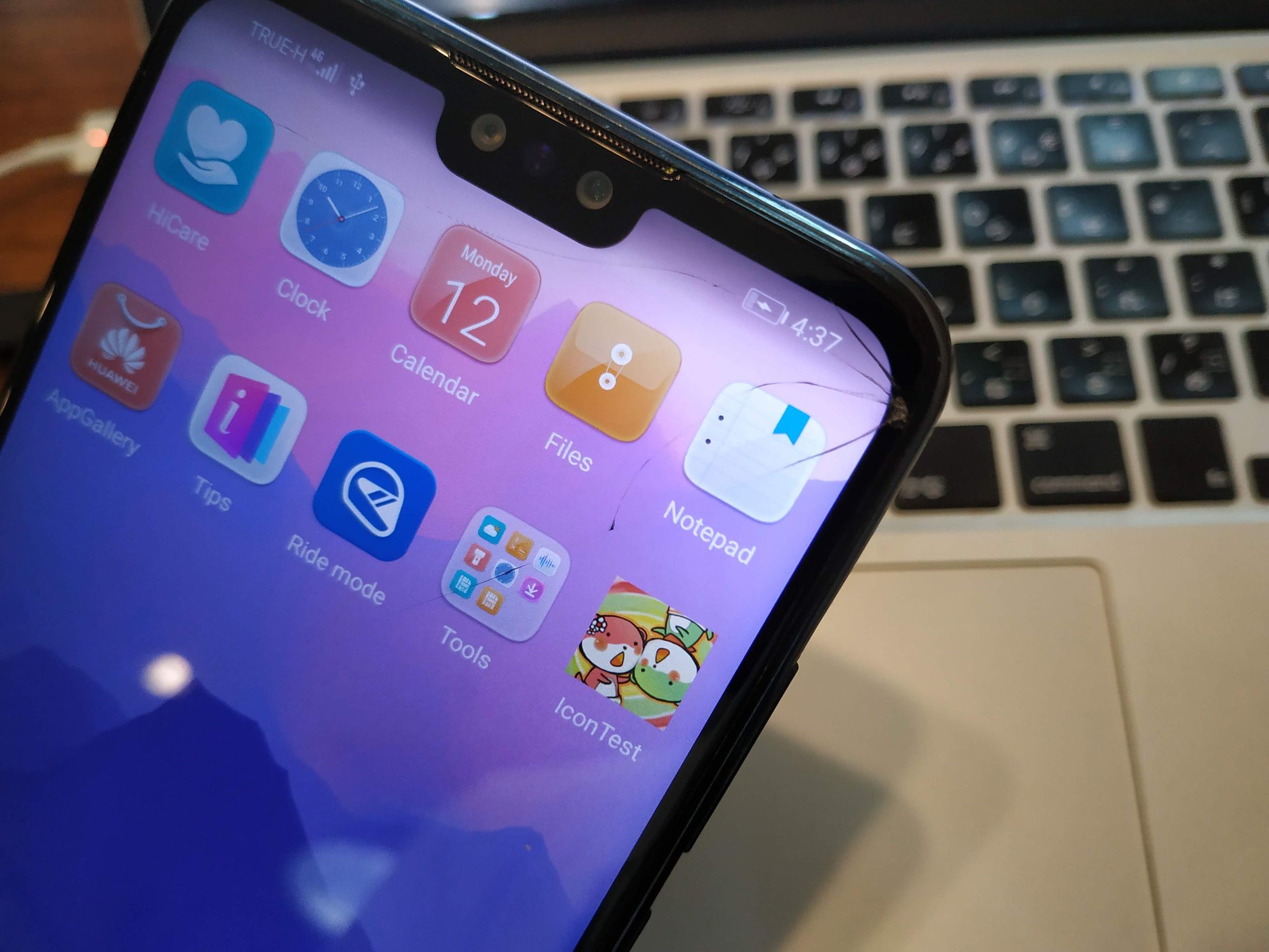


- This is like a better behaving A2, or Z5 that could understand Adaptive. Granted, the Android version is 9.
- It uses the latest available icon, the mask shape is circular on Adaptive, but no hideous white circle applied on Default and Legacy.
- This is the best behaviour so far! Unlike the S10+ or A2, it is fine if it couldn't get the icon to its mask shape.
What we learned / dilemma
- You can't use only Default, or else it will sucks on a device like A2. The A2 needed rounded icon ideally.
- We need to keep Legacy in there, so older devices can use it.
- When we use Legacy, then the S10+ sucks now because it put Legacy inside the mask instead of keep masking the Default.
- Now we must go all the way to Adaptive to fix the S10+, even though we want it to keep masking the Default.
- Doing this in turn break the A2 which we wants it to use the perfectly fine rounded icon, but now it is using a weirdly zoomed Adaptive. (I wish there is a check box that says phone which has circular mask should prefer rounded icon instead of adaptive. Google is trying to forward us to a new standard...)
- Final solution : put everything in, and somehow fix the Adaptive to looked more like Default on S10+, and more like rounded on A2, at the same time.
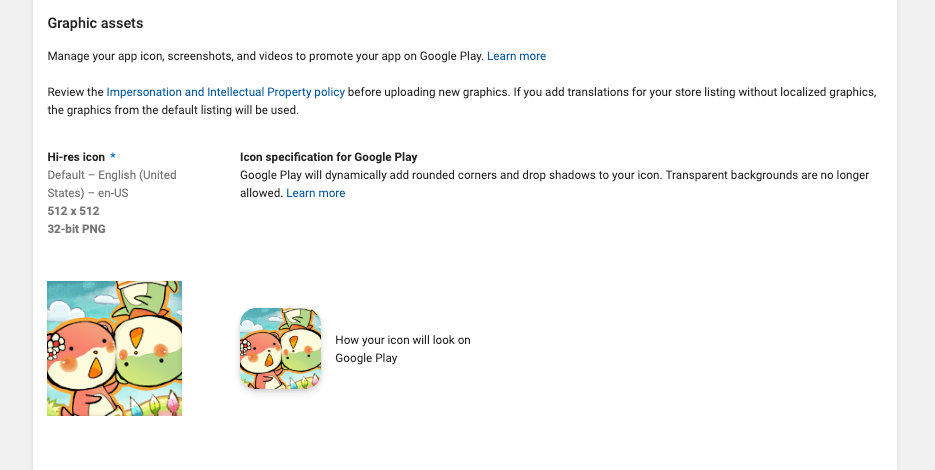
We are not even looking at the store icon..
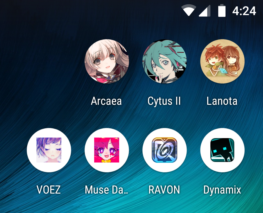
To add even more complexity, the icons on your home screen aren't look like when they were in the store!


Look at Lanota's icon, it is completely different! And also is completely different from the one in circular mask on A2, and ther is one more that is just a cat which I am not sure how to get it again or where that cat appeared in the story at all. Muse Dash and VOEZ probably used just Default so it masks correctly on S10+ but sucked on A2. Dynamix also only Default, but it has a built-in rounded corner that make it looked weird when masked. Arcaea looks perfect everywhere so far, as expected from a top team that has everything perfect from start from insane artwork, tons of popular artists with exclusive and high ranked song from popular contests, and perfect business class Japanese on social medias.
The answer is in this page https://developer.android.com/google-play/resources/icon-design-specifications. It says that store icon is a completely different thing than APK icon. So at least you don't have to be worried about this after you get the APK one right.
And worth noting that Google wants to do rounded rectangle over full-bleed art submitted. Much like Default in Unity that is displayed on the S10+, it's a simple mask, no zoom or animation padding shenanigans, and perfect. In this case, I would submit simply an art like this :
Edit : I found that there is a little section that says about this in the admin console.
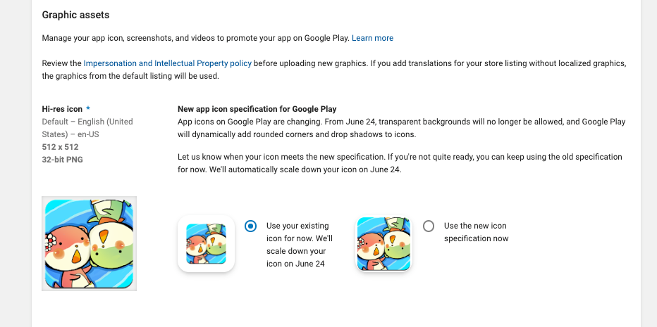
It explicitly says it do not want any transparents from now on. But you could keep your old icon given that it is scaled down. So, that's actually what I want except the scale-down. (Because your icon will always looks a little smaller than competitors despite all the transparent and unique design you can use.) I guess I have to give in with the new no-transparent specification.
As soon as you uploaded a new full-bleed icon (fortunately we don't have to deal with adaptive mess here), you can't go back to the old one anymore. Also, the rounded corner looks very much like iOS's design. (Remember this is only for the store, the phone do not necessarily need to coorperate with this design.) So if your icon works on iOS it would be fine on Google Play Store too, fortunately.
What's up with the Adaptive Icon's zoom
One disappointing thing is that all the 2 layers restrictions ended up doing nothing at all even on highest end device like Galaxy S10+. Maybe someone in the future will decide to play with it and break the icons that weren't prepared to be wiggled.
Anyways about the zoom, this is in the specs. See this https://developer.android.com/guide/practices/ui_guidelines/icon_design_adaptive again.
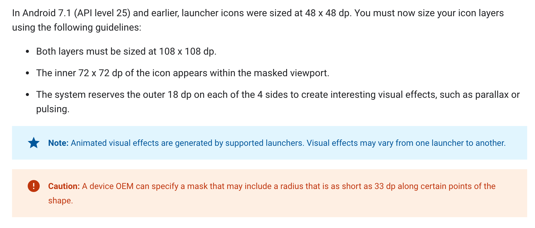
So basically only a small center area sized 72x72 dp on the graphic will be in the mask. Outer 18 dp for effects, which disappeared completely on devices I saw so far because no one wants to play with adaptive layers.
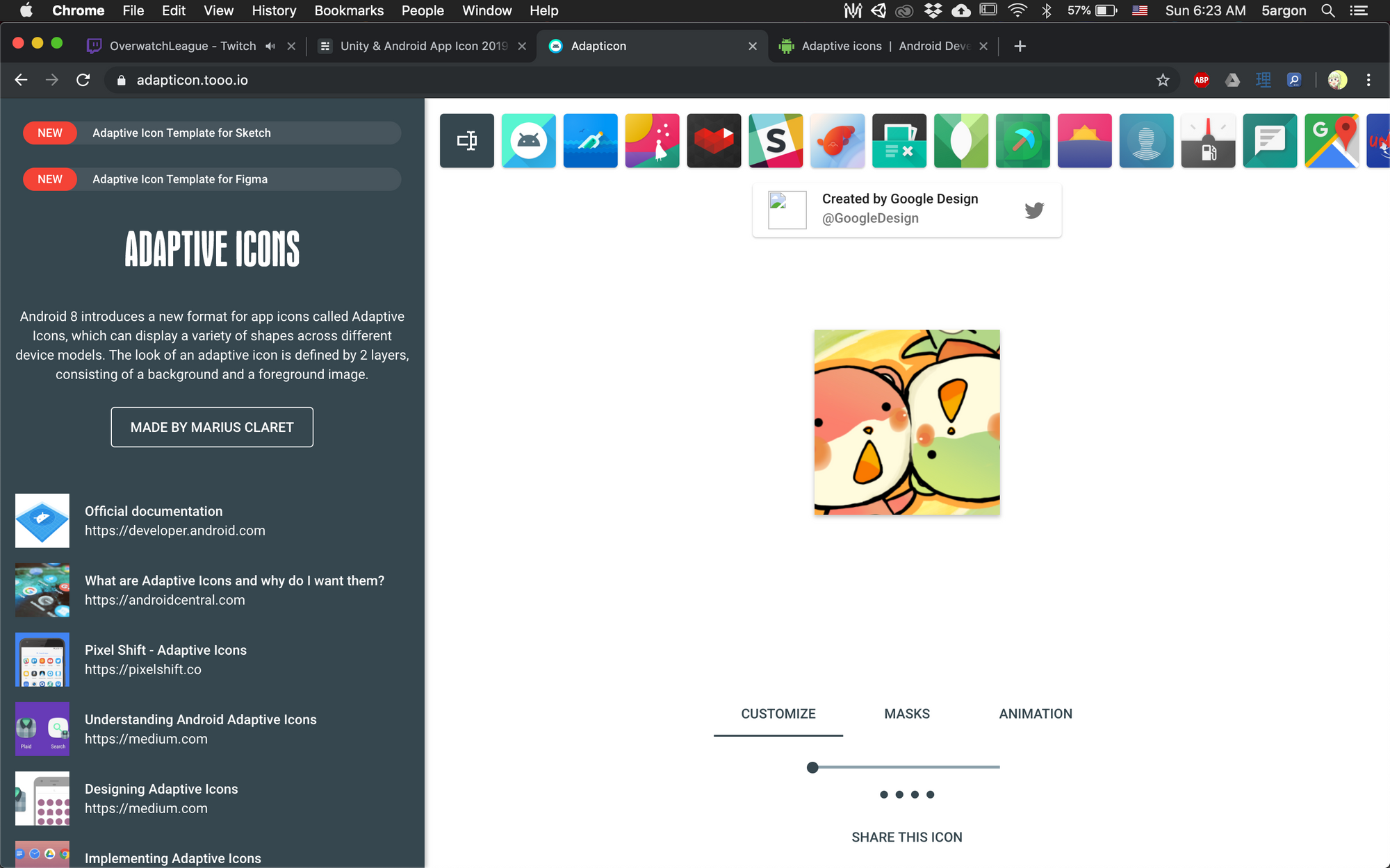
In fact, you can upload your graphic to this website and it will zoom in the same way. https://adapticon.tooo.io/ Select a completely square mask, and you get an idea how small that 72 dp really is.
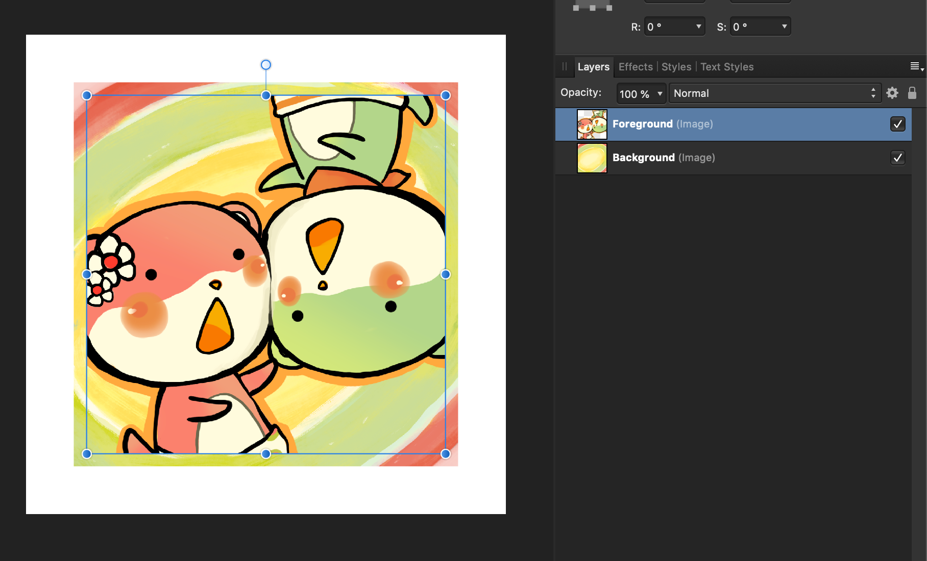
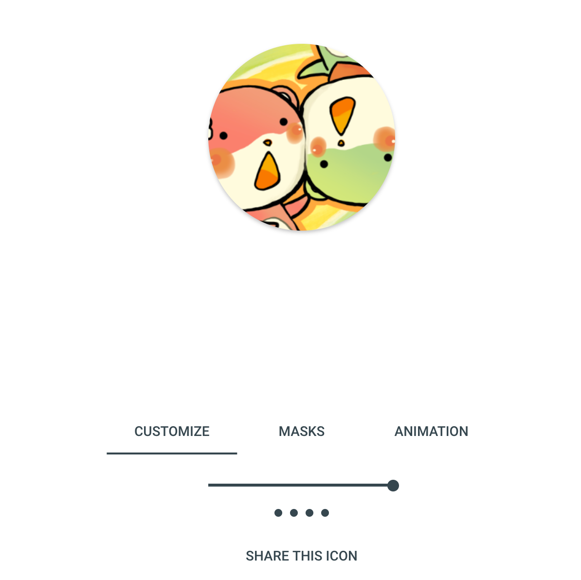
Now you realize why Arcaea's icon works. Because the focus point is at the center that even 18 dp each was cut from each side, it didn't lose much context. In my case why it doesn't work? There are 2 characters, neither is on the center. The character's body got clipped out. And one eye of the green one disappeared.
Now it maybe my fault that design the icon like this without knowing Adaptive will crop the center out of it, turns out the focus point of my icon is on bottom left and top right.
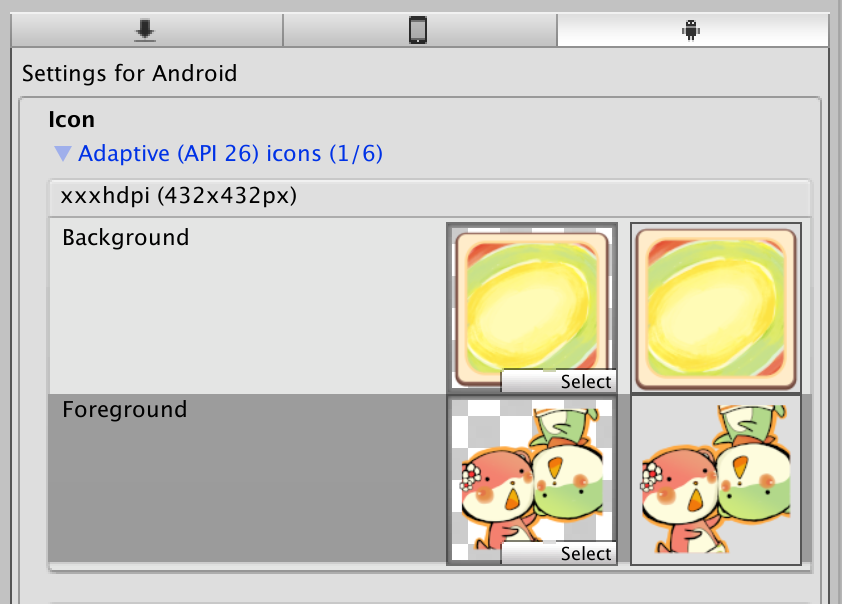
But to savage the current design, I considered doing something like this :
This is hacking the system, so that it cropped the center and yields perfect icon. But honestly, I am worried about those white space around it lol. Someday if some device decided to mess with some animations, it gonna reveals the truth.
And you see the weakness of the top layer that comes from the edge. The artist didn't draw that ear, so I cannot just put them on the center without risking exposing the cutoff on some future phones.
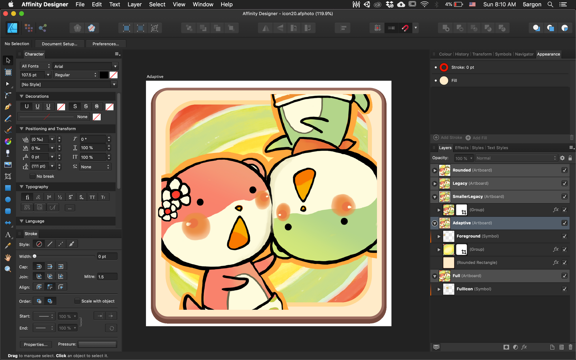
In the end, I tried to get all the eyes back by scaling down, and a smaller center pattern so that a bit of green ended up in the display area. I then freestyled the rest of outer brown area, just to see if some phone in the future ended up using those area, I could debug how far it goes. While if some phone stupid enough to use Adaptive but forgot to zoom, then I still get a servicable icon.
This icon is basically saying "f*uck you Google I heard you like to place my whole icon at the center of white mask, so now I have to put an icon inside an icon, so you finally wants to mask my icon in a non-white mask."
After Adaptive-zoomed it looks like this. Finally that eye is back in the frame, and I got some of the green BG now.
If I knew this, I would have asked the artist to draw the entire character. Well that was like 4-5 years ago just before they all quit. I redraw the background but want to keep using the old foreground part to keep her legacy in the game.
The official docs seems to do it wrong themselve as well :
https://developer.android.com/google-play/resources/icon-design-specifications#corner_radius
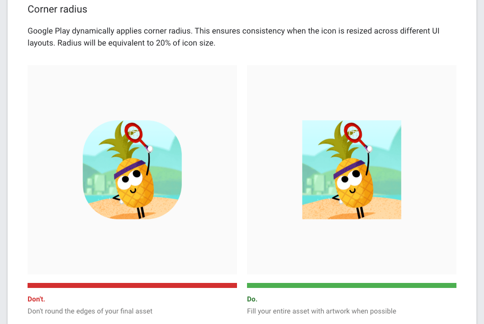
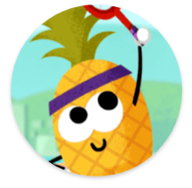
Ironically, if you design as the "Do" suggests, the result on the Mi A2 and Samsung Galaxy S10+ would miss the racket due to adaptive zoom and reserved paddings, and therefore looks like a pineapple game more than a tennis game. That preview is likely just how it looks on Google Play Store listing, not on your player's device. (Which has no zoom or padding, just rounded the corner from a 1 piece of full art.)
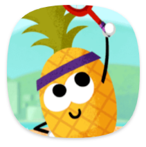
It did say "Google Play dynamically..." not the player's device though. So it means that this guide may only be applicable for store icon and not the adaptive icon, despite the article talks about adaptive icons in the beginning. It is difficult to think about what you could put on the stupid paddings required to be cut off without resorting to "hacked frame" like I did.
Also imagine when the trend finally started to utilize that foreground part and do parallax effect as advertised in Google's documentation. In that case, then we get even more fragmentation inside the same device that could perfectly do Adaptive Icon, when you see some icon could parallax and some could not, in a midst of an another layer of fragmentation that some icon even can't be masked and ended up a little pathetic graphic on the center of white squirricle, or whatever that is called, which may or may not be auto-parallaxed.